@ThatRyanChap @declamare @whippletom I know you didn’t really ask for this, but I had to go back and check my intuition – and luckily, it’s not wrong. But the exercise was useful because it exposes a couple of interesting dynamics – and helped me understand why we can’t see the impact of delta on hospitalisations.
@ThatRyanChap @declamare @whippletom So here goes: imagine that pre-vaccine we have a population with 1000 cases per day, and 100 hospital admissions per day. So a hospitalisation ratio of 10%. Now let’s suppose that we administer 1 dose of a vaccine that stops 25% of infections, and 80% of hospitalisations
@ThatRyanChap @declamare @whippletom Now we’ll have 750 cases and 20 hospitalisations per day, for a ratio of 2.7%. And let’s apply the second dose, which stops 80% of cases and 95% of hospitalisations. So we’ll have 200 cases and 5 hospitalisations, for a ratio of 2.5%.
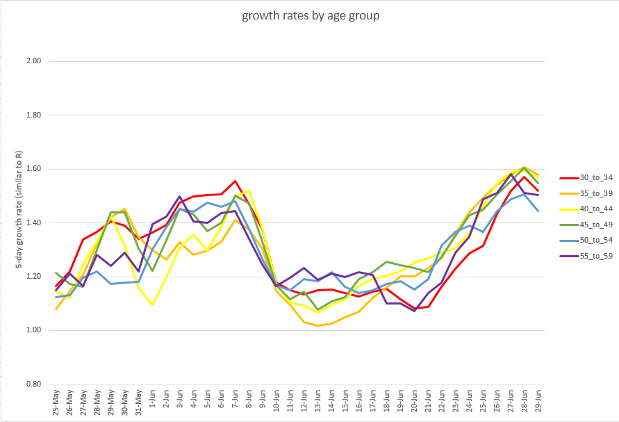
@ThatRyanChap @declamare @whippletom So the first part of the intuition was correct: using VE figures similar to the (combined AZ and Pfizer) impact on delta, we get much more benefit in this ratio from the first dose than the second – which reduces cases and hospitalisations roughly in line with each other.
@ThatRyanChap @declamare @whippletom But age-based risk is also important. For simplicity, let’s just deal with two age groups, of equal size. The “old” age group has 500 cases per day, and 90 hospitalisations; while the “young” group also has 500 cases but only 10 hospitalisations. The totals are as before.
@ThatRyanChap @declamare @whippletom Now let’s apply the first doses only to the older group. As you can see in the table, this cuts the overall hospitalisation ratio to 3.2%. If we then apply first doses to the young as well, it comes down a bit further to 2.7%. Second doses in the old then drop it to 1.4%.
@ThatRyanChap @declamare @whippletom And then – interestingly – second doses in the young take it *back up* to 2.5% (because they have a much bigger impact on the overall case total than they do on overall hospitalisations, given that the younger group are at much less risk of going to hospital).
@ThatRyanChap @declamare @whippletom So the second part of the intuition also works: giving doses to the older group is much more powerful in its impact on this ratio, and giving second doses to the old is more impactful than giving first doses to the young.
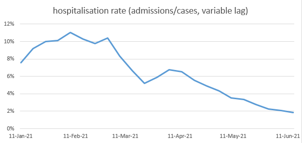
@ThatRyanChap @declamare @whippletom But of course that’s not quite what happened in reality. We gave out first doses to the elderly when alpha was dominant, so it was alpha’s vaccine efficacy (VE) that governed the impact on this ratio, not delta’s. So let’s try that again, with different VE assumptions:
@ThatRyanChap @declamare @whippletom Now the first step (in red) is giving a first dose to the elderly, assuming 60% VE vs cases rather than 25%. The overall ratio drops to 4% (rather than 3.2% as before). And then the next four steps all happen in quick succession / overlapping with each other:
@ThatRyanChap @declamare @whippletom -Delta arrives, flipping the VE assumption for those who have a first dose
-We give first doses to the young
-And second doses to the elderly
-And delta also increases the risk of hospitalisation by factor of 2
@ThatRyanChap @declamare @whippletom The net effect of these 4 steps is to reduce the ratio from 4% to 2.7% (see the second red column in the table, not quite at the right hand end). So this gives us a clue as to why we find it hard to see the 2x increased risk of delta on hospitalisations in this ratio:
@ThatRyanChap @declamare @whippletom … it came in at the same time as we were getting benefit from first doses in the under-50s, and second doses in the over-50s AND it was also offset to some extent by the impact of delta on VE for those who had had one dose (which increases cases, but not hospitalisations)
@ThatRyanChap @declamare @whippletom Please note this is just a toy model, it doesn’t have a full age structure or precise timing, and the numbers are designed more for ease of explanation than accuracy. But it does I think capture some important dynamics in understanding how this ratio has evolved over time. /end

• • •

Missing some Tweet in this thread? You can try to force a refresh
 

Keep Current with James Ward

James Ward Profile picture

Stay in touch and get notified when new unrolls are available from this author!

Read all threads

This Thread may be Removed Anytime!

PDF

Twitter may remove this content at anytime! Save it as PDF for later use!

Try unrolling a thread yourself!

how to unroll video
  1. Follow @ThreadReaderApp to mention us!

  2. From a Twitter thread mention us with a keyword "unroll"
@threadreaderapp unroll

Practice here first or read more on our help page!

More from @JamesWard73

2 Jul
I know the cases and admissions data looks bad again today, but I’m going to stick my neck out and say: I think we might have passed the current peak of growth rates, and so R could be about to head down again. Here’s the recent growth trends in the 30-60 year olds: 1/ Image
And here’s the same graph for the 0-30s: 2/ Image
The trends in the older age groups (60-90) are less good – but *if* we think a lot of these cases are direct infections from younger people, then we’d expect these curves to follow the shape of the younger groups, just a bit behind. So if those come down, these should too. 3/ Image
Read 4 tweets
1 Jul
Today we got @PHE_uk’s latest weekly surveillance report which provides their age-stratified hospital admissions data. I can use this to extend my analysis of the hospitalisation ratio, as follows: Image
This shows that in the most recent week (admissions in 21-27 June), the ratio has dropped further, to around 1.5%. I can also extend my “fixed age mix” curve, in orange (see thread below for explanation of this) – which has dropped by a similar amount. Image
This implies that the most recent drop is “real” i.e. it’s caused by falls in hospitalisation ratios *within* each age group, not by changes in the age mix of cases. We can see this if we look at the hospitalisation ratios for each age group, as per the chart below: Image
Read 10 tweets
30 Jun
Obviously today’s case data is horrible again, and admissions look like they might be picking up. But there is a small piece of hidden good news: we might be at or near the peak of growth rates. And some bad news in the older age groups (sorry). Details in thread below... 1/7
The good news is that growth rates in the under-60s look like they may have stopped growing. Here are the under-30s: as you can see, only the preschool kids (0-4s) still have a rising growth rate, with other age groups looking flat or even with slightly falling growth. 2/n
And here are the 30-60s, with an even clearer pattern. This might seem like small comfort: after all, growth isn’t yet falling, let alone cases. But if a zero second derivative is the best thing available, I’ll celebrate that – and it’s better than the alternative. 3/7
Read 7 tweets
29 Jun
I’m not going to comment on today’s case data, because the message hasn't changed, and I don’t want to spoil an otherwise positive evening. But case data only really matters if it causes bad medical outcomes, and here the news may be a bit better. 1/n
The ratio of hospitalisations to cases has been dropping over the last few months – mostly due to vaccines. (the main effect of vaccines is to stop people getting infected, but for those who do get infected, they also reduce the chances of going to hospital or dying). 2/n
[note: to calculate this ratio, we need to compare hospitalisations to cases a few days earlier, and there’s some debate as to how long a lag to use. I’ve used lags from this recent ONS study ons.gov.uk/releases/coron…, but I get similar results with different assumptions] 3/n
Read 19 tweets
28 Jun
I’m honestly not liking this case data much at all. While the modeller in me is happy that the growth rates in different age groups are, for once, moving consistently in the same direction, I just wish that direction wasn’t up. 1/6 Image
Looking in a bit more detail, we can see growth continuing to accelerate in school-age children (5-14s)… 2/6 Image
And the young adults (15-29) are starting to accelerate (gently) again, after a period of consistent growth 3/6 Image
Read 6 tweets
27 Jun
So R is staying stubbornly high in England, and maybe even drifting upwards. Why is this? I’m not really sure, but as usual I think the age-stratified case data is the first place to look for clues. And the changing growth probably isn’t quite where you’d expect it to be. 1/7
Your first suspects might be unvaccinated young adults, out partying and watching the football? Well, their case rates continue to be high and growing, but R seems to have settled down to a new level around 1.3, so it’s not them that’s caused any recent uplift in R. 2/7
Your next suspects might be schoolchildren – we know they spiked up about a week ago, and again growth continues, but there isn’t strong acceleration (although maybe a bit in the 10-14s). Still, there could be a mix effect happening here: 3/7
Read 7 tweets

Did Thread Reader help you today?

Support us! We are indie developers!


This site is made by just two indie developers on a laptop doing marketing, support and development! Read more about the story.

Become a Premium Member ($3/month or $30/year) and get exclusive features!

Become Premium

Too expensive? Make a small donation by buying us coffee ($5) or help with server cost ($10)

Donate via Paypal Become our Patreon

Thank you for your support!

Follow Us on Twitter!

:(