This post rips Prophet (a forecasting package I helped create) to shreds and I agree with most of it🥲 I always suspected the positive feedback was mostly from folks who’d had good results—conveniently the author has condensed many bad ones into one place. microprediction.com/blog/prophet
It’s really freakin hard to make statistical software that generalizes across many problems. Forecasting (extrapolation) is among the hardest statistical problems. I don’t think anyone who’s seen me present Prophet would think I’ve misrepresented these facts.
The website might not do the best job of explaining all the limitations and it’s honestly been surprising to me how much sophistication people attribute to the underlying model. I hope a little cold water will help! There are often better approaches and packages out there.
If I could build it again, I’d start with automating the evaluation of forecasts. It’s silly to build models if you’re not willing to commit to an evaluation procedure. I’d also probably remove most of the automation of the modeling. People should explicitly make these choices.
The lesson here is important and underrated: models and packages are just tools. We attribute magical powers to them, as if their creators have somehow anticipated all the idiosyncrasies of your particular problem. It’s unlikely they have and there’s no substitute for evaluation.
I haven't worked on text models in a long time, because (TBH) I find them boring. I had been ignoring progress in that space because you could kind of see where it was heading. I don't feel *that* surprised by GPT-3 but it illustrates some useful ideas.
To me, what's big is challenging current status quo of many specialized single-task models with one general multi-task model. Expensive, pre-trained embeddings are common at large cos, but mostly used as features for specific learning tasks. Multi-task models have small # tasks.
As @sh_reya points out, big challenge becomes "how do you explain to the model what task it should be working on?" Probably a large design space here and require entirely new "meta-query" language. Also challenging to formally evaluate a model like this, hard to quantify value.
I'm procrastinating tonight so I'll share a quick management tool I use. It's close to the end of H1 so performance reviews are coming. I tell this to my reports: "Your work is going to be distilled into a story, please help me tell a good one so I can represent your work well"
A good story must be easy to understand and compelling. At all times you should think about what story you'll tell about your work. It helps you do good work and it helps me (your manager) get you the credit you deserve. A story has three parts: a beginning, middle, end.
Beginning of the story:
- Your work is well motivated. It addresses a clear need that you were smart to identify.
- Help me by being deliberate with project choice, finding good opportunities, and not chasing shiny objects. Generate buy-in and excitement before starting.
I think I had a tough time communicating with @yudapearl today. It’s worth sharing where I think we ended up misunderstanding each other. I don’t think he is likely to agree with me, but it's useful for me to articulate here.
I shared the Meng paper because it’s a nice discussion of how greater sample size doesn’t solve estimation problems. This is part of a strong opinion I have that collecting adequate data is the key challenge in most empirical problems. Some people will not agree with this.
Most folks thought I was talking about causal inference from the start. I was actually talking about the tool of *randomization*. IMO, Meng’s paper is an example of measuring the value of randomization for an estimation problem. Randomness is a complement to sample size.
I think this is an interesting topic but found this visualization hard to follow (no surprise if you've been reading my complaints about animated plots).
I have nothing to do tonight so i'm going to try to re-visualize this data. Starting a THREAD I'll keep updated as I go.
The original data is from the ACS. Nathan used a tool called IPUMS to download the data set: usa.ipums.org/usa/
Looks like there's a variable called TRANTIME that is "Travel time to work." The map uses PUMA as the geography, which are areas with ~100K people each.
IPUMS is pretty annoying to use. You need an account and you create a dataset to add to your "data cart"(!!!). But I was able to download a file with the 2017 ACS responses for TRANTIME, along with PUMA, and STATEFIP. The latter two fields uniquely identify the geographic region.
This is a pretty short and unpolished <thread> on launch criteria for experiments. Hoping for feedback!
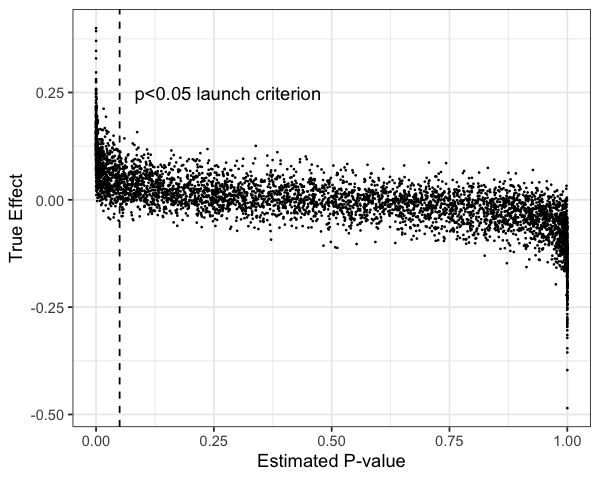
Background: one heuristic people use to decide to "ship" in an A/B test setting is p-value < 0.05 (or maybe 0.01). How important is "stat sig" for maximizing expected value?
I simulated 10,000 A/B tests with effects drawn from Laplace(0, 0.05) (most effects are close to zero) with Normal(0,1) noise and N=2000. I'm going to ignore costs of "shipping" and assume effects are additive, both huge assumptions. Here's the distribution of effects:
Since simulated data, I know the true effects. I order the experiments left to right by one-sided p-value (H0: effect <= 0). This p < 0.05 criterion would catch a lot of good tests, but ignore a lot of other positive ones. We have high precision but low recall.
- Instead of sharing slides I'm transcribing my QCon.AI talk to tweets with lots of GIFs :)
- Thanks to @_bletham_ for all his help.
Prophet motivation:
- there are many forecasting tasks at companies
- they are not glamorous problems and most people aren't trained well to tackle them
- 80% of these applications can be handled by a relatively simple model that is easy to use
We approach time series forecasting as a *curve fitting problem.* This has some benefits:
- curves are easy to reason about and you can decompose them
- the parameters you fit have straightforward interpretations
- curve fitting is very fast so you can iterate quickly