I think this is an interesting topic but found this visualization hard to follow (no surprise if you've been reading my complaints about animated plots).
I have nothing to do tonight so i'm going to try to re-visualize this data. Starting a THREAD I'll keep updated as I go.
I have nothing to do tonight so i'm going to try to re-visualize this data. Starting a THREAD I'll keep updated as I go.
The original data is from the ACS. Nathan used a tool called IPUMS to download the data set: usa.ipums.org/usa/
Looks like there's a variable called TRANTIME that is "Travel time to work." The map uses PUMA as the geography, which are areas with ~100K people each.
Looks like there's a variable called TRANTIME that is "Travel time to work." The map uses PUMA as the geography, which are areas with ~100K people each.
IPUMS is pretty annoying to use. You need an account and you create a dataset to add to your "data cart"(!!!). But I was able to download a file with the 2017 ACS responses for TRANTIME, along with PUMA, and STATEFIP. The latter two fields uniquely identify the geographic region.
It's sadly not a CSV file, it's a "dat.gz" file and you need some XML schema file to read it in. In R you need the `ipumsr` package to actually load it (ughh). But about 10 mins later, I have a data frame! Game on. 

The first thing you gotta plot is a histogram. I figure a 5-minute binwidth sounds good. Why are there all these zeros? These have to be people who don't commute or work from home? What the hell is this "haven_labelled" crap?

I figured it out, TRANTIME = 0 is the way they coded NAs. That is dumb, what if a respondent said 0 mins? (Ok maybe not plausible). I'm just going to cast `TRANTIME` to numeric because YOLO.
I wonder why Nathan's plot said something about 3 hours? None of these are that high.
I wonder why Nathan's plot said something about 3 hours? None of these are that high.

Update: Surveys have these things called "weights" and you're supposed to use them (🤦♂️). I'm going to check that the histogram is not drastically different if I use the weights.

Obviously one big aspect of Nathan's chart was the geography. It feels like a choropleth is a bad choice here you're using so much space for areas of the country with very little commuting, while us coastal elites get no ink! Let us complain about our long commutes!
I'm going visualize the distribution for just one city first. I can then expand that to all big cities. I'll start with NYC because I commuted while living there in grad school. Now to figure out which PUMA codes correspond to NYC...
This is a map of the NYC PUMAs. Annoying AF.
This is a map of the NYC PUMAs. Annoying AF.
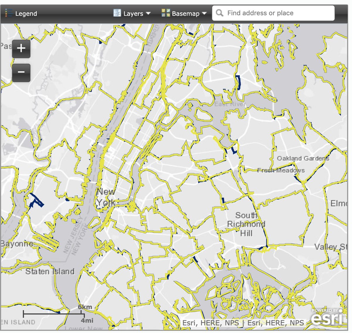
I found a mapping of PUMA codes to names on some FTP server hosted by the Census. Much harder than it should have been. NYC has a lot of PUMAs (55 of them, which I guess adds up to about ~5-10M people? checks out). I'll hackily sub string to get borough and count folks.


A quick sanity check. I'm plotting the ECDFs of the transit times by borough. (I have to remind myself how to read an ECDF) Looks like folks in Manhattan have shorter commutes and people in Staten Island have longer ones (genius!). Then I remember to make a table of the means💡


I'm reminded now how many assumptions you're forced to make while analyzing a new data set. It's so hard to know whether I have the right column, whether filtering the 0s was ok, whether it means one-way or round-trip, etc. Anddd oops forgot to use weights in the previous tweet!
Hit the first thing I don't know how to do from memory. This really slows things down. I want to create a list of city names, and "fuzzy join" them to the PUMA names. I know there's a package called `fuzzyjoin` It has a `fuzzy_join` function but I have no clue how to use it.
This code I wrote is totally reasonable! WTF is it not working?? (...10 minutes later...) Sometimes one character makes all the difference.


Grouping PUMAs into cities is a huge PITA - I'm realizing I probably should have just found some other geographic definition in that stupid IPUMS tool. Yep there it is, `MET2013` is the Metropolitan area. Sometimes you start with some arbitrary constraint you need to revisit.
As I sit waiting for this new data set to be generated by this stupid tool, I feel miles away from making any kind of visualization. These metro area definitions better be solve all my problems forever.

That tool is still processing! Must be a lot of people downloading ACS data tonight🥳
So i'm going with the old fuzzy-matching approach. Here's a quick table and plot:
So i'm going with the old fuzzy-matching approach. Here's a quick table and plot:


Does this make sense? 🤷♂️ LA has terrible traffic -- can people there really commute only 32 mins per day? Why is NYC so much longer than the others? Why is San Jose so low, the Bay Area is a garbage fire of traffic?
This doubt is a special feeling you have while analyzing data.
This doubt is a special feeling you have while analyzing data.
How am I going to resolve this? I google "best commute cities" and "worst commute cities" and here are the results:
Best: Buffalo, Columbus, Milwaukee (Algonquin for "the good land"), Hartford, Memphis
Worst: New York, DC, SF, Stockton, Chicago
Story kinda checks out.
Best: Buffalo, Columbus, Milwaukee (Algonquin for "the good land"), Hartford, Memphis
Worst: New York, DC, SF, Stockton, Chicago
Story kinda checks out.

As convenient as it is, I can't settle for just mean travel time, I want to visualize the distribution like Nathan did. I'd really like to surface if the mean doesn't tell the whole story in any cases. I go back the ECDF well, but they get confusing with >3-4 cities.

Boxplot! THE GOGGLES DO NOTHING!
The outliers make it cluttered. Tricky to remove (first trip to StackOverflow!), but it looks good after that. I want to try something else, because your first instinct should always be to take something that works and make it more complicated.
The outliers make it cluttered. Tricky to remove (first trip to StackOverflow!), but it looks good after that. I want to try something else, because your first instinct should always be to take something that works and make it more complicated.


Here's kind of a fun throwaway. The densities have different scales because I tried to use weights with density, and they end up sort of nested and looking like a topographic map. But I can see right away a density plot will be too hard to read because of all the close lines.

`ggridges` got popular last year and everyone started making these stacked density plots. It kinda looks like a drawing from a children's book! I find it confusing to read because it's hard to compare densities like this (you're mentally subtracting across a lot of space)

I had this "idea" to compute a bunch of quantiles and then plot the values of the quantiles for each city. Then I realized that I stupidly re-invented an ECDF, just turned on its side🤦♂️ I kind of like this better though! Higher curves clearly have larger values. Hmmm...

Here's an idea I'm toying with. I really like stacking the cities vertically because it looks like a ranking. I want to display the quantiles, and have it read either rightward or upward is higher. I computed the .10,.25,.5.75,.9 quantiles and plotted lines. Dots are the mean.

Ok this is the one I'm going to end on.
- Cities are clearly ranked and listed in order.
- Divided it up into the important quantiles: 10th (shortest commutes), 25-75 (normal-ish range), and 90th (longest)
- Mean time is still visible (the dot), always higher than the median.
- Cities are clearly ranked and listed in order.
- Divided it up into the important quantiles: 10th (shortest commutes), 25-75 (normal-ish range), and 90th (longest)
- Mean time is still visible (the dot), always higher than the median.

If you've made it this far, I hope you've enjoyed a window into my weird brain / gained some understanding of the temporary descent into madness that happens when you get hyper-focused on an (honestly, boring) question.
I await your friendly critiques of my R style and taste.
I await your friendly critiques of my R style and taste.