1/ New to Token Terminal?
Here’s a thread with tips & tricks that will help you get started using the platform! 👇
Here’s a thread with tips & tricks that will help you get started using the platform! 👇
2/ Website layout 🎨
• Landing page: protocol revenue chart + customisable data table
• Metrics dashboards: total revenue, protocol revenue, P/S ratio, TVL
• Markets dashboards: exchange, lending, blockchain, DeFi
• Project dashboards: choose your favourite!
• Landing page: protocol revenue chart + customisable data table
• Metrics dashboards: total revenue, protocol revenue, P/S ratio, TVL
• Markets dashboards: exchange, lending, blockchain, DeFi
• Project dashboards: choose your favourite!

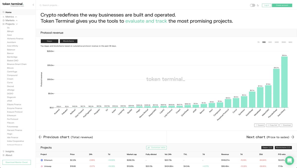
3/ Landing page 🛬
• Protocol revenue chart shows you which protocols are generating money for their token holders.
• With the toggle, you'll get similar charts for Total Revenue & Price to sales ratio.
• The customisable data table lets you choose metrics & sort the results.
• Protocol revenue chart shows you which protocols are generating money for their token holders.
• With the toggle, you'll get similar charts for Total Revenue & Price to sales ratio.
• The customisable data table lets you choose metrics & sort the results.


4/ Metrics dashboards 📈
• 1st, pick a metric you’re interested in: total revenue, protocol revenue, P/S ratio, TVL.
• 2nd, analyse how different projects have performed against that metric over time.
• 3rd, for specific projects: use the competitive landscape feature.
• 1st, pick a metric you’re interested in: total revenue, protocol revenue, P/S ratio, TVL.
• 2nd, analyse how different projects have performed against that metric over time.
• 3rd, for specific projects: use the competitive landscape feature.


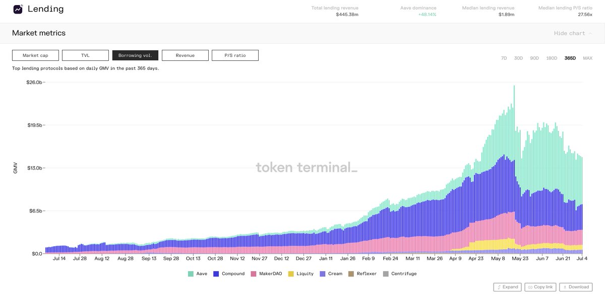
5/ Markets dashboards 📊
• 1st, pick a market you’re interested in: exchange, lending, blockchain, DeFi
• 2nd, analyse how project’s within that market/sector have performed against each other over time.
• 3rd, for specific projects: use the competitive landscape feature.
• 1st, pick a market you’re interested in: exchange, lending, blockchain, DeFi
• 2nd, analyse how project’s within that market/sector have performed against each other over time.
• 3rd, for specific projects: use the competitive landscape feature.


6/ For the rest of the thread, we'll go through the layout of the project-specific dashboards:
• Key metrics
• Revenue share
• Composition
• Competitive landscape
• Key metrics
• Revenue share
• Composition
• Competitive landscape
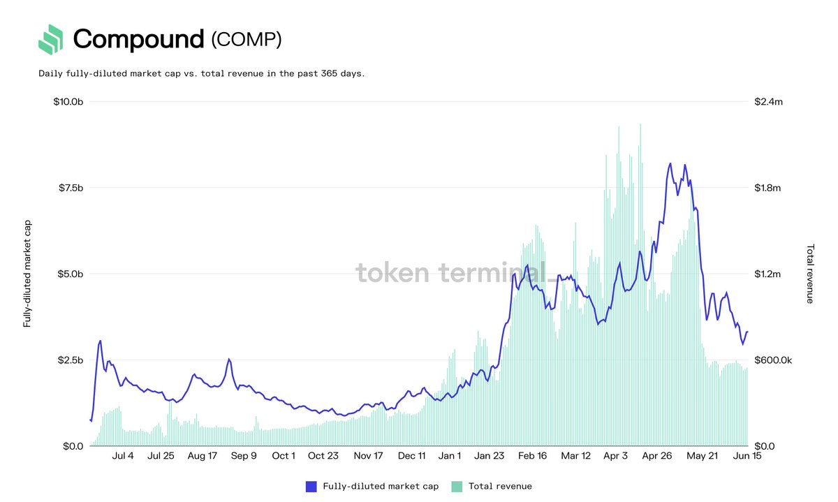
7/ Key metrics 🔑
Here you can pick different project-specific metrics and evaluate their correlation over different periods of time.
The market cap button has a dropdown for both circ. & fully-diluted & revenue for total, supply-side & protocol revenue (where applicable).
Here you can pick different project-specific metrics and evaluate their correlation over different periods of time.
The market cap button has a dropdown for both circ. & fully-diluted & revenue for total, supply-side & protocol revenue (where applicable).


8/ Revenue share 💰/💰
Currently, we divide the revenue (total fees paid by demand-side users) into three different categories:
1. Total revenue (2+3)
2. Supply-side revenue (goes to LPs, lenders, etc.)
3. Protocol revenue (goes to token holders)
Currently, we divide the revenue (total fees paid by demand-side users) into three different categories:
1. Total revenue (2+3)
2. Supply-side revenue (goes to LPs, lenders, etc.)
3. Protocol revenue (goes to token holders)


9/ Composition 🎨
Here you can go deeper on the different project-specific metrics to better evaluate their quality.
For example, does the majority of a lending protocol’s revenue come from only a few markets or is the revenue-generation spread across multiple markets?
Here you can go deeper on the different project-specific metrics to better evaluate their quality.
For example, does the majority of a lending protocol’s revenue come from only a few markets or is the revenue-generation spread across multiple markets?


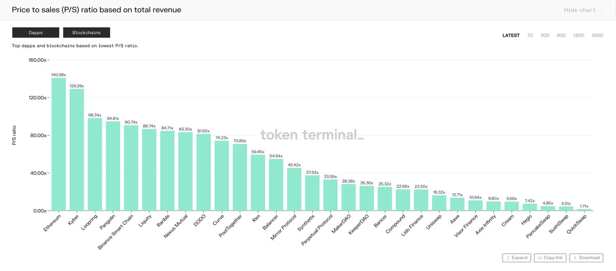
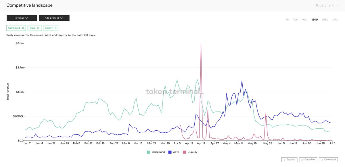
10/ Competitive landscape 🤺
Here you can select multiple projects and a metric and compare their performance over different time periods.
For example, you might want to compare different lending protocols based on their historical price to sales (P/S) ratio.
Here you can select multiple projects and a metric and compare their performance over different time periods.
For example, you might want to compare different lending protocols based on their historical price to sales (P/S) ratio.


11/ Access the underlying datasets 🤓
Finally, the paid version of Token Terminal gives researchers & analysts access to the underlying datasets in both excel & CSV formats.
Early subscribers are also granted API access to the data: tokenterminal.com/signup
Finally, the paid version of Token Terminal gives researchers & analysts access to the underlying datasets in both excel & CSV formats.
Early subscribers are also granted API access to the data: tokenterminal.com/signup

12/ You can check out a sample (Excel file) of our daily master sheet here:
d2kyooqkgm9ipp.cloudfront.net/Token%20Termin…
d2kyooqkgm9ipp.cloudfront.net/Token%20Termin…

fin/ Subscribe to our newsletter for more data-driven insights on the crypto markets!
tokenterminal.substack.com
tokenterminal.substack.com
• • •
Missing some Tweet in this thread? You can try to
force a refresh