I’m not going to do a very long model update thread, because it’s a busy week at work and I do actually need to get some sleep at some point. But I thought you might appreciate some headline conclusions from the latest version, as it might help inform the debate re. 19 July 1/n
I’m also not going to give you a policy recommendation, because it’s a genuinely tough call, and as usual I’m going to take it to the wire before getting off the fence (and I’ll stop the mixed metaphors there, before I do myself a nasty – if imaginary – injury). 2/n
So as usual I’ve updated to all the latest data and made a few other adjustments in an attempt to get as close as possible to a genuine “central view” i.e. as likely to be wrong on the upside as the downside. This week, those changes have included: 3/n
- Updated vaccine take-up (slightly more positively, I’m now forecasting we’ll get 80% of 18-50s, and 90% of all adults, 1st dosed by the end of July)
- Higher estimates for vaccine escape and prior-infection immunity escape, combined with a lower estimate for R0 of delta 4/n
- Higher estimates for vaccine escape and prior-infection immunity escape, combined with a lower estimate for R0 of delta 4/n
to maintain a ~65% overall transmission gain
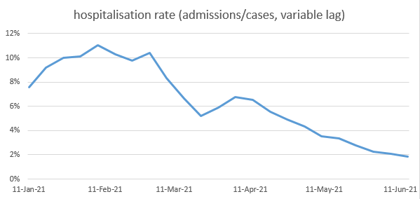
- adjusting my hospitalisation ratios to correct for the age mix of cases, and better fit current data
- allowing for Step 3 to have taken us a bit closer to normality than I previously assumed (and reducing the size of Step 4) 5/n
- adjusting my hospitalisation ratios to correct for the age mix of cases, and better fit current data
- allowing for Step 3 to have taken us a bit closer to normality than I previously assumed (and reducing the size of Step 4) 5/n
- increasing the seasonality assumption to 30% change in R0 from peak to trough, closer to more recent studies
- reducing the adjustment I previously made (based on pre-alpha data) that reduces the susceptibility of under-12s by 60% relative to adults – now reduced to 30% 6/n
- reducing the adjustment I previously made (based on pre-alpha data) that reduces the susceptibility of under-12s by 60% relative to adults – now reduced to 30% 6/n
- bringing into the central case a moderate adjustment to allow for people with higher rates of contact being more likely to get infected in the early stages of the epidemic – I believe this effect is very likely to be real, although the parameterisation is quite uncertain 7/n
With those assumptions, my new model base case looks like this, with a peak of hospitalisations around 12k per week (c. 40% of the January peak), and around 10k deaths in total in the exit wave. (note this is increased by about 50% from my central view of 2 weeks ago). 8/n 
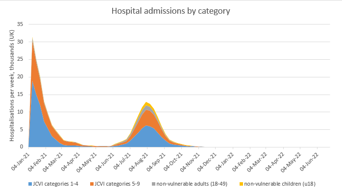
I still have quite a wide range of uncertainty around this, and would suggest a 75% confidence range of 6-15k deaths, and 8-20k weekly hospitalisations at the peak. For example, if I’m wrong about the contact heterogeneity assumption, you could get this: 9/n

And, noting today’s announcement that Step 4 will be aiming to get quite close to normality, with only voluntary guidance for masks, etc, and a lot of discretion for individuals, if I reduce my assumed impact of baseline controls to 10% (from 25%) then you get this: 10/n

Doesn’t look so bad? OK, but if you combine that with removing the contact heterogeneity assumption then you get this, which doesn’t look good at all. 11/n

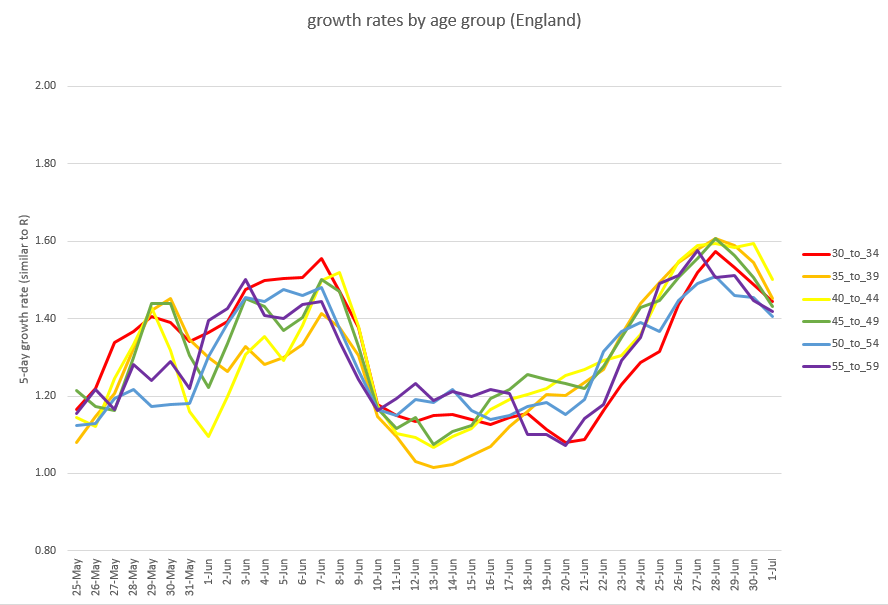
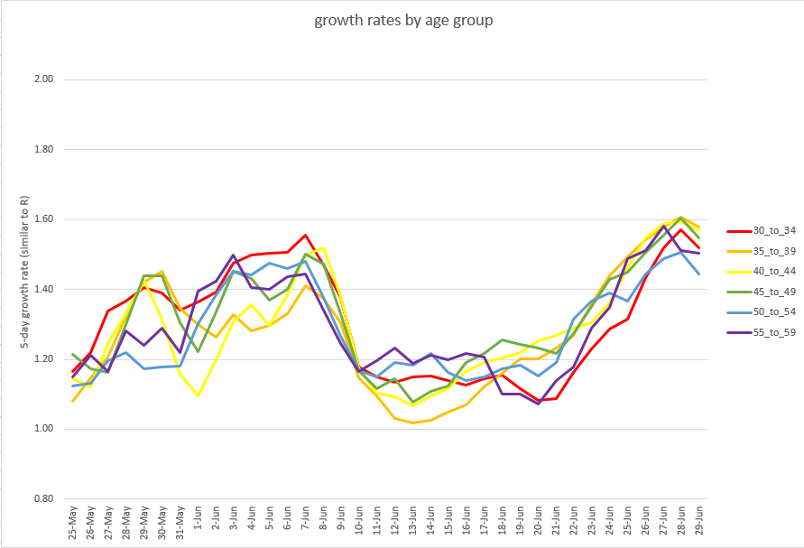
Now, I don’t think that’s likely to happen, and it would require two significant assumption errors, in the same direction, for that to occur. But I can’t completely rule it out. Particularly since, as I’ve noted previously, there are age- and region-specific dynamics… 12/n
…that my model doesn’t capture, and which have become increasingly important in recent weeks in determining the course of the epidemic. I did spend time at the weekend building an age-stratified extension to the model, but it’s proving challenging to fit to live data. 13/n
One other question to explore: does delaying opening to the start of September, by when nearly all adults will be double-vaccinated, help significantly? Well in the central case, a little bit, but not a lot (reducing deaths and peak hospitalisations by around 20%). 14/n

The bigger potential benefit of a delay to September, in my view, would be a reduction in the downside risk profile. For example, if you take that really nasty scenario (where I’m wrong about the size of Step 4, and on heterogeneity) and delay the opening, you get this: 15/n

Still bad, but by splitting the wave into two, you would significantly reduce the peak load on the NHS, and perhaps avoid standards of care deteriorating in that period. (although by spreading the peak you might also impact non-covid care over a longer period). 16/n
So, as I say, it’s a tough call – is reducing the downside risk sufficient gain to justify extending our current restrictions for another 7 weeks across the summer holidays? I expect people will have different views on that, and I’ll give mine soon, but not just yet. 17/n
In the meantime I’ll be watching the daily case and hospitalisation data closely over the next few days. A fast-falling growth rate would be a good sign, and would reduce the risk levels. Growth staying high and constant, or falling only very slowly, would be less good. 🤞 /end
• • •
Missing some Tweet in this thread? You can try to
force a refresh