Food is about more than calories: we need a wide range of nutrients, vitamins & minerals.

A healthy diet is more than 4 times the cost of a basic, calorie-sufficient one.

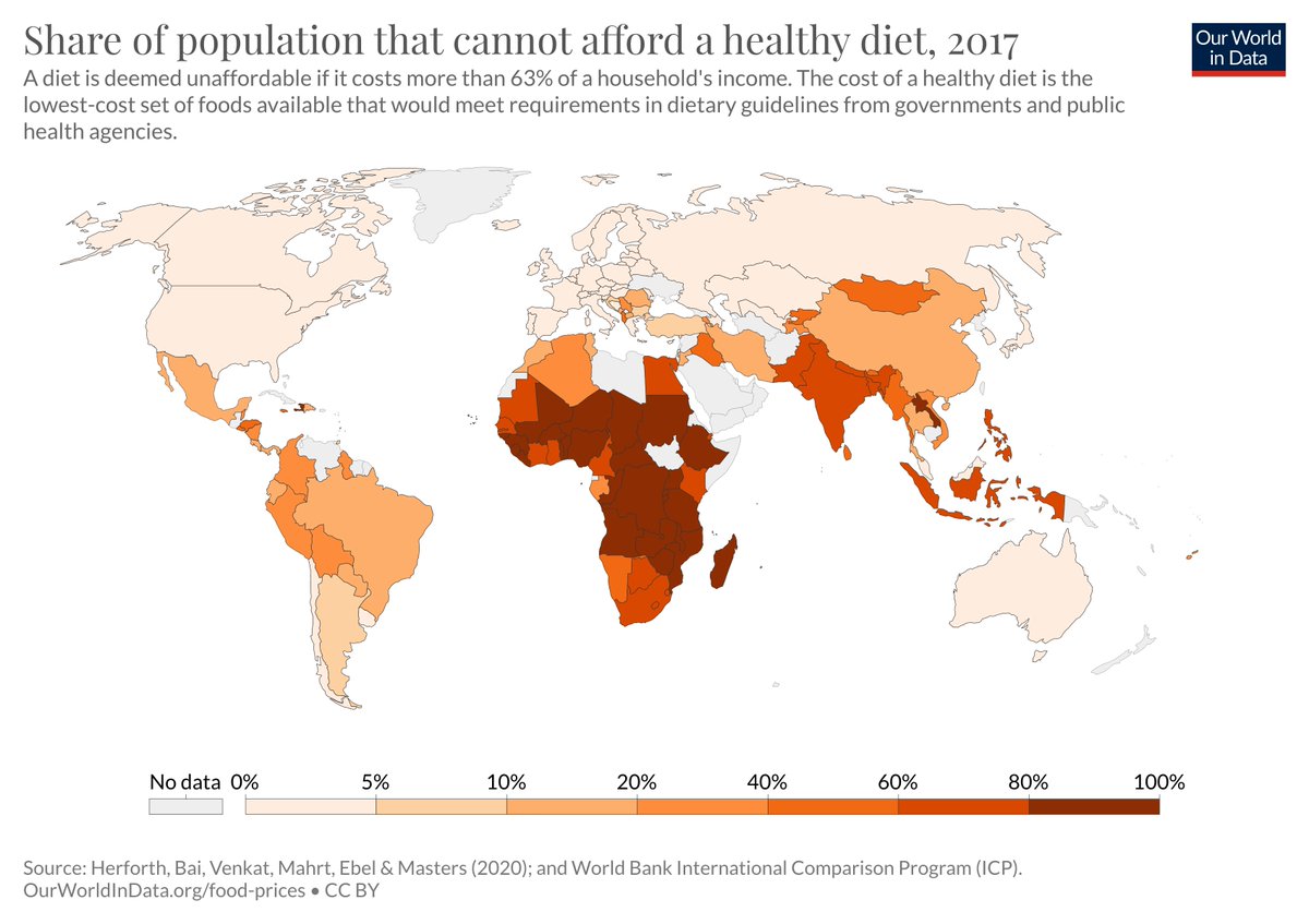
As a result, three billion people cannot afford a healthy diet.

My latest post: ourworldindata.org/diet-affordabi…
You can get calories in cheaply if you rely on staple foods like cereals & starchy roots.

Across the world, the cheapest calorie-sufficient diet costs about $1 per day.

Unfortunately hundreds of millions still go without.

1/
'Healthy' diets that meet nutritional guidelines are much more expensive because they contain a wide variety of foods.

Costs around 4x as much in most countries.

Three billion people cannot afford this even if they spend most of their income on food.

2/
We can put the cost of healthy diets in perspective by putting this cost on top of the income distribution.

The blue boxes are the median income in each country. Pink line is cost of healthy diet.

In many countries, cost of a healthy diet is higher than the median income.

3/
Ending hunger (in terms of calories) is essential. But this is just the first basic step towards providing a nutritious diet for all.

If a healthy diet is to be achievable for everyone we need much more growth for people at the mid-to-low end of the income distribution.

4/
This work is based on the affordability of diets work by @wamasters & colleagues in prep for the UN FAO. You find their work here: sites.tufts.edu/foodpricesforn…

and here:
fao.org/3/cb2431en/cb2…

5/
You can explore this dataset on diet affordability in our new Food Prices Data Explorer: ourworldindata.org/explorers/food…

/end

• • •

Missing some Tweet in this thread? You can try to force a refresh
 

Keep Current with Hannah Ritchie

Hannah Ritchie Profile picture

Stay in touch and get notified when new unrolls are available from this author!

Read all threads

This Thread may be Removed Anytime!

PDF

Twitter may remove this content at anytime! Save it as PDF for later use!

Try unrolling a thread yourself!

how to unroll video
  1. Follow @ThreadReaderApp to mention us!

  2. From a Twitter thread mention us with a keyword "unroll"
@threadreaderapp unroll

Practice here first or read more on our help page!

More from @_HannahRitchie

1 May
Where does the plastic in the ocean come from?

A new study published in @ScienceAdvances updates our understanding.

My latest @OurWorldInData article looks at the global picture of plastic pollution: ourworldindata.org/ocean-plastics

Thread of key points 👇
Previous studies suggested a small number of big rivers accounted for most of ocean plastics.

But higher-resolution data suggests many more small rivers play a big role.

To cover 80% of plastic inputs you need to tackle > 1,000 rivers.

1/
Factors that matter a lot for a river's plastic inputs:
– waste management practices
– distance to coast
– cities nearby
– precipitation rates
– slope of terrain

Here are the top 10 rivers 👇
(most are small rivers in the Philippines)

2/
Read 10 tweets
4 Mar
Half of world's ice- and desert-free land is used for agriculture. Most for meat & dairy.

Dietary changes could reduce this by as much as 75%.

But you don't have to go vegan: massive reductions by simply switching to chicken, eggs, fish.

Latest article: ourworldindata.org/land-use-diets
A point that comes up often: "grazing land is not suitable for growing crops".

True. Two-thirds of grazing land is not great for crops.

But that's okay: more plant-based diets tend to need *less* cropland, not more.

How can this be true? 👇

2/
It's because so much of our cropland is used to produce feed for animals.

Less than half of the world's cereals go directly to human food.

3/
Read 6 tweets
14 Jan
"We only have 100 / 60 / 30 harvests left" often hits the headlines. It's a myth. No scientific basis to it.

In fact, soil erosion rates span five orders of magnitude. Some are eroding quickly, some very little, and others are actually thickening.

1/

ourworldindata.org/soil-lifespans
First global assessment of soil lifespans by @DanEvansol & colleagues shows:

→ lifespans cross five orders of magnitude
→ 16% had < 100 years
→ 50% had > 1000 years
→ One-third had > 5000 years
→ some soils are thickening

2/
So the "60 harvests left" claim is overblown. But it shouldn't detract from the fact that soil erosion *is* a problem.

Thankfully there are things we can do:
→ cover cropping
→ minimal or no-till
→ contour cultivation

These soils showed longer lifespans in the study.

3/
Read 5 tweets
16 Oct 20
It's #WorldFoodDay

Much of our work at @OurWorldInData covers food & agriculture – it's central to many of the world's largest problems

Feeding everyone a nutritious diet in a sustainable way is one of our biggest challenges this century

Thread of some of our work on this 👇
No one in the world should go hungry.

Global hunger has declined massively over the long-term, but more than 1-in-10 (> 820M people) are undernourished.

This is unacceptable in a world where we produce more than enough for everyone.

Our work on hunger:
ourworldindata.org/hunger-and-und…
Despite rapid population growth over the last century, famines have become much more rare.

Today they are largely the result of sociopolitical instability, war and inequality vs. a lack of food on aggregate.

@JoeHasell and @MaxCRoser's work on Famines: ourworldindata.org/famines
Read 13 tweets
25 Sep 20
"China uses more cement in 3 years than the US did in the entire 20th century".

I see this claim a lot & was curious if it stacked up against data on CO₂ emissions from cement.

So, some more back-of-the-envelope fact-checking below ↓↓

Spoiler: yes, seems to stack up Image
I'm using annual data on CO₂ from cement prod from @gcarbonproject & CDIAC. You can explore, compare countries, download from our CO₂ data explorer here: rb.gy/szuwvo Image
My calcs:

CO₂ from cement in USA for entire 20th century = 1838 million tonnes

Annual CO₂ from cement in China (2018) = 781 million tonnes

China emits same in 2.4 years as US in 20th century.
Read 5 tweets
21 Sep 20
Important new paper published in @NatureFoodJnl. Looks at the impact of rising temperatures on 18 staple crops across the world.

A couple of interesting findings below ↓↓

nature.com/articles/s4301…
Yields tend to show inverse-U response to temp. Different countries lie on different parts of curve.

As expected, for most crops it's lower-lat, warmer countries that see negative response to temp rise.

Maps show response to 1°C rise (red = yield decline; blue = increase).

Some higher-latitude countries see yield increases across many crops.

Most crops show a yield decline globally. But there are a few exceptions: soybeans, sorghum, potatoes show yield increase nearly everywhere.

Useful to know for crop selection.

Read 4 tweets

Did Thread Reader help you today?

Support us! We are indie developers!


This site is made by just two indie developers on a laptop doing marketing, support and development! Read more about the story.

Become a Premium Member ($3/month or $30/year) and get exclusive features!

Become Premium

Too expensive? Make a small donation by buying us coffee ($5) or help with server cost ($10)

Donate via Paypal Become our Patreon

Thank you for your support!

Follow Us on Twitter!

:(