Is the market a bubble ready to burst? In this thread, we'll consider what share buybacks have to say about it: (THREAD)
With dividends being relatively stable and the DCF placing a lot of weight on the terminal value (long-term growth after 5 years), the main variable to consider is the pace of share buybacks, which affect the payout ratio. /2
Historically, earnings growth has been 6% in the US, and in recent years the payout ratio has been around 90%. Currently (a/o Q1) it’s 71%, with dividends comprising 35% and buybacks 36%. /3
The pandemic put an abrupt halt to buybacks last year and that has taken down the payout ratio 20 points. Since buybacks tend to follow earnings growth, the payout ratio will typically lag into an earnings recovery. /4
Even at 71%, US companies still buy back more shares than companies in Europe and Japan (where the payout ratios are closer to 50%). This may be one reason why US equities tend to have higher valuations, and have outperformed non-US equities in recent years. /5
The grid below shows that, at a 6% annual growth rate for earnings, a 10-percentage point shift in the payout ratio corresponds to a six-point shift in the P/E ratio. /6
With dividends being relatively stable, share buybacks are the swing factor that drive changes in the payout ratio, which in turn affects the P/E multiple. The question, at least for this exercise, is whether buybacks are a product of easy money policies. /7
There is no easy answer to that question. While it seems intuitive to conclude that the Fed’s easy money policy has led to financial arbitrage (borrowing cheaply to buy back shares) and capital misallocation, I’m not prepared to draw that conclusion. /8
It’s my sense that most buybacks are the result of profitable companies producing excess cash flows, even after CAPEX, and wanting to return that idle cash to shareholders. Think of it as a modern-day dividend. /9
This chart shows how remarkably stable the pace of free cash flows (FCF) has been as a percent of sales. Since the recovery of the financial crisis, for the S&P 500 index that number has been around 10%, while CAPEX has been around 6% and dividends of 4%. /10
If the Fed was blowing bubbles and creating a cash flow illusion for stocks, or somehow was incentivizing companies to misallocate capital by buying back shares rather than investing in CAPEX, I would expect that chart to look different. /11
That's not to say there isn’t financial arbitrage going on. This chart shows annual borrowing by non-financial corporates as well as the annual flow of buybacks, acquisitions and equity issuance (all from the Fed’s Flow-of-Funds report). /12
So there is plenty of financial arbitrage going on. But it's not clear whether this is the direct result of monetary policy. There was a buyback boom from 2004-07, but that was before the QE/ZIRP era. The Fed was even raising rates during the latter part of that period. /13
This next chart shows that the buyback era began in the mid-2000s. From the 1980s to the 2000s, the equity float (and therefore the S&P 500 divisor) was generally rising, but it peaked in 2004 and has been declining ever since. /14
Regardless of motivation, buybacks impact the market in two ways. First, they inflate the market’s earnings per share, and therefore understate the P/E ratio, by reducing shares outstanding. Same earnings but lower shares = inflated EPS. /15
A simple way to demonstrate this is to regress EPS against the $ amount of earnings (both of which are published by S&P). If we do this for the pre-2004 period as well as the post-2004 period, we can see that the slopes are different (see scatter plot below). /16
The orange line above shows that every dollar of earnings produces more EPS than it used to (i.e. a steeper slope). To test what today’s EPS would be based on fewer buybacks, we can simply apply the old slope to today’s dollar earnings, below. /17
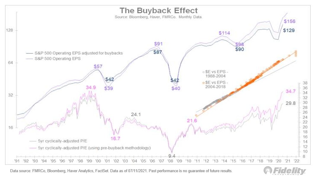
This increased “divisor leverage” has led to a 20% EPS inflation. This has, in turn, led to the P/E being understated. The current trailing P/E multiple (5yr CAPE) is 29.8x, but using the old slope it would be 5 points higher at 34.7x. /18
So what about the payout ratio? If companies in the S&P 500 only paid dividends, the current payout ratio would be 35%. That would warrant a lower valuation than the current 71% when buybacks are included. /19
We can see the impact in this chart: It shows the pre-Covid earnings path compared with the current consensus estimates (from Bloomberg). /20
As the DCF model on the right hand side of the chart shows, at a discount rate of 5.5% the difference between the current 71% payout and a 60% payout is roughly 600 SPX points, or 15%. /END

• • •

Missing some Tweet in this thread? You can try to force a refresh
 

Keep Current with Jurrien Timmer

Jurrien Timmer Profile picture

Stay in touch and get notified when new unrolls are available from this author!

Read all threads

This Thread may be Removed Anytime!

PDF

Twitter may remove this content at anytime! Save it as PDF for later use!

Try unrolling a thread yourself!

how to unroll video
  1. Follow @ThreadReaderApp to mention us!

  2. From a Twitter thread mention us with a keyword "unroll"
@threadreaderapp unroll

Practice here first or read more on our help page!

More from @TimmerFidelity

16 Jul
Is the market a bubble ready to burst? In recent threads, I examined that question from a variety of angles, using a discounted cash flow (DCF) model, which helps us quantify the effects of today’s ultra-low interest rates and abundant financial engineering. A summary: (THREAD)
Without even getting into the equity risk premium and payout ratio, it's fair to say that today’s low rates have added 5 P/E points to the market’s valuation, and the many trillions in buybacks since 2004 has added another 5 points. /2
That’s 10 P/E points of additional valuation. Absent these factors, the S&P 500 would trade at a 15x trailing P/E instead of 25x. Coincidently, 15x was the average P/E ratio for the market’s entire history prior to the current era. /3
Read 10 tweets
14 Jul
Is the market a bubble ready to burst? An important factor to consider is the risk-free rate (RFR), aka the 10-year Treasury yield. So let's dive in: (THREAD)
It doesn't take a leap of faith to see that monetary policy is suppressing interest rates. This chart shows it. Nominal yields on the vertical axis and TIPS break-evens on the horizontal. The size of the bubbles (no pun intended) shows the size of the Fed’s balance sheet. /2
Based on the regression between these two variables, the current level of the 10-year is about 100 bps lower than it “should” be. This chart shows the 10-year vs the above TIPS model. Are today’s subdued yields the result of policy? It seems that way to me. /3
Read 10 tweets
13 Jul
Following up on the previous thread, as we seek to answer the question: “Is the market a bubble that is ready to burst?” The next factor to look at is the equity risk premium. (THREAD)
The discount rate (or cost of capital) consists of the risk-free rate (10 year Treasury yield) plus the equity risk premium. The ERP is like a credit spread, reflecting the additional return investors demand as compensation for additional volatility vs. the risk-free asset. /2
The surge in “excess money” (money supply growth less GDP growth) resulting from the fiscal/monetary response to the pandemic has clearly elevated the market’s valuation, as the chart below shows. /3
Read 13 tweets
13 Jul
With stocks trading at near-record valuations and the Fed hoping to retreat from the zero lower bound (ZLB) and its $120 billion in monthly asset purchases, everyone wants to know: Is this market a bubble that is about to burst? Let's take a hard look. (THREAD)
I’m going to try the process of looking at all the market’s moving parts through the lens of the discounted cash flow model (DCF). It’s a good exercise in discipline in that it forces me to actually quantify the puzzle pieces.
For the DCF there are four important variables that we need to consider: earnings growth, the payout ratio (dividends + buybacks as a percent of earnings), interest rates, and the equity risk premium. /2
Read 9 tweets
12 Jul
Sentiment. It finds its way into a lower ERP, as it did at the secular peak in 2000, but we can also measure it through investor behavior. (THREAD)
We know about speculation in meme stocks & non-profitable tech this cycle. Margin debt has growth dramatically on a year-over-year basis, although as a percentage of market cap, margin debt remains well below the peak in the 2000s. /2
With retail speculation presumably limited to a relatively small subset of the market, looking at long-term flows--that is, regular investors saving for retirement--we see very little evidence of exuberance. /3
Read 5 tweets
23 Jun
With all the speculation about the Fed raising interest rates sooner than later, let's take a look at how past "liftoff" attempts by the Fed affected the markets, and how the Fed then responded. (THREAD)
There have been four major liftoff attempts since the Global Financial Crisis. The first was in April 2010, after an 80% run in the S&P 500. The Fed ended QE1, producing a three month, 16% drawdown for stocks, which forced the Fed to start QE2 a few months later. /2
The second attempted liftoff gave us the infamous taper tantrum in May 2013 (8% drawdown). The third was the actual liftoff in 2018, which ultimately produced a brief but scary 20% decline for stocks. And now we are in the early stages of the fourth liftoff attempt. /3
Read 12 tweets

Did Thread Reader help you today?

Support us! We are indie developers!


This site is made by just two indie developers on a laptop doing marketing, support and development! Read more about the story.

Become a Premium Member ($3/month or $30/year) and get exclusive features!

Become Premium

Too expensive? Make a small donation by buying us coffee ($5) or help with server cost ($10)

Donate via Paypal Become our Patreon

Thank you for your support!

Follow Us on Twitter!

:(