The Flow menu has a slightly new look. I'd like to briefly touch on what you can expect to see in each section. 

Flow:
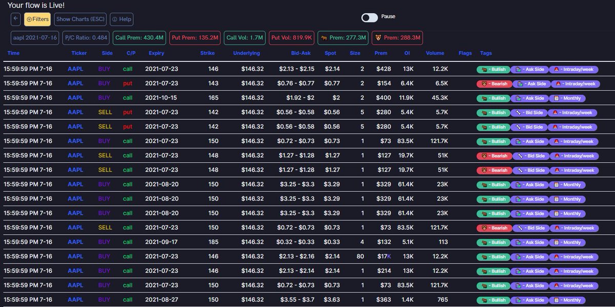
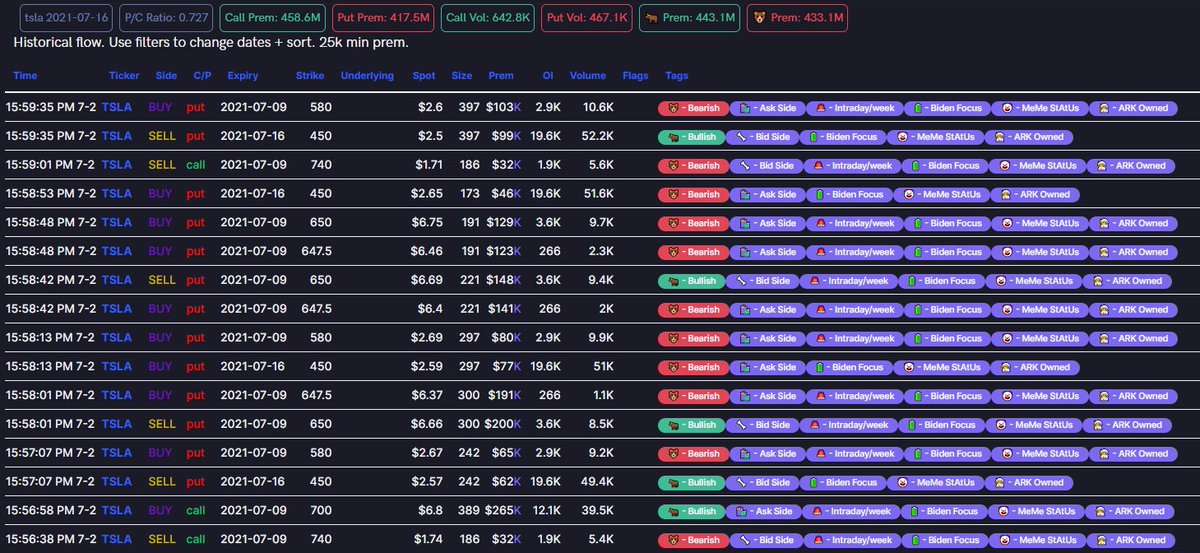
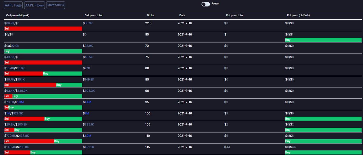
(1) The options flow feed
(2) You can see the full range of transactions from any one date of your choosing, as well as filter in/out other variables
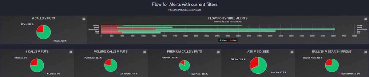
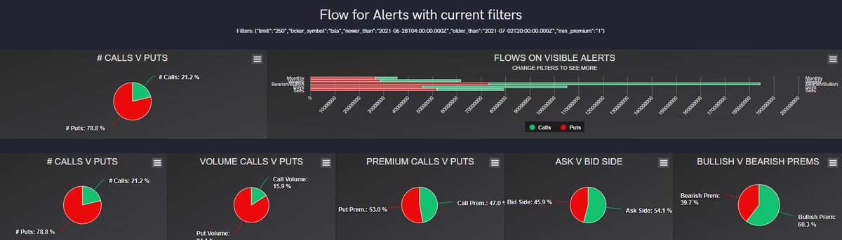
(3) View the flow charts
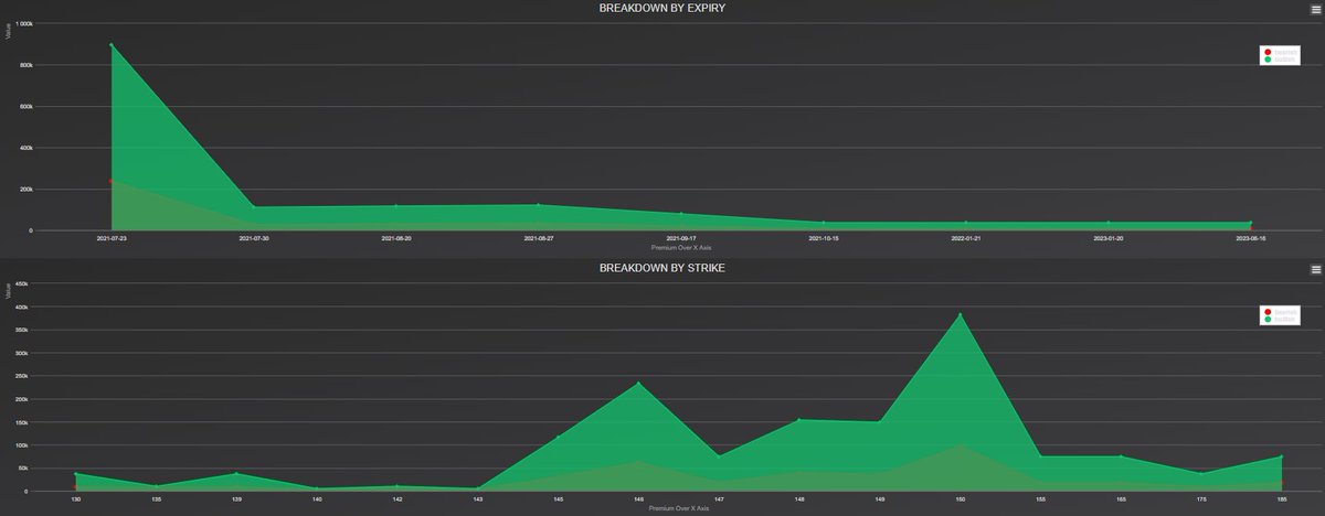
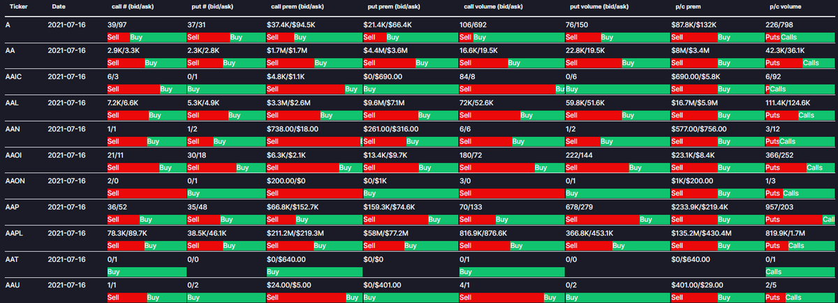
(4) View the breakdown by expiration and strike charts
(1) The options flow feed
(2) You can see the full range of transactions from any one date of your choosing, as well as filter in/out other variables
(3) View the flow charts
(4) View the breakdown by expiration and strike charts

Dark flow:
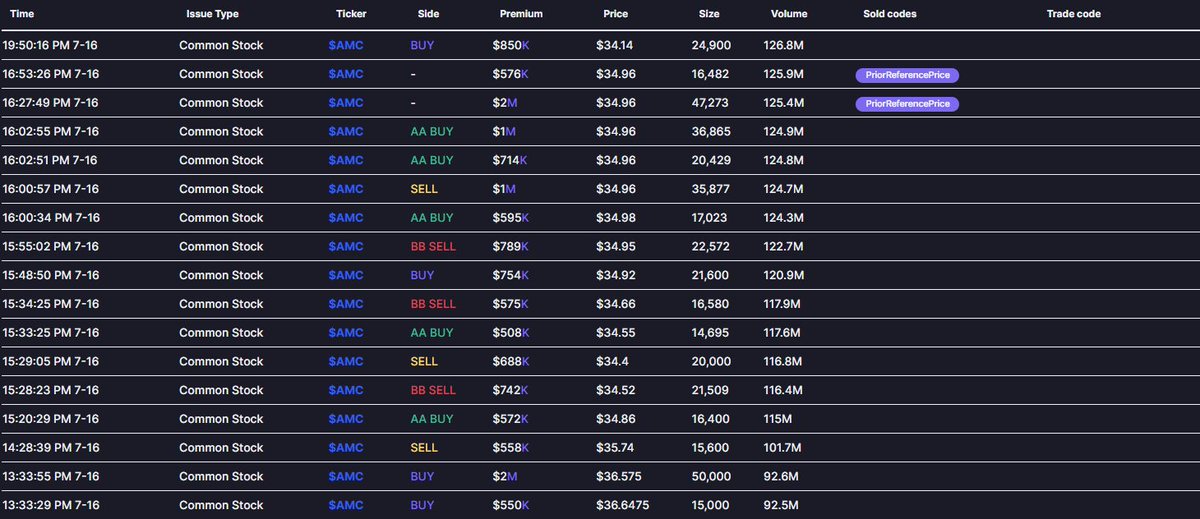
(1) The dark pool transaction feed
(2) You can hover over the sold/trade codes for more information
(3) View the dark pool breakdown charts
(1) The dark pool transaction feed
(2) You can hover over the sold/trade codes for more information
(3) View the dark pool breakdown charts

Historical flow:
(1) The options flow feed for dates you can specify in the filters
(2)(3) The filters and charts work the same way as the regular Flow
(1) The options flow feed for dates you can specify in the filters
(2)(3) The filters and charts work the same way as the regular Flow

Tickers:
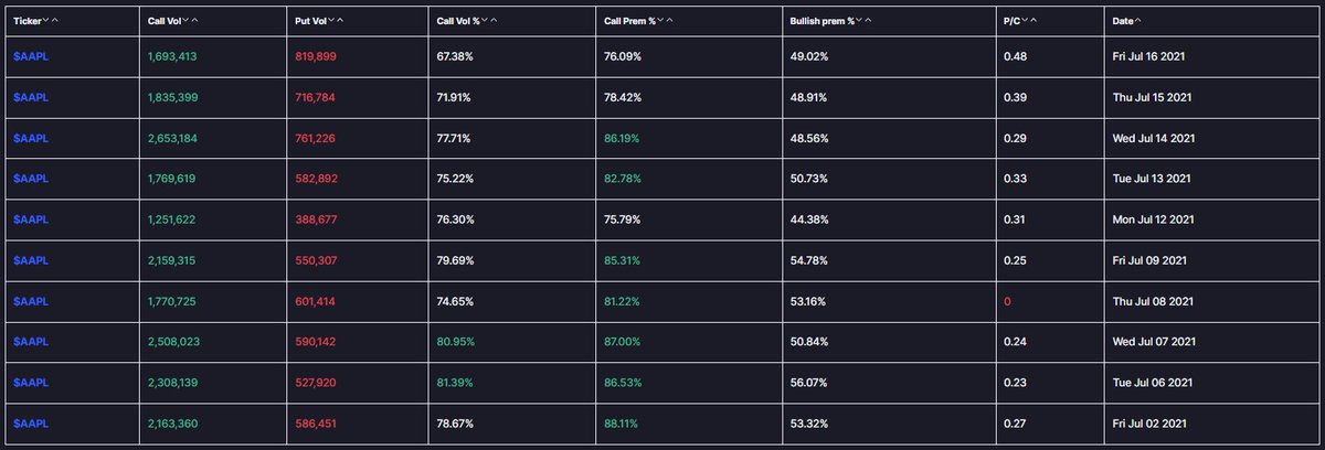
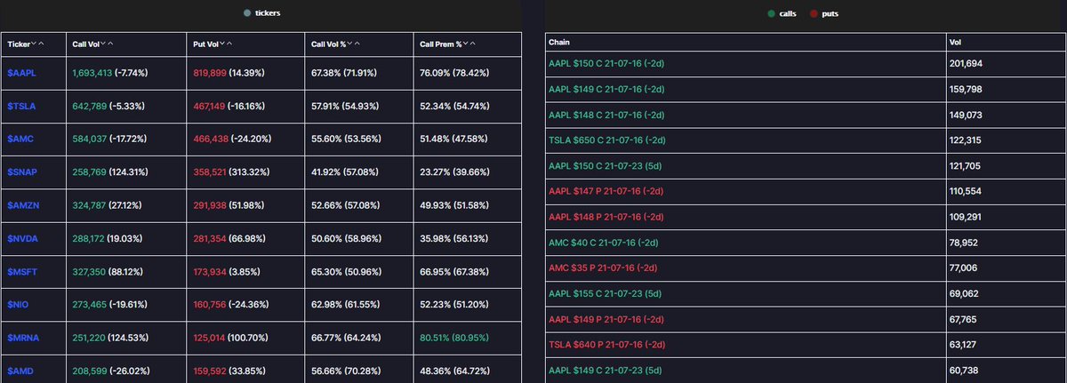
(1) Birds eye view of general options activity information
(2) You can specify a ticker
(3) By selecting "$XYZ Flows" you can view historical flow data
(4) By selecting "Show Charts" you can view the charts for all activity for ticker XYZ for that whole day
(1) Birds eye view of general options activity information
(2) You can specify a ticker
(3) By selecting "$XYZ Flows" you can view historical flow data
(4) By selecting "Show Charts" you can view the charts for all activity for ticker XYZ for that whole day

Hot Chains and Tickers:
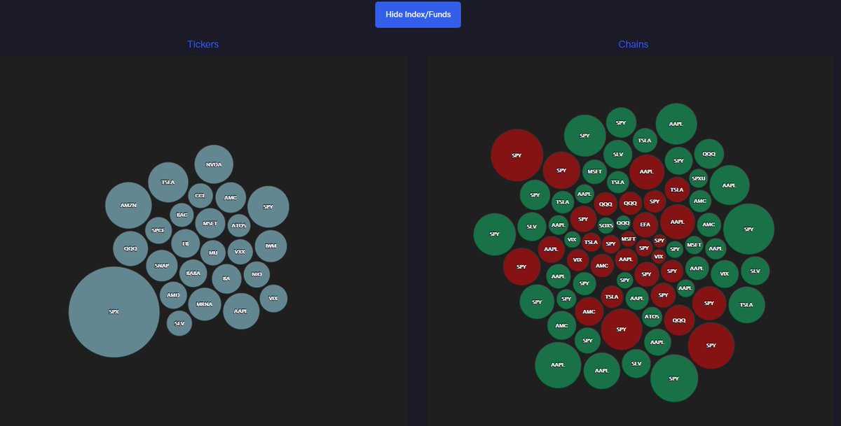
(1) Heatmaps displaying tickers with the size of the bubble relative to the amount of premium traded on the ticker and tickers with the size of the bubble relative to the amount of premium traded on that specific chain
(2) Additional volume/premium metrics
(1) Heatmaps displaying tickers with the size of the bubble relative to the amount of premium traded on the ticker and tickers with the size of the bubble relative to the amount of premium traded on that specific chain
(2) Additional volume/premium metrics
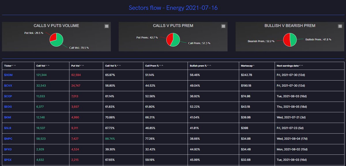
Sector Flow
(1) Volume and premium metrics specific to sector
(2) Select a sector to see the flow for applicable tickers
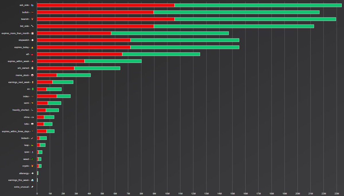
Emoji Flow
(3) Daily emoji flow
(4) Use the module to view more or less information
(1) Volume and premium metrics specific to sector
(2) Select a sector to see the flow for applicable tickers
Emoji Flow
(3) Daily emoji flow
(4) Use the module to view more or less information


Major Flow Whales:
(1) A beluga whale feed
Halts and IPOs:
(2) Live Halt and IPO tracker
& lastly:
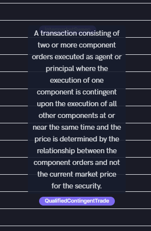
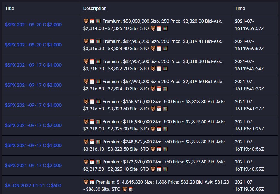
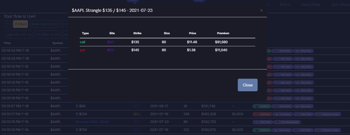
Group spreads, straddle, sweeps, blocks, and option strategies
(1) Beta view for Flow
(2) Options strategies identified for you
(1) A beluga whale feed
Halts and IPOs:
(2) Live Halt and IPO tracker
& lastly:
Group spreads, straddle, sweeps, blocks, and option strategies
(1) Beta view for Flow
(2) Options strategies identified for you


• • •
Missing some Tweet in this thread? You can try to
force a refresh