The rotations we are seeing in the market right now fit perfectly with the “peak reopening” and “peak inflation” themes that I have been highlighting since March. (THREAD)
As the chart shows below, back in March the rate of change in the NY Fed’s Weekly Economic Index (WEI) peaked at the same time the year-over-year change in the small/large ratio peaked. /2
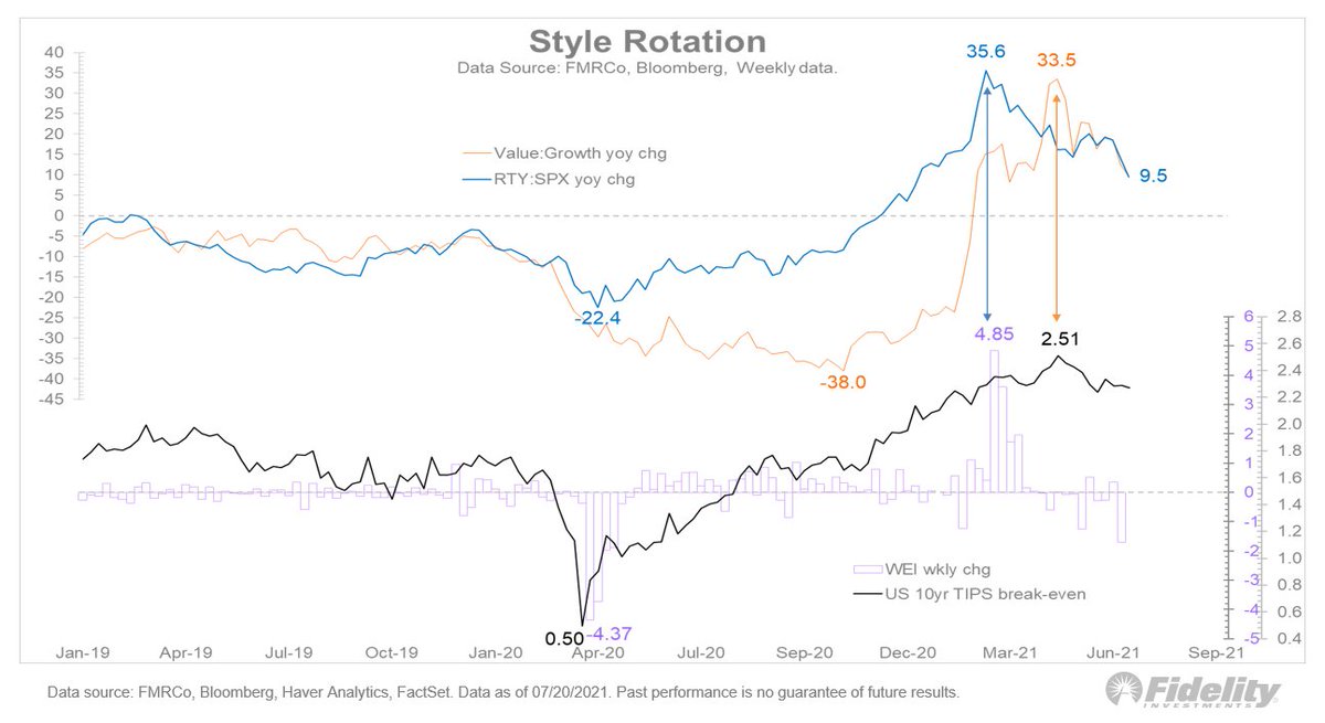
Then, a few months later the year-over-year change in the value/growth ratio peaked during the same week that the 10-year TIPS breakeven spread peaked. /3
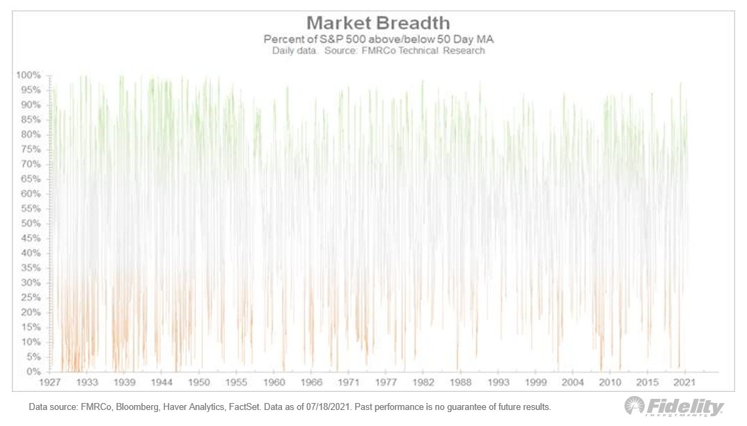
Taking a wider view of the market, we can see below how much rotation has taken place since the liquidity-driven phase of the market cycle ended earlier this year. /END

• • •

Missing some Tweet in this thread? You can try to force a refresh
 

Keep Current with Jurrien Timmer

Jurrien Timmer Profile picture

Stay in touch and get notified when new unrolls are available from this author!

Read all threads

This Thread may be Removed Anytime!

PDF

Twitter may remove this content at anytime! Save it as PDF for later use!

Try unrolling a thread yourself!

how to unroll video
  1. Follow @ThreadReaderApp to mention us!

  2. From a Twitter thread mention us with a keyword "unroll"
@threadreaderapp unroll

Practice here first or read more on our help page!

More from @TimmerFidelity

23 Jul
Following up on yesterday’s thread on bitcoin: There is a widely-held view among bitcoiners that the post-1971 era of fiat money is over and will lead to a new regime centered around hard money (built on bitcoin and the blockchain). Is that correct? (THREAD)
If you browse through crypto twitter you will likely see charts of how $1 so many decades ago is worth only a few pennies today. That trend is as old as humanity itself and has persisted from regime to regime, regardless of reserve currency. /2
But as true as the monetary debasement argument is, it often gets overstated by the assumption that people just keep their money under a mattress. Sure, if $1 sits idle for 100 years, it would be worth only 3 cents today. But who keeps their money idle like that? /3
Read 7 tweets
22 Jul
The resurgence of inflation (consumer, monetary & asset) makes this a good time to take a fresh look at gold – and digital gold. So let's dive in: (THREAD)
Gold hasn’t done much of anything since last August, as real rates remain in a holding pattern. Meanwhile, bitcoin has been in a correction since April, and has been eerily stuck around 30k since May amid an uncharacteristic absence of volatility. /2
Below I show the annualized volatility of gold (horizontal) vs the monthly return (vertical). This chart goes all the way back to the 1700s and nicely illustrates that, prior to 1971, gold was just money and nothing more. No return and no volatility. /3 Image
Read 8 tweets
21 Jul
The market had a glossy surface before Monday's rout but, in my view, the current cycle adjustment will likely continue to produce a sideways trading range that produces only modest swings at the index level but plenty of rotation and churn beneath the surface. (THREAD)
We saw this happen in 2018 when the Fed was normalizing policy, as well as in 2015-2016 when the Fed was trying to do the same. The Fed lift-off dance comes with every cycle. When financial conditions tighten, the stock market tends to take note. /2
Perhaps the most classic example of a Fed-induced mid-cycle correction was the “stealth” bear market of 1994, during which the Fed doubled short rates out of nowhere (no dot plot back then). /3
Read 4 tweets
19 Jul
Unusual: The S&P 500 index is at an all-time high while fewer than 50% of its constituents are above their 50-day moving average. In fact, by my calculation, the recent signal is only the third one since 1927… (THREAD)
The first one was June 24, 1998, just before the LTCM fund top (for those who recall it) and the second one was December 21,1999, just before the dotcom bubble peak. The first preceded a 20% drawdown & the second preceded a 53% decline. /2
The third and most recent occurred just a few weeks ago. /3
Read 4 tweets
16 Jul
Is the market a bubble ready to burst? In recent threads, I examined that question from a variety of angles, using a discounted cash flow (DCF) model, which helps us quantify the effects of today’s ultra-low interest rates and abundant financial engineering. A summary: (THREAD)
Without even getting into the equity risk premium and payout ratio, it's fair to say that today’s low rates have added 5 P/E points to the market’s valuation, and the many trillions in buybacks since 2004 has added another 5 points. /2
That’s 10 P/E points of additional valuation. Absent these factors, the S&P 500 would trade at a 15x trailing P/E instead of 25x. Coincidently, 15x was the average P/E ratio for the market’s entire history prior to the current era. /3
Read 10 tweets
15 Jul
Is the market a bubble ready to burst? In this thread, we'll consider what share buybacks have to say about it: (THREAD)
With dividends being relatively stable and the DCF placing a lot of weight on the terminal value (long-term growth after 5 years), the main variable to consider is the pace of share buybacks, which affect the payout ratio. /2
Historically, earnings growth has been 6% in the US, and in recent years the payout ratio has been around 90%. Currently (a/o Q1) it’s 71%, with dividends comprising 35% and buybacks 36%. /3
Read 21 tweets

Did Thread Reader help you today?

Support us! We are indie developers!


This site is made by just two indie developers on a laptop doing marketing, support and development! Read more about the story.

Become a Premium Member ($3/month or $30/year) and get exclusive features!

Become Premium

Too expensive? Make a small donation by buying us coffee ($5) or help with server cost ($10)

Donate via Paypal Become our Patreon

Thank you for your support!

Follow Us on Twitter!

:(