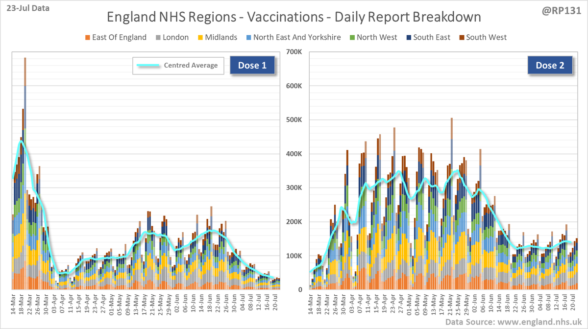
England #NHS region vac. chart based on today's (23-Jul) report.

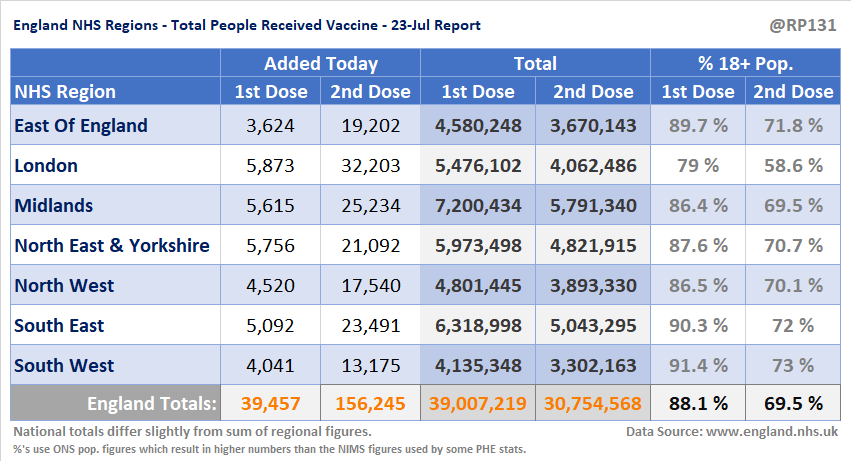
1st doses have increased by 39K since yesterday to 39.0M.

2nd doses are up by 156K to 30.8M.

Approx. 69.5% of the 18+ population has now received both doses.
Separate full versions of the regional dose charts.
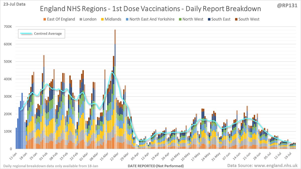
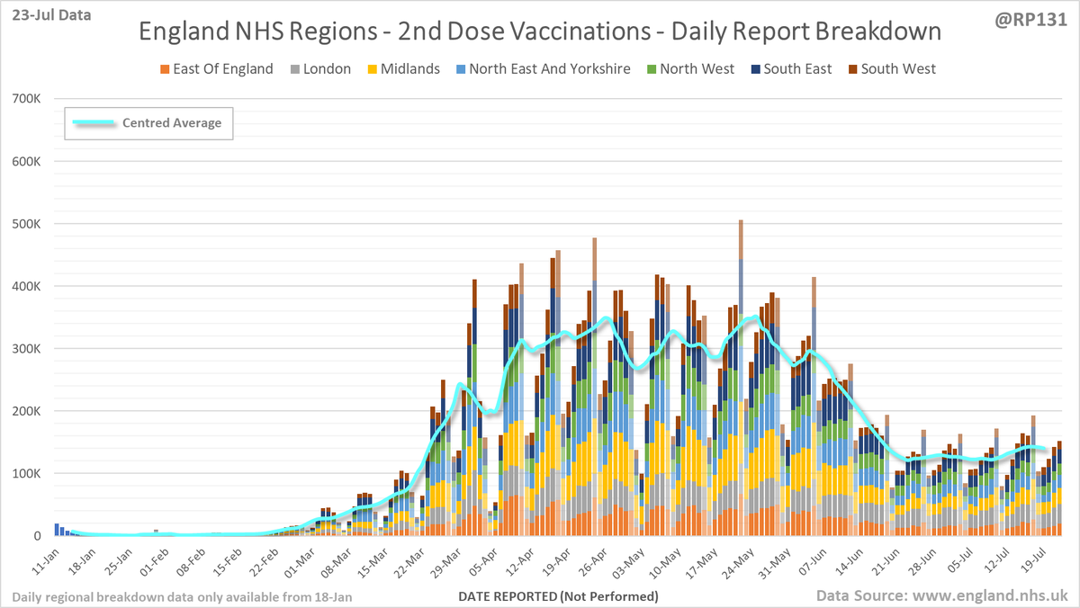
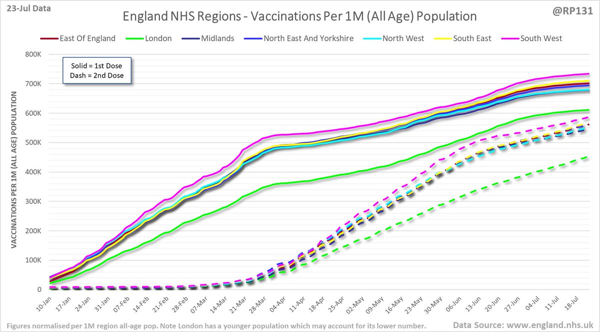
Chart plotting rates per 1M population to allow relative comparison.
Age breakdown table from daily NHS report. Data is a bit different to weekly figures as it doesn't exclude people who subsequently died and also includes people without NHS numbers. This makes it arguably more accurate against fixed ONS population estimates.
England regional age breakdown of vaccination data in chart form.
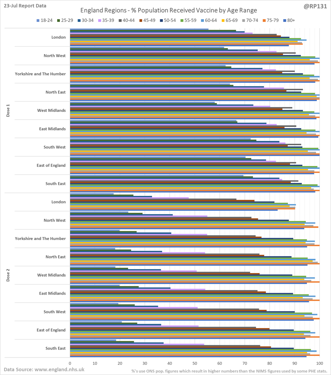
Table view of today's (23-Jul) updated England NHS region vaccination data.

• • •

Missing some Tweet in this thread? You can try to force a refresh
 

Keep Current with Richard 📊📉

Richard 📊📉 Profile picture

Stay in touch and get notified when new unrolls are available from this author!

Read all threads

This Thread may be Removed Anytime!

PDF

Twitter may remove this content at anytime! Save it as PDF for later use!

Try unrolling a thread yourself!

how to unroll video
  1. Follow @ThreadReaderApp to mention us!

  2. From a Twitter thread mention us with a keyword "unroll"
@threadreaderapp unroll

Practice here first or read more on our help page!

More from @RP131

23 Jul
Hopefully we'll see the recent drops in Redcar LA data filter through to MSOA numbers in the next few days.

Updated (23-Jul) table of top 30 MSOAs (by rate) based on latest numbers in today's report.
Bringing back the view of how many weeks the MSOAs have been in the suppressed 'less then 3 +ves in the last week' category. Since they don't allow us to distinguish between zero / 1 / 2, we generally consider it to mean zero. Link to full table in reply below.
Read 6 tweets
23 Jul
#covid19uk - Detailed positive tests thread. The majority of this thread is a set of views of rolling 7 day average positives per 100K by specimen date. Starting with England regions:
Some of the more detailed content from this thread has been moved to an external page to try and make the twitter updates a bit more manageable. You can still see the full version here: …ddatashare.s3-eu-west-1.amazonaws.com/Detail/Detail_…
UK nations:
Read 12 tweets
23 Jul
#covid19uk - Tables thread. Starting with the top 50 England Local Authorities by positives per 100K population in last 7 days, up to 3 days ago. Bright green means lower than previous period.
Cumulative summary view by regions.
Read 6 tweets
23 Jul
Bubble chart thread for England local authorities. This type of chart allows us to quickly visualise week on week changes by seeing if the points are above or below the dotted line. The size of the dot is the relative level of positives in the 60+ age range.
Key for the chart in the above tweet.
Link to the interactive version of this bubble chart: …ddatashare.s3-eu-west-1.amazonaws.com/Bubble.html
Read 4 tweets
23 Jul
#covid19uk - Nations level positive tests thread. Starting with "spaghetti" chart based on today's 23-Jul data. This shows positives tests by specimen date for the top 250 (of 315 total) lower tier local authorities in England:
The original UTLA version of the spaghetti chart. I've switched the lead chart to top 250 LTLA's so we can see the detail around places in the NW better.
Chart for monitoring lag in reporting of England positive test results. Each column represents a given day's report and shows which specimen dates it covers.
Read 4 tweets

Did Thread Reader help you today?

Support us! We are indie developers!


This site is made by just two indie developers on a laptop doing marketing, support and development! Read more about the story.

Become a Premium Member ($3/month or $30/year) and get exclusive features!

Become Premium

Too expensive? Make a small donation by buying us coffee ($5) or help with server cost ($10)

Donate via Paypal Become our Patreon

Thank you for your support!

Follow Us on Twitter!

:(