I feel like I've seen this before somewhere 🧐🤔
Lol that they couldn't even be bothered to change a single one of the numbers.
I guess this must be revenge for me making all those pizzas without crediting Italy

• • •

Missing some Tweet in this thread? You can try to force a refresh
 

Keep Current with John Burn-Murdoch

John Burn-Murdoch Profile picture

Stay in touch and get notified when new unrolls are available from this author!

Read all threads

This Thread may be Removed Anytime!

PDF

Twitter may remove this content at anytime! Save it as PDF for later use!

Try unrolling a thread yourself!

how to unroll video
  1. Follow @ThreadReaderApp to mention us!

  2. From a Twitter thread mention us with a keyword "unroll"
@threadreaderapp unroll

Practice here first or read more on our help page!

More from @jburnmurdoch

24 Jul
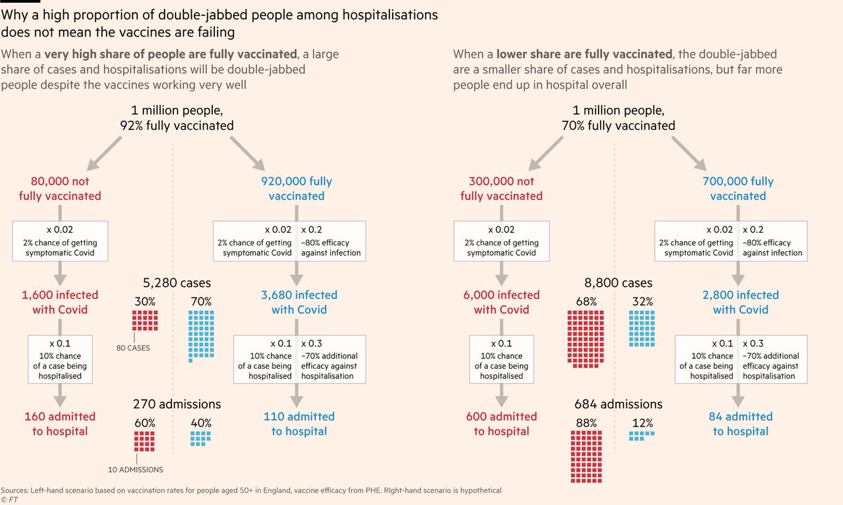
NEW: people worry when they hear "40% of hospitalisations are fully vaxxed", but this chart shows that's actually good news.

The more people you vaccinate, the higher their share of hospitalisations, but the *total* number in hospital is a fraction of what it would otherwise be
If fewer people are fully vaccinated, a smaller share of hospitalisations will be fully-vaxxed too, but this is not a good thing:

Overall there will be a lot more people in hospital because far more of the population is unprotected.
In other words: if you want to know whether the vaccination program is working, don't focus on whether the fully vaxxed make up 40% or 12% of hospitalisations.

Focus on whether the hospitalisation rate is 270 per million or 684 per million.
Read 10 tweets
18 Jul
NEW: probably the most important Covid chart I’ve made

As Delta goes global, it’s a tale of two pandemics, as the heavily-vaccinated Western world talks of reopening while deaths across Africa and Asia soar to record highs

My story with @davidpilling ft.com/content/fa4f24… Image
Here’s another version, zooming in on the last few months.

In two well-vaccinated European countries, weeks of surging cases are reflected by only a sliver of deaths.

In eight countries where very few are vaccinated, surging cases are mirrored in surging deaths as before. Image
A grim gulf is opening up between the wealthy, mostly vaccinated world and the poorer, mostly-unprotected.

In the UK, vaccines have reduced the case-fatality rate roughly 12-fold, from ~2% to 0.16%

In Namibia, Tunisia, Malaysia and Indonesia, death rates have never been higher.
Read 18 tweets
16 Jun
A huge thanks to everyone at the FT who made this possible. Both the rest of the brilliant data/visuals team, and the editors and reporters across the rest of the FT who really *get* the power of data journalism more than any other newsroom I've encountered.
We're not in the business of making charts to dress-up stories. We make charts that *are* the stories.
Read 10 tweets
15 Jun
Another excellent chart idea from @BristOliver

Just as in previous waves, cases today are an excellent guide to where hospital admissions will be 10 days into the future.

But there is a difference this time around, and here come two charts to illustrate it...
Here’s the same data, but adding the autumn/winter wave, and expressing everything as % of January peak

Spot the difference between waves:

Admissions track cases ~perfectly both times, but this time red admissions line is lower: a smaller share of cases require hospital (💉💪)
And here’s the same data using another @BristOliver concept: admissions as share of cases 10 days earlier.

Today admissions are ~4% of lagged cases. At this point in the autumn wave, they were ~8%.
Read 5 tweets
11 Jun
NEW: UK’s full reopening is set to be postponed by a month due to resurgence in cases — and now hospitalisations — fuelled by the Delta variant.

Story ft.com/content/fa7c25…

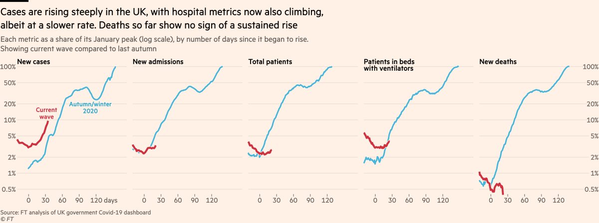
Thread: first up, that core data: UK admissions, patients & ventilator bed numbers now all climbing
An obvious initial point to make: whilst the rate of increase in cases is just as steep as it was last autumn, the hospital metrics are climbing more slowly.

This is good news (!), but it comes with nuances that point in both an optimistic and pessimistic direction.
The pessimistic: until recently admissions in Wales and Northern Ireland were falling steeply, which was countering rises elsewhere and making UK totals flatter than they would otherwise be.

In the last week, admissions have risen in every UK region but one: the East of England.
Read 17 tweets
8 Jun
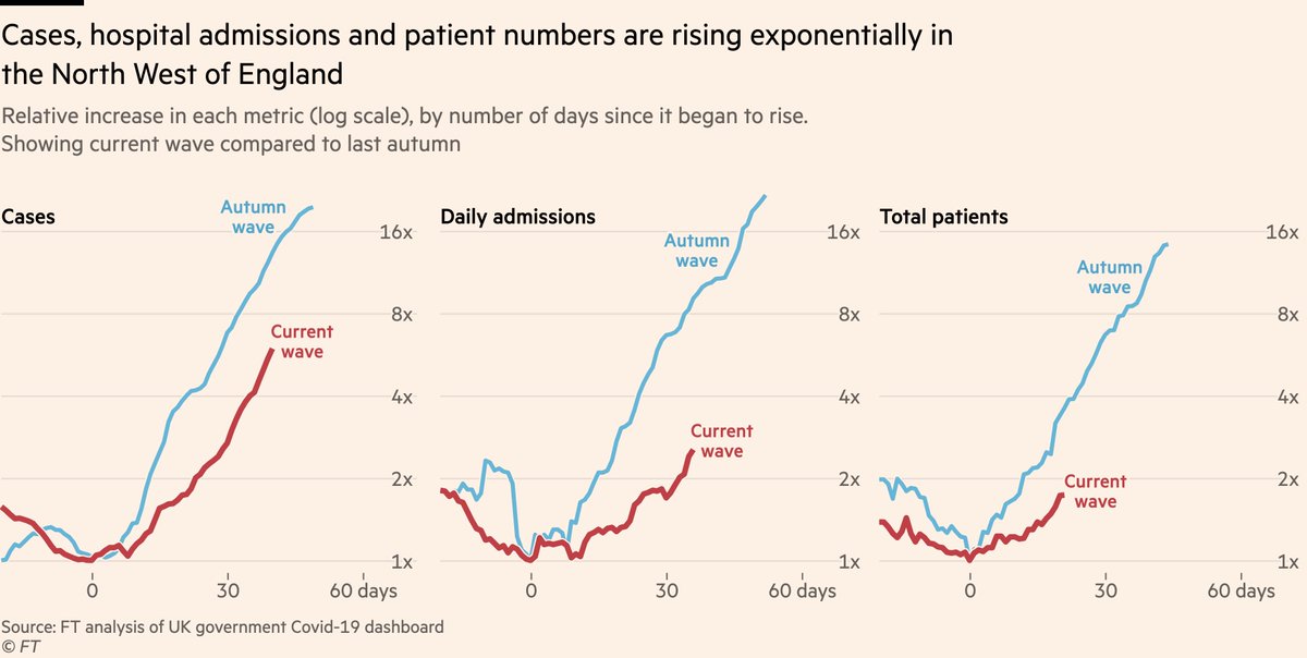
NEW: latest data now show a clear rise in hospital admissions in the UK, and numbers could climb rapidly.

Admissions & patient numbers in the North West are ~straight lines on a log-scale: exponential growth

Our story, with @mroliverbarnes & @AndyBounds: ft.com/content/f2ae00…
Let’s take a closer look at that chart
• Cases have been rising at a similar rate to previous waves for some time now
• What’s new is hospital admissions now undeniably following suit. In North West, admissions rose by 30% in week ending May 30th. Since then they’ve climbed 40%
This is despite vaccines that offer good protection against hospitalisation, so what’s going on?

As ever, age breakdowns tell the story. Hospital admissions remain low and flat among mostly-double-dosed older groups, but the increase is coming among younger adults.
Read 14 tweets

Did Thread Reader help you today?

Support us! We are indie developers!


This site is made by just two indie developers on a laptop doing marketing, support and development! Read more about the story.

Become a Premium Member ($3/month or $30/year) and get exclusive features!

Become Premium

Too expensive? Make a small donation by buying us coffee ($5) or help with server cost ($10)

Donate via Paypal Become our Patreon

Thank you for your support!

Follow Us on Twitter!

:(