I reviewed 100+ user interfaces this year.
Avoid the most common 18 mistakes to make your UI/UX design better 👇
Avoid the most common 18 mistakes to make your UI/UX design better 👇
1️⃣ Poor contrast
It happens when your text is hard to read on background because you've chosen the wrong color.
Look at the attached example. 🧐
You might not even notice the "My Quotes" label at the top.
Related tweets

It happens when your text is hard to read on background because you've chosen the wrong color.
Look at the attached example. 🧐
You might not even notice the "My Quotes" label at the top.
Related tweets
https://twitter.com/vponamariov/status/1378314373639385088
https://twitter.com/vponamariov/status/1379802139267112965

2️⃣ Many primary buttons
It's considered good practice to have one primary action per page.
You CAN have many buttons, but one of them should be primary.
In the example below two buttons stand out equally and it's hard to decide what button the user should click to.
It's considered good practice to have one primary action per page.
You CAN have many buttons, but one of them should be primary.
In the example below two buttons stand out equally and it's hard to decide what button the user should click to.

3️⃣ Small clickable area
This one is crucial on mobile devices. And important for desktop as well.
Add an invisible area for elements that is hard to hit.
Related tweets:
This one is crucial on mobile devices. And important for desktop as well.
Add an invisible area for elements that is hard to hit.
Related tweets:
https://twitter.com/vponamariov/status/1384090262381633537
https://twitter.com/vponamariov/status/1377243874192687104
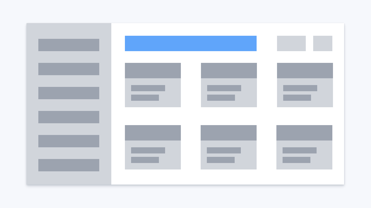
4️⃣ Poor paddings
Very popular mistake. Happens often when using cards.
Just give the content a little bit more room to breathe.
Very popular mistake. Happens often when using cards.
Just give the content a little bit more room to breathe.

5️⃣ Icon inconsistency
This one happens when you use icons from different collections.
You may end up with icons that are:
- Colored
- Black & White
- Thick
- Thin
- Flat
- 3D
Which will result in inconsistency and look clumsy.
Related tweet:
This one happens when you use icons from different collections.
You may end up with icons that are:
- Colored
- Black & White
- Thick
- Thin
- Flat
- 3D
Which will result in inconsistency and look clumsy.
Related tweet:
https://twitter.com/vponamariov/status/1378677906029821954
6️⃣ Text hard to read/scan
Nobody likes to read long texts. Especially if they are poorly formatted.
Few tips:
- Remove what should be removed, keep it short
- Use headlines
- Break text into paragraphs
- Use lists
- Supplement your text with RELEVANT images
Nobody likes to read long texts. Especially if they are poorly formatted.
Few tips:
- Remove what should be removed, keep it short
- Use headlines
- Break text into paragraphs
- Use lists
- Supplement your text with RELEVANT images

7️⃣ Wrong alignment
This one is easy to avoid. Just keep an eye on how do you align items.
Columns/Grids might help here.
This one is easy to avoid. Just keep an eye on how do you align items.
Columns/Grids might help here.
8️⃣ Not enough whitespace
This one happens almost in every UI. But this one is tricky.
On the one hand, you should have enough "air".
On the other hand, related elements should go together.
The key here is to keep balance and have some taste. There is are no strict rules.
This one happens almost in every UI. But this one is tricky.
On the one hand, you should have enough "air".
On the other hand, related elements should go together.
The key here is to keep balance and have some taste. There is are no strict rules.


9️⃣ Poor validation
This is a complex topic.
Good news is that you can avoid most validation problems by reading this tread
The thing is that there ARE some rules, and if you stick to them, you can eliminate most problems with validation.
This is a complex topic.
Good news is that you can avoid most validation problems by reading this tread
https://twitter.com/vponamariov/status/1400388896136040454
The thing is that there ARE some rules, and if you stick to them, you can eliminate most problems with validation.
1️⃣0️⃣ Proximity violation
The law states: "Objects that are near, or proximate to each other, tend to be grouped together".
Take a look at the attached image and how to fix that.
Related:
The law states: "Objects that are near, or proximate to each other, tend to be grouped together".
Take a look at the attached image and how to fix that.
Related:
https://twitter.com/vponamariov/status/1370683973656002568

1️⃣1️⃣ Long text lines
Remember that text lines that have more than 50-70 characters are hard to read.
It happens because when you return to the beginning of the text, you might start reading the same line instead of the next one.
Related:
Remember that text lines that have more than 50-70 characters are hard to read.
It happens because when you return to the beginning of the text, you might start reading the same line instead of the next one.
Related:
https://twitter.com/vponamariov/status/1373234865102073858

1️⃣2️⃣ Redundant text
This one happens when you follow some patterns like there HAS to be a headline, a description, a button. And all of them have the same message.
Or if you put obvious hints or too wordy messages.
This one happens when you follow some patterns like there HAS to be a headline, a description, a button. And all of them have the same message.
Or if you put obvious hints or too wordy messages.

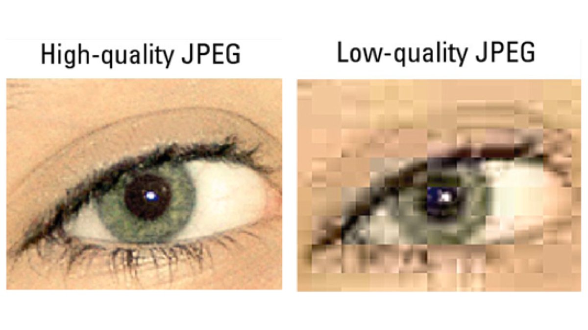
1️⃣3️⃣ Poor quality of screenshots
Quite often I see logos that are not in SVG but in PNG/JPEG.
It's alright but remember that they should be suitable for the retina.
If you put 50x50 jpeg as your logo, it'll look pixilated & low quality.
Quite often I see logos that are not in SVG but in PNG/JPEG.
It's alright but remember that they should be suitable for the retina.
If you put 50x50 jpeg as your logo, it'll look pixilated & low quality.
1️⃣4️⃣ Small font-size
The minimum font-size should be 16px in my opinion.
Don't be afraid to enlarge text.
Some sites have one sentence that takes the whole screen.
And that's totally okay.
The minimum font-size should be 16px in my opinion.
Don't be afraid to enlarge text.
Some sites have one sentence that takes the whole screen.
And that's totally okay.

1️⃣5️⃣ Taking full width when it's not necessary
You don't need to stretch your form elements or text to the full size of your screen.
There is no such a rule.
Let it take just enough space.
You don't need to stretch your form elements or text to the full size of your screen.
There is no such a rule.
Let it take just enough space.
1️⃣6️⃣ No hovering state
When users hover on some element it should react if users can do something with it.
The most common example is buttons.
Related tweet:
When users hover on some element it should react if users can do something with it.
The most common example is buttons.
Related tweet:
https://twitter.com/vponamariov/status/1405495978589921281
1️⃣7️⃣ Poor shadows
If you're not sure if your shadows are good or not, just take them from a popular site or from a collection of shadows in some of the CSS frameworks.
It happens quite often that they don't look good.
Related tweet:
If you're not sure if your shadows are good or not, just take them from a popular site or from a collection of shadows in some of the CSS frameworks.
It happens quite often that they don't look good.
Related tweet:
https://twitter.com/vponamariov/status/1382294880865693701
1️⃣8️⃣ Layout shifts
This is more a usability issue. This one happens when the user does not expect any changes in your layout, but they happen.
Random popups, ads, and all that stuff.
It might be a subtle shift, but still a bit annoying.
Related tweet:
This is more a usability issue. This one happens when the user does not expect any changes in your layout, but they happen.
Random popups, ads, and all that stuff.
It might be a subtle shift, but still a bit annoying.
Related tweet:
https://twitter.com/vponamariov/status/1380571729974730758
I didn't expect THAT traction here. 😳
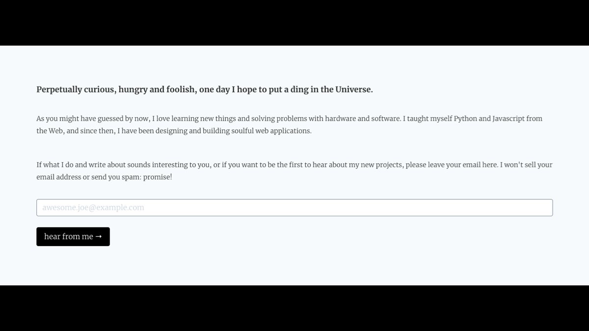
Guys, I also have a newsletter. I don't sell any ads here, usually send more or less the same stuff as on Twitter.
You're welcome. 👇
user-interface.io
Guys, I also have a newsletter. I don't sell any ads here, usually send more or less the same stuff as on Twitter.
You're welcome. 👇
user-interface.io
• • •
Missing some Tweet in this thread? You can try to
force a refresh