Today in the #AtlanticBubble
27 new cases were reported:
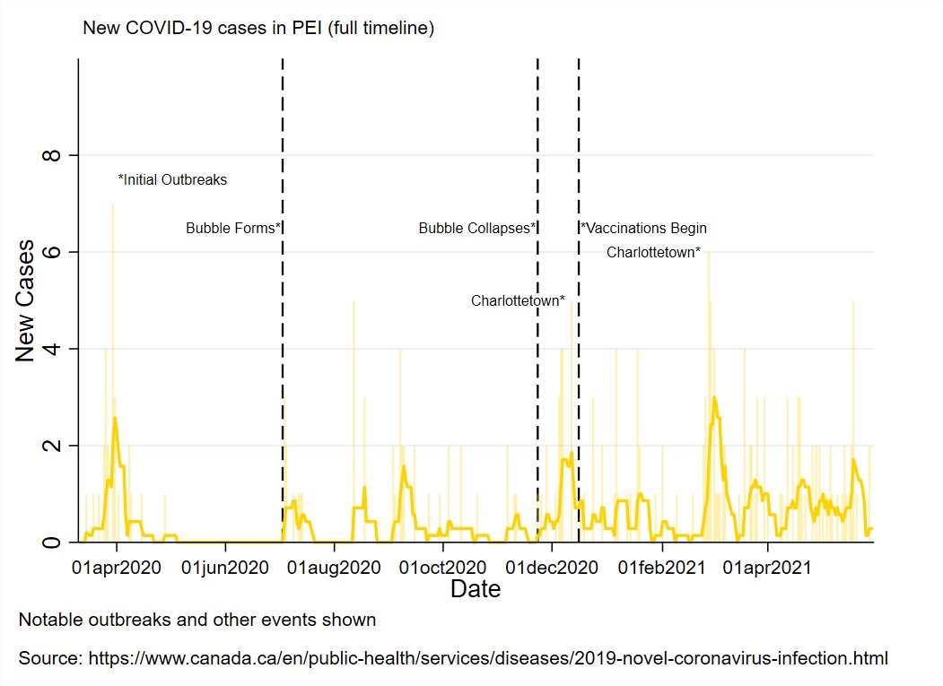
2 in PEI (travel-related)
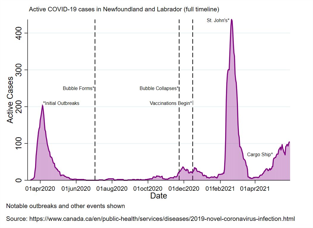
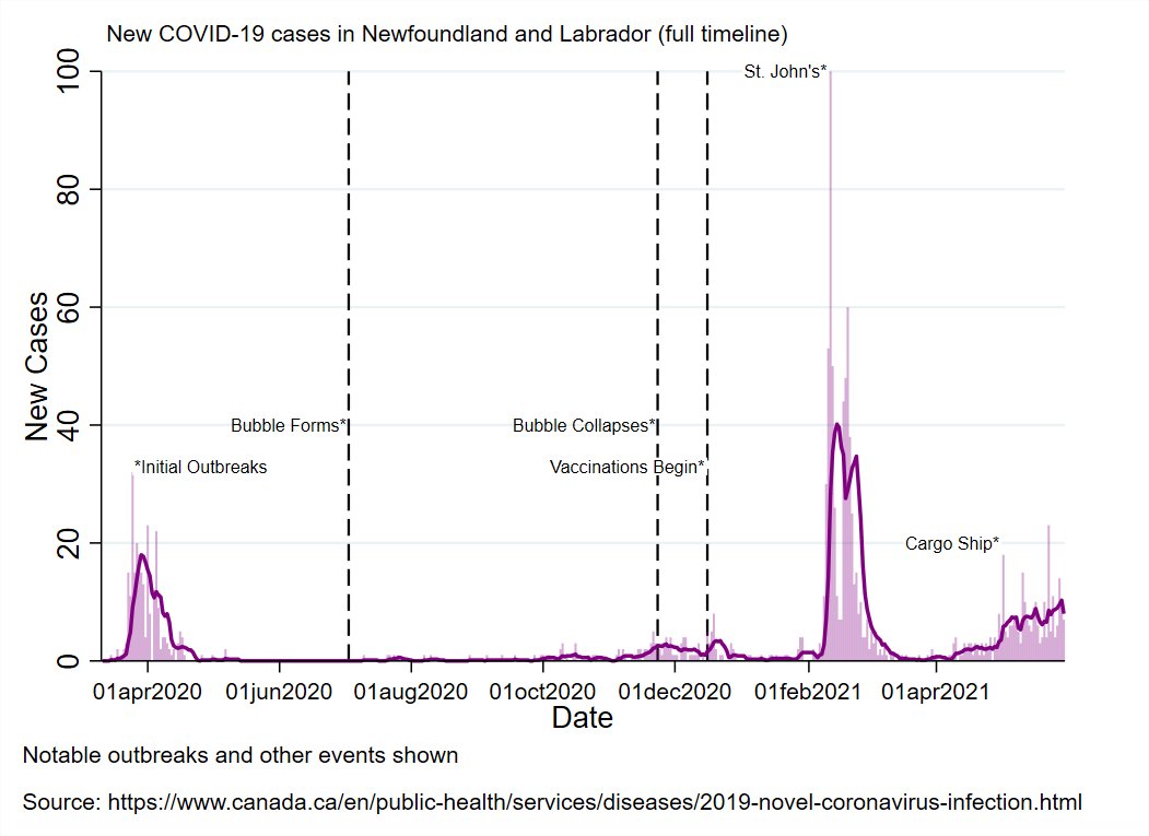
4 in Newfoundland and Labrador: 1 in Labrador-Grenfell, 3 in the Eastern Health region (all travel)
2 in Nova Scotia: 1 each in the Northern (travel) and Eastern (under investigation) zones


27 new cases were reported:
2 in PEI (travel-related)
4 in Newfoundland and Labrador: 1 in Labrador-Grenfell, 3 in the Eastern Health region (all travel)
2 in Nova Scotia: 1 each in the Northern (travel) and Eastern (under investigation) zones


New Brunswick reported 19 new cases:
2 each in Fredericton (under investigation), Campbellton (under investigation), and Bathurst (close contacts).
3 in Saint John (2 travel-related, 1 under investigation)
10 in Moncton (5 contacts, 5 under investigation).
2 each in Fredericton (under investigation), Campbellton (under investigation), and Bathurst (close contacts).
3 in Saint John (2 travel-related, 1 under investigation)
10 in Moncton (5 contacts, 5 under investigation).
There are now 126 known, active cases in the Atlantic region, of which 84 are in NB (and62 are in the Moncton area).
Regional Summary
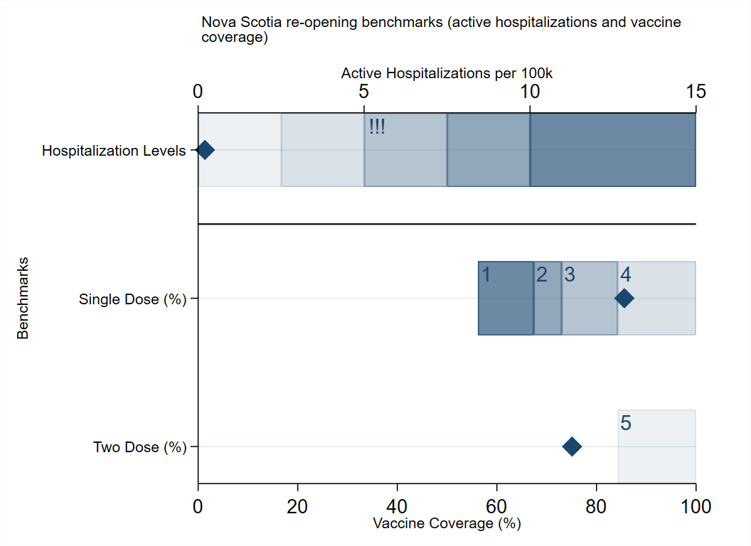
Mostly quiet, although travel-related cases are on the sure (not surprising given the situation in the rest of the country). Risk of local outbreaks has increased.
The Moncton outbreak remains small but seems to have seeded cases to neighbouring health regions.
Mostly quiet, although travel-related cases are on the sure (not surprising given the situation in the rest of the country). Risk of local outbreaks has increased.
The Moncton outbreak remains small but seems to have seeded cases to neighbouring health regions.

It's Friday, so NS has released updated outcomes by vaccine status.
I've updated how I'm presenting that data. In short, for each reporting period I've vaccine group proportions onto the number of cases/hospitalizations/deaths.


I've updated how I'm presenting that data. In short, for each reporting period I've vaccine group proportions onto the number of cases/hospitalizations/deaths.


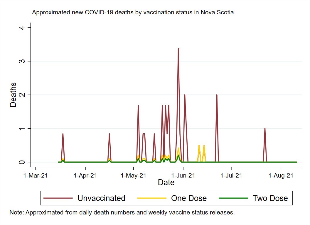
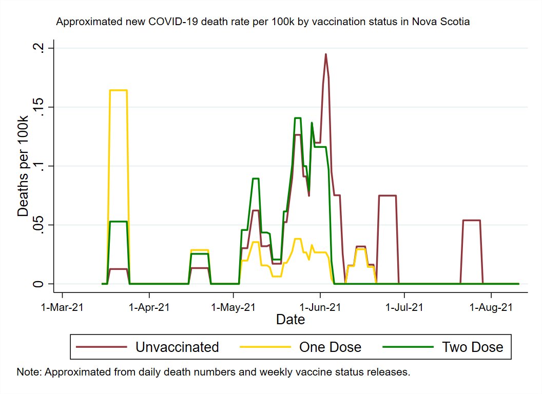
So for each period we know X% of cases (and hospitalizatoins/deaths) were vaccinated. We don't know which case in a period was vaccinated or not, but we can approximate it by applying the probabilities to the cases, then dividing by the percent of people in that group for a rate.
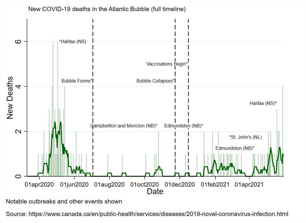
I think it's pretty good as a concept, although I'll admit that the death graph is a little troublesome with this method:
To-date there has been 1 fully vaccinated death. This happened 1) in the period when we have the least data and 2) happened when few were fully vacced
To-date there has been 1 fully vaccinated death. This happened 1) in the period when we have the least data and 2) happened when few were fully vacced
So you end up with a period where it looks like the fully vaccinated are at just as high risk as the unvaccinated.
It just comes down to the fully vaccinated at that time point (~5% of pop) being the absolute most at risk people/low denominator group.
Hence absolute counts too

It just comes down to the fully vaccinated at that time point (~5% of pop) being the absolute most at risk people/low denominator group.
Hence absolute counts too


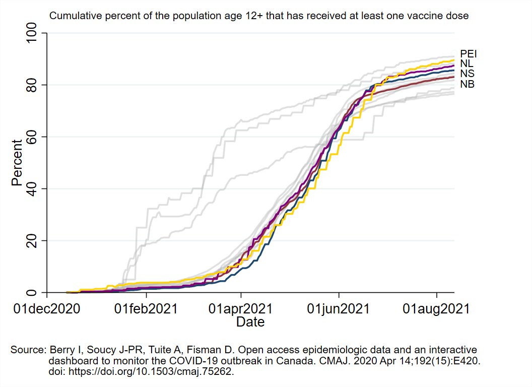
Vaccine Roll-Out Metrics:
1st graph shows how many days since each province had enough doses to cover current usage.
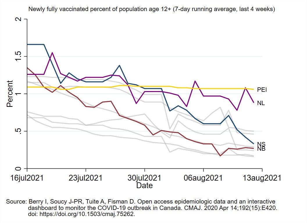
Graphs 2-4 show vaccination speed: percent of the population age 12+ receiving 1st dose (graph 2), 2nd dose (graph 3), or either (total output, graph 4) daily.


1st graph shows how many days since each province had enough doses to cover current usage.
Graphs 2-4 show vaccination speed: percent of the population age 12+ receiving 1st dose (graph 2), 2nd dose (graph 3), or either (total output, graph 4) daily.



That's it for tonight's update.
Take care of one another and have a great rest of the night!
Take care of one another and have a great rest of the night!
• • •
Missing some Tweet in this thread? You can try to
force a refresh

