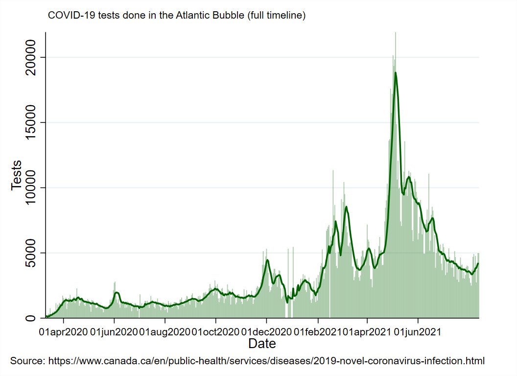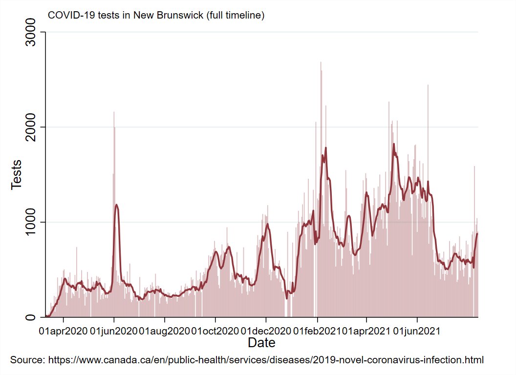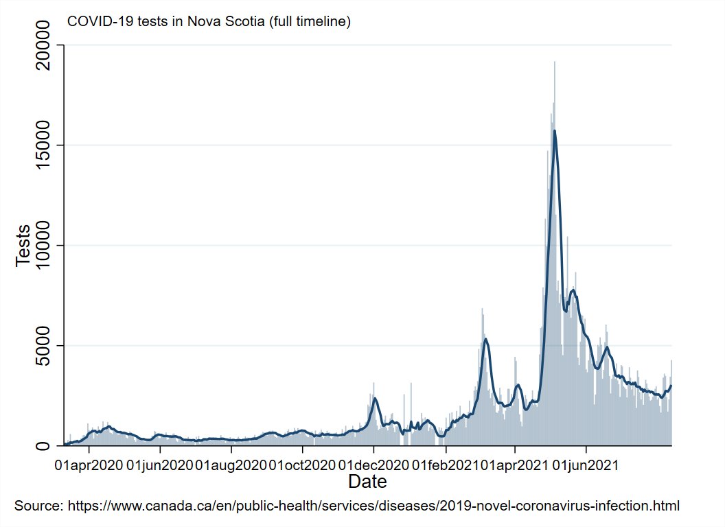
Today in the #AtlanticBubble
No one updated their numbers, so I'll just do the full weekend report on yesterday's numbers.
There are currently 126 known, active cases in the region.


No one updated their numbers, so I'll just do the full weekend report on yesterday's numbers.
There are currently 126 known, active cases in the region.


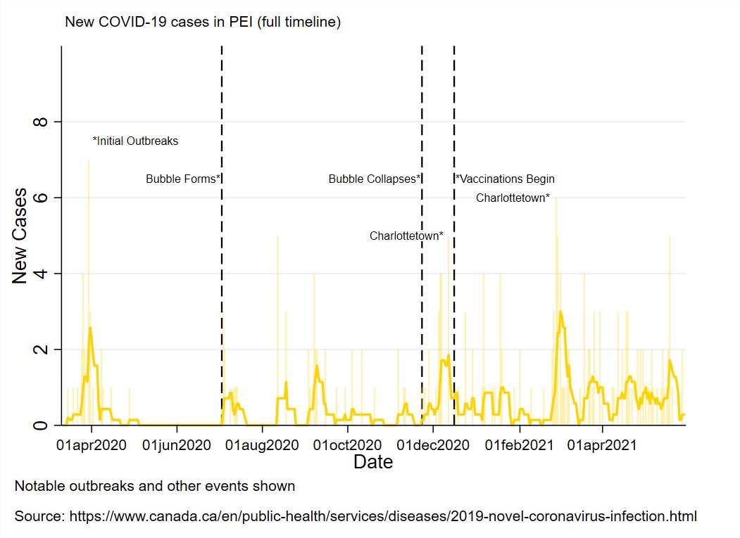
There are currently 9 known, active cases in PEI, but no known outbreaks/community transmission, and no one is in hospital. 


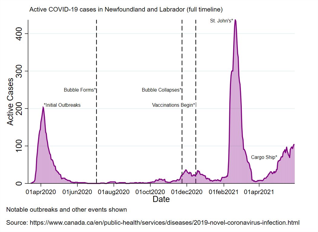
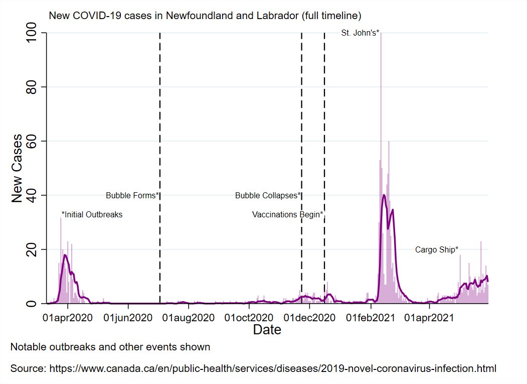
There are 7 known, active cases in NL, no evidence of community transmission, and 2 people in hospital (crew members from passing ships). 


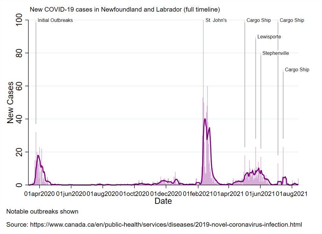


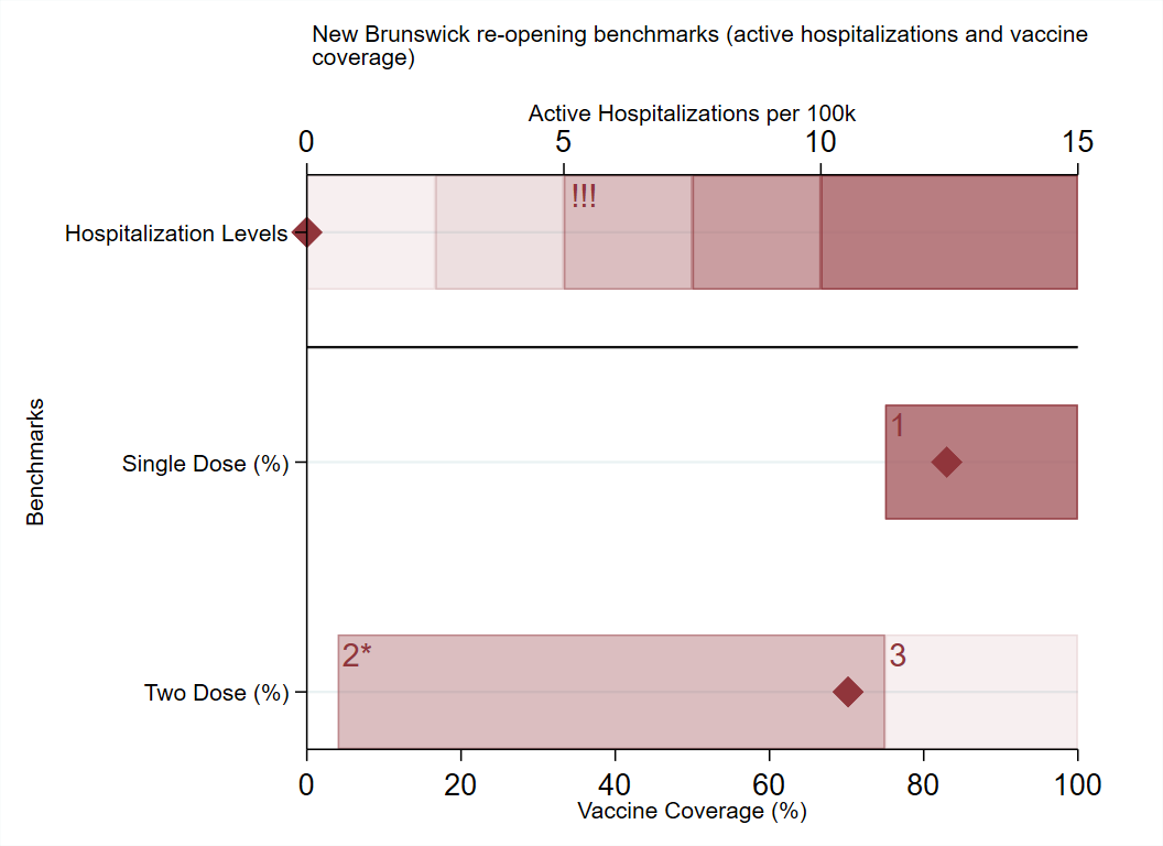
There are 84 known, active cases in NB.
There is a small outbreak in the Moncton area that has started seeding cases in neighbouring health regions.
No one is in hospital presently.


There is a small outbreak in the Moncton area that has started seeding cases in neighbouring health regions.
No one is in hospital presently.

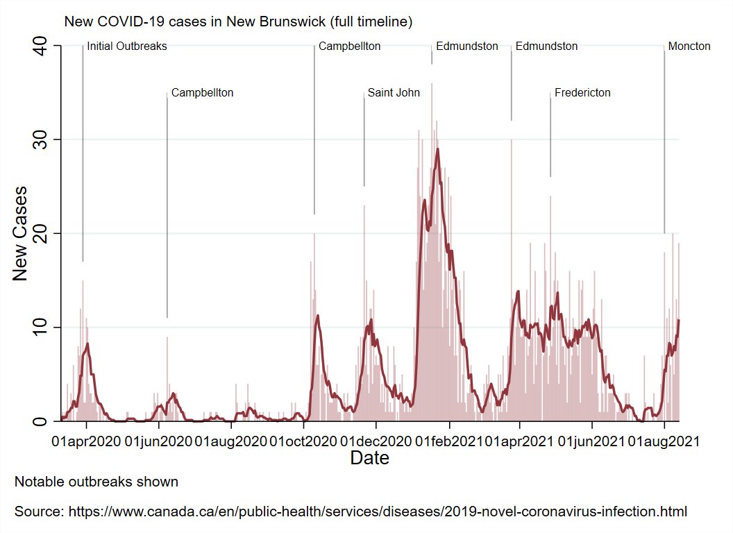


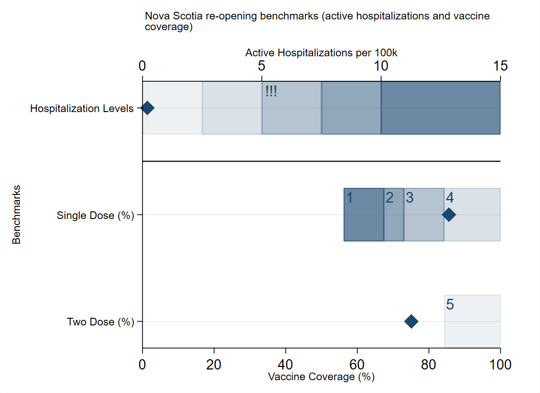
NS currently has 26 known, active cases.
There is no evidence of community transmission.
One person is in hospital (in ICU).
They were unvaccinated. Get. Your. Shots.


There is no evidence of community transmission.
One person is in hospital (in ICU).
They were unvaccinated. Get. Your. Shots.


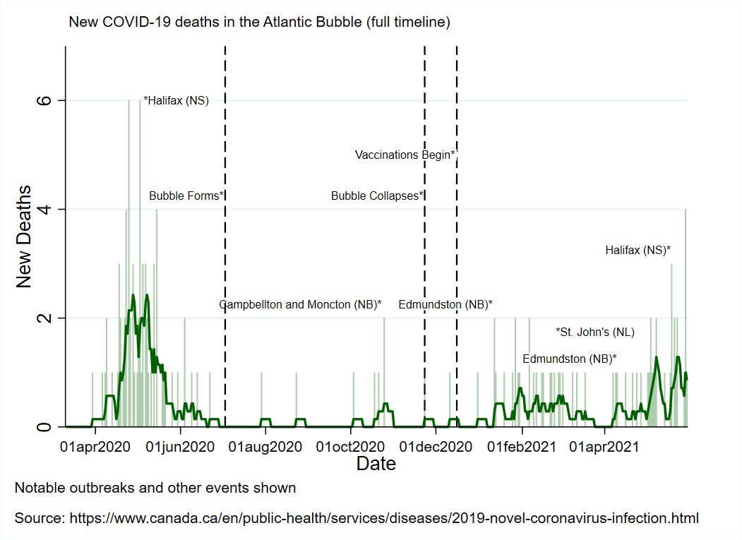
You can see the entire pandemic timeline for the Atlantic region and surrounding area in the animation.
Each tick is a week since the start of the pandemic in March of last year.
Each tick is a week since the start of the pandemic in March of last year.
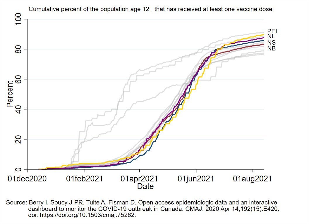
Vaccine Roll-Out Metrics:
1st graph shows how many days since each province had enough doses to cover current usage.
Graphs 2-4 show vaccination speed: percent of the population age 12+ receiving 1st dose (graph 2), 2nd dose (graph 3), or either (total output, graph 4) daily.


1st graph shows how many days since each province had enough doses to cover current usage.
Graphs 2-4 show vaccination speed: percent of the population age 12+ receiving 1st dose (graph 2), 2nd dose (graph 3), or either (total output, graph 4) daily.


Animation shows provinces' vaccination pace as a percent of the pace they need to each 80% 2nd dose coverage by the end of August (based on how many they have already vaccinated and how much time is left).
Provinces with lower single dose coverage are penalized proportionately.
Provinces with lower single dose coverage are penalized proportionately.
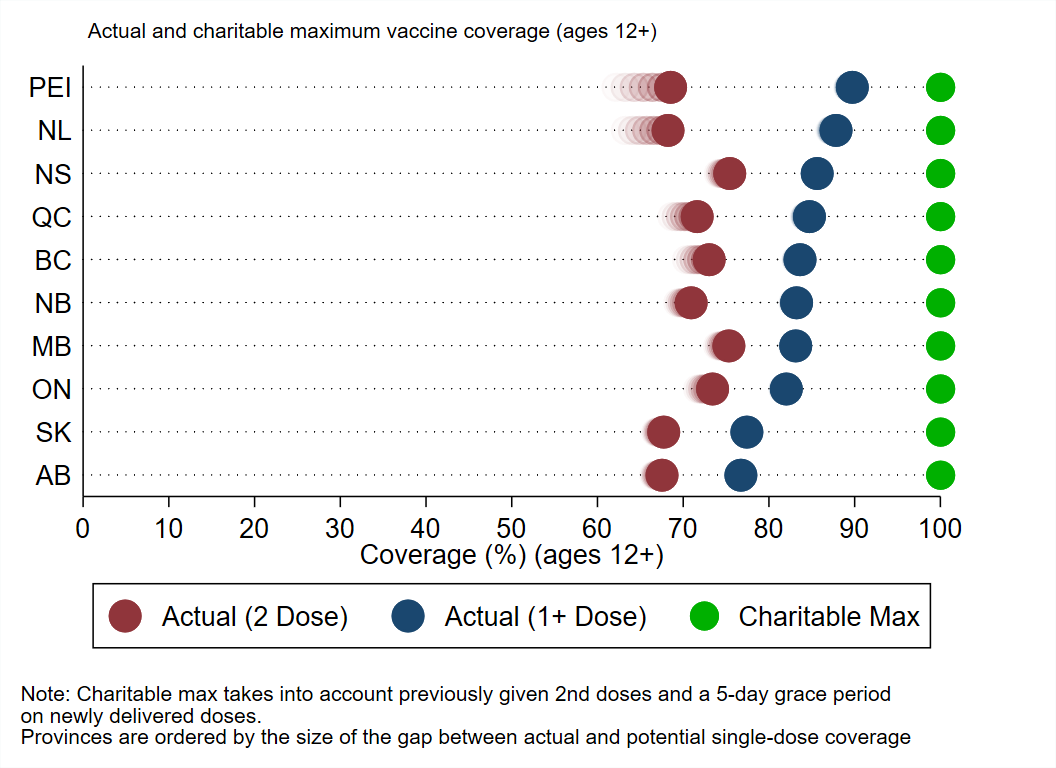
Graph shows actual first (blue) and 2nd dose (red) coverage compared to a charitable maximum (green) that accounts for 2nd doses and gives a 5-day grace period on deliveries.
Provinces are sorted from smallest (good) to largest (bad) gap between actual/potential coverage.
Provinces are sorted from smallest (good) to largest (bad) gap between actual/potential coverage.
That's it for tonight's update.
Take care of one another and have a great rest of the night!
Take care of one another and have a great rest of the night!
• • •
Missing some Tweet in this thread? You can try to
force a refresh

