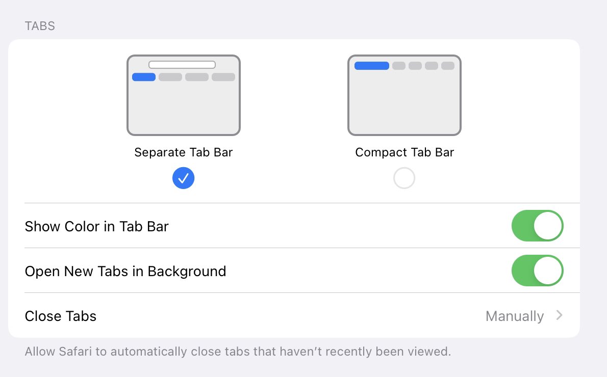
The “gyrations” through Apple’s beta cycle since WWDC when it comes to Safari UX are fascinating—some might even say not very “Apple-like”. Changing is fine. But where the design seems to be ending up is suboptimal for a platform, IMO. Here’s why, but not why one might think /1 


2/ Moving address bar up/down and/or having a separate address bar are rational design choices that people will (vigorously) debate. I have an opinion too.
What one has come to expect from Apple is a “point of view” in product design expressed through “the way it should work.”
What one has come to expect from Apple is a “point of view” in product design expressed through “the way it should work.”
3/ There was a lot of feedback about the early design and implementation. It was rough. That started the feedback loop from developers (those are who use the beta) that it was never going to be right. Developers of all people should know it could change. But momentum gained…
4/ Then Apple added the options to have the tab bar top or bottom and/or compact/separate and so on. This is what I wanted to comment on. Many people rejoice at having the choice. “Give me options” is the rallying cry of developers/techies everywhere.
5/ At the same time “everyone knows” that vast majority of people never change the default. A design choice like this either works or doesn’t. Most people would have had a “moved my cheese” moment/minutes and then resumed routine usage.
6/ So the argument goes that for power users options are great. They can find them and tweak them. Then they are back to being fully productive and most people don’t notice.
But this creates a “fork” in the evolution of the product. That is bad for everyone.
But this creates a “fork” in the evolution of the product. That is bad for everyone.
7/ When Office 97 introduced the scroll wheel on mice (invented by an Excel PM) the original idea was to zoom w/ the wheel. But Word and browsing thought scrolling was best. Testing. Debates. More tests. Scrolling was right. Still we shipped an option. No one used it. 

8/ Here’s the 2 problems that arise. First, from an engineering perspective the code has these two states. Everything needs to be tested against these two states. Easy to see a bunch of ways that this impacts web site design too because now sites have different available pixels.
9/ This is not just a pain or an easy to absorb cost, but this compounds exponentially. Every new feature now has to consider this modality. Pretty soon combinatorics of options like this across a platform add up.
And remember, this was kind of an objection handler for techies.
And remember, this was kind of an objection handler for techies.
10/ Second, product now has a constraint for all future design changes. Down the road every new feature has to be designed considering how the design works in each of these states.
What can happen is that a new feature conflicts with one state or simply doesn’t work with it.
What can happen is that a new feature conflicts with one state or simply doesn’t work with it.
11/ In the scroll wheel, what happened was that it meant now across Office the wheel was inconsistent because not every app really made sense with zoom. How often do you need zoom in Outlook? Sure just doing the “right thing” could mostly work, but it is also confusing.
12/ So there are real costs. Ultimately, product design is about expressing a point of view. It isn’t always right. It can be super wrong (some people probably didn’t get to tweet 12 and already made snarked about Windows 8).
But a point of view is what a product is.
But a point of view is what a product is.
13/ Of course some preferences or options are a good thing. But the time to add those is not when introducing a new feature you’re not sure of. That’s the worst time.
All that does is say that if the vocal group on pre-release products complains, then add an option. Ugh.
All that does is say that if the vocal group on pre-release products complains, then add an option. Ugh.
14/ If feedback is so overwhelming and you believe your point of view won’t be “appreciated” by a larger more diverse set of customers, then revisit the choice entirely.
Or stick to your POV. Maybe it’s right. Or wrong. Adjust down the road. It’s how new things can happen.
Or stick to your POV. Maybe it’s right. Or wrong. Adjust down the road. It’s how new things can happen.
15/ Making choices about changing UX people are used to is fundamentally what product design is about. Only you know where you want to take a product in years beyond a release. Sometimes you make changes along the way that take time to “appreciate”. Or you make mistakes. // END
PS/ I know this is controversial on twitter esp b/c here are the tiny %age of people who use options. But please at least consider the real engineering challenges that happen by introducing modalities—or just blast me for hating choice.
I get the visceral reaction. Honest. 🙏//
I get the visceral reaction. Honest. 🙏//
• • •
Missing some Tweet in this thread? You can try to
force a refresh


