I’ll never build a form in @figmadesign the same way again…
It took me countless tries, but I think I’ve finally created a system that is flexible and doesn't result in variant overload 💪
Here's a 5 step walkthrough 👇
It took me countless tries, but I think I’ve finally created a system that is flexible and doesn't result in variant overload 💪
Here's a 5 step walkthrough 👇

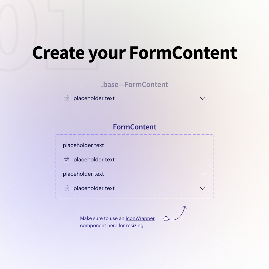
01 — Create a "FormContent" component
This most likely combines text + icons
I'll create a handful of variants that give me flexibility around where/how my icons are displayed
Pro tip: Use an `IconWrapper` component so you can resize icons using variants
This most likely combines text + icons
I'll create a handful of variants that give me flexibility around where/how my icons are displayed
Pro tip: Use an `IconWrapper` component so you can resize icons using variants
02 — Create a "FormChild" component
This is simply an auto-layout wrapper around my FormContent that dictates the base size + padding.
We'll use these to create many types of subcomponents!
This is simply an auto-layout wrapper around my FormContent that dictates the base size + padding.
We'll use these to create many types of subcomponents!

03 — Create your form subcomponents
The three examples I have:
• Input
• Select
• Text Area
👆 All of these can be created from our single FormChild component with some simple auto layout tweaks
This is the level where I define states like error/disabled/etc.
The three examples I have:
• Input
• Select
• Text Area
👆 All of these can be created from our single FormChild component with some simple auto layout tweaks
This is the level where I define states like error/disabled/etc.


04 — Now it's time to build out our "Form" component!
To do so, we add a "top" and a "bottom" auto layout around our "Input" component that includes things like labels, button text, helper text, character counters, etc.
Then create a variants map to turn on/off each piece 👍
To do so, we add a "top" and a "bottom" auto layout around our "Input" component that includes things like labels, button text, helper text, character counters, etc.
Then create a variants map to turn on/off each piece 👍

05 — Assemble your UI
You can easily swap out your "Input" with a "Select", a "Text Area" or anything else you've defined at your subcomponent level!
Any changes you want to make to an individual element's state happens at that same subcomponent level.
You can easily swap out your "Input" with a "Select", a "Text Area" or anything else you've defined at your subcomponent level!
Any changes you want to make to an individual element's state happens at that same subcomponent level.

Benefit #1
Separating input "state" from all of the different layout options our forms can have radically simplifies our end variants matrix.
You'll never end up with 100+ variants at the form level. And the subcomponent states are repeatable and easy to manage
Separating input "state" from all of the different layout options our forms can have radically simplifies our end variants matrix.
You'll never end up with 100+ variants at the form level. And the subcomponent states are repeatable and easy to manage
Benefit #2
This system is ridiculously flexible because you can add/tweak any number of subcomponents and they'll slide perfectly into the larger "Form" component and its existing variants.
Think how easy it would be to add a side-by-side "Select" component?
This system is ridiculously flexible because you can add/tweak any number of subcomponents and they'll slide perfectly into the larger "Form" component and its existing variants.
Think how easy it would be to add a side-by-side "Select" component?
Obviously, there are a ton of implementation details that can't be communicated in a thread (but I did my best 😅)
So I've created a full lesson (walkthrough + 15 min video) available through figma.academy
So I've created a full lesson (walkthrough + 15 min video) available through figma.academy
In general, this system speaks to the benefits of strategically building out each individual piece of the puzzle.
Assembling many nested components (vs. diving right into the "Form") means less variants, less manual work, and more flexibility 💪
Assembling many nested components (vs. diving right into the "Form") means less variants, less manual work, and more flexibility 💪
If you found this useful and want to pass along the inspiration...
Click into the first tweet and share the thread with another designer 😊
Click into the first tweet and share the thread with another designer 😊
https://twitter.com/Ridderingand/status/1430999115270279173
Enough of you have asked about the ‘IconWrapper’ component...
This is what I’m referring to! Allows you to change your icon sizes even when they’re nested in another component 👇
This is what I’m referring to! Allows you to change your icon sizes even when they’re nested in another component 👇
https://twitter.com/ridderingand/status/1426980974961643521
• • •
Missing some Tweet in this thread? You can try to
force a refresh