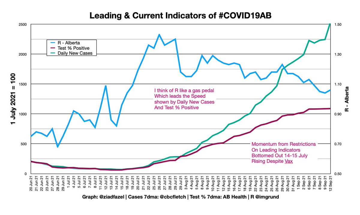
Sadly, today is the day we exceed Alberta's baseline ICU Capacity.

Again.
• Blue Exponential Growth Curve = Albertans in ICU with COVID-19
• Red line = Baseline Capacity
• Surge Capacity comes from Cancelling Surgeries & Redeploying Doctors, Nurses, other Healthcare Workers
I don't normally do one graph inset into another, but I wanted to show @GosiaGasperoPhD modelled this exactly, on 24 August.

She's a world-class biologist who could be doing this anywhere in the world, saying "Look what is happening over there in AB."

Instead, she's here in Calgary, volunteering her expertise late at night (eg 12.36am for this tweet) to help our province.

And she's wiping the floor with Alberta Health's CMOH team, even though they have access to internal data and high-end computers.

alberta.ca/assets/documen…
Fair comparison?
• CMOH team working full time, with technical and epidemiological help, in late June saying we'd have ~67 in ICU now
• 1 biologist working alone on a home computer in late August, saying we'd have ~173 people with COVID-19 in ICU now.
So let's zoom in some more to see the problem:
• on 8 July, when Alberta Cabinet approved the CMOH recommendations to dismantle TTI
• CMOH model said ~ 12 in ICU, going down
• Reality was we had about 32 in ICU, going sideways

Yet Cabinet still approved dismantling TTI.
So when I see @Drew__Barnes, @AngelaPittAB and other rural MPs get frustrated that COVID-19 is not over, it isn't because THEY deny it exists.

It is because the Premier & CMOH's circles pretended it wasn't serious.

So did the replacement Caucus Chair.

cbc.ca/news/canada/ca…
And for those saying "Yabut she said we'd have 2000 Cases/Day now"
• We're doing half the test volume
• Contact tracing was stopped on 29 July
• We're still getting 1500 Cases

Severe Outcomes are happening full blast..

..but Case Count is "Decoupled" by Sneaky Suppression.
Those beautiful* graphs (and more) are courtesy @ucalgaryCHI, who keep making their site better every week.

covid-tracker.chi-csm.ca

* I've used pen plotters since University engineering. I think such graphs are as beautiful as fancy new visuals from graphics specialists.

• • •

Missing some Tweet in this thread? You can try to force a refresh
 

Keep Current with Ziad 😷 Fazel

Ziad 😷 Fazel Profile picture

Stay in touch and get notified when new unrolls are available from this author!

Read all threads

This Thread may be Removed Anytime!

PDF

Twitter may remove this content at anytime! Save it as PDF for later use!

Try unrolling a thread yourself!

how to unroll video
  1. Follow @ThreadReaderApp to mention us!

  2. From a Twitter thread mention us with a keyword "unroll"
@threadreaderapp unroll

Practice here first or read more on our help page!

More from @ZiadFazel

14 Sep
Last night @CMOH_Alberta gave a presentation to Alberta family docs, and I got a chance to see it and take screenshots before the video was set to Private.

Whenever a politician wants to give you "Context", be wary of Deceptive Framing.

Have a look at her graphs of BC/AB/SK.
Did you do that yet? No skipping ahead now.

I zoomed in for you.

See it yet?

The axis scales are not the same.
Here are the graphs exactly how they look at

health-infobase.canada.ca/covid-19/epide…

The default shows every province on the same axis for fairness.

See that green "Relative scale". That compares each province to its own peak.

Click it. Gosh - every province looks equally bad now.
Read 8 tweets
13 Sep
#COVID19AB Balanced Scorecard
13 Sep 21

We're all interested in ICU, but I'll stay consistent with giving all metrics, including signals from Leading Metrics which end up in Severe Outcomes.

Test Positivity has paused at an all-time pandemic record just above 3rd Wave Peak.
@jvipondmd @GosiaGasperoPhD @RajBhardwajMD @TehseenLadha @drdagly @shazmamithani @kwburak @plasercalgary @noelgibney @dupuisj Looking at R for Alberta, we can see the "gas pedal" of R has eased up a bit, but still stays above 1.0, which means still accelerating with exponential growth of COVID-19.

The damage was done in July with that steep rise of R > 1.2 during & after Stampede.
I'm sticking with Leading Indicators of the spread of #COVID19AB, because They. Lead. To. Severe. Outcomes, including Death.

You can't grow ICU Capacity to match exponential growth. You have to stop the spread up front to give your healthcare system a chance, Public + Private.
Read 16 tweets
10 Sep
#COVID19AB Balanced Scorecard
Fri 9 Sep

Leading indicators continue to show accelerating spread of infection.

7-day average Test Positivity 11.73% against all-time record 11.75%.

Severe Outcomes: Hospital, ICU and Death all surging faster than ever. Obviously NOT Decoupled.
ICU Capacity taking a huge hit.

169 Albertans just with COVID-19, against total ICU capacity for all needs 173.

Look at the difference two days makes on the curve. See also comparison to AHS CEO Dr Yiu charts on 17 May 2021.
Great presentation by Sarah Mackey of @ab_vax who teaches that we can't just look at the unvaccinated as one big blob, and just write them off.

IIRC, she says we have to look at different reasons:
• Access
• Complacency
• Hesitancy

And count the removal of barriers, not 💉
Read 8 tweets
10 Sep
Big news about COVID-19 Vaccinations in US, UK and Canada to share before @PopAlberta explains this live today at 4pm.

The news is about vaccine mandates, passports, and 3rd doses.

Let's start with Dr Fauci speaking to Americans on @NewsHour, on which we Canadians eavesdrop because:
• he's world class
• Covid in Canada is like a lot of American states
• Alberta (and BC & SK) are like the worst of American states

pbs.org/newshour/show/…
Then, Dr Fauci gave the 2021 Pumphandle Lecture to @JohnSnowSociety in UK.

See summary from UK Public Health Doc @GabrielScally with some clips of key points, and then the link to full 1-hour lecture.

You & I can get this whether you have a PhD or not.

Read 5 tweets
10 Sep
#COVID19AB Balanced Scorecard
Thu 8 Sep

Slivers of silver lining in Leading Indicators.

I don't trade stocks, but technical analysts seeing that choppiness at top of Test Positivity would say there is a pause.

Not testing enough. Averaging 3/5th the volume of previous peaks.
Severe Outcomes? 😢

Alberta (4.4m people) might soon pass Ontario (14.7m) in Canadians dying of COVID-19 per week.

12% of 🇨🇦population; 32% of the deaths.

canada.ca/en/public-heal…

Every time I change the axes on my graph, I remember these are families suffering, and grieving.
The number of Albertans going to Hospital & ICU for COVID-19 is exploding, and our healthcare workers are throwing themselves on the blast to try to save us.

One day's data on ICU projection:
• Yesterday: cross baseline on 13 Sep, 250 on 21 Sep
• Today: 12 Sep; 19 Sep
Read 9 tweets
9 Sep
#COVID19AB Balanced Scorecard
Wed 8 Sep

Silver lining on dark clouds today:
• Looks like leading indicators have paused a bit
• Severe outcomes still out of control
• Albertans are going to Hospital and ICU, and Dying at levels not seen since 3rd Wave Peak in May.
I think as a province we're beaten down, and looking for compassionate & trustworthy leadership.

We went into July thinking this would be a turnaround summer. It turned the wrong way.

So enjoy good news when you can. R < 1.1 for first time since mid-July, and Test % Stalled.
Because Severe Outcomes - real people in pain - Ouch.

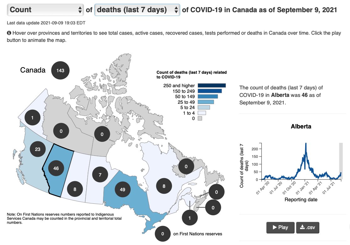
More Canadians have died from Covid in AB than in any other province but ON:
• 42 in the last 7 days
• 69 in the last 14 days

ICUs are over capacity, causing widespread backups and consequences.

canada.ca/en/public-heal…
Read 7 tweets

Did Thread Reader help you today?

Support us! We are indie developers!


This site is made by just two indie developers on a laptop doing marketing, support and development! Read more about the story.

Become a Premium Member ($3/month or $30/year) and get exclusive features!

Become Premium

Too expensive? Make a small donation by buying us coffee ($5) or help with server cost ($10)

Donate via Paypal Become our Patreon

Thank you for your support!

Follow Us on Twitter!

:(