What exactly is kerning? What is spacing? How are they different? Let’s talk about it!
THREAD 🧵:
THREAD 🧵:
Spacing and kerning are two separate things, and both are crucial to the experience of reading type. When done correctly they are intended to be practically invisible. In this thread I will attempt to make that ‘invisible’ part a bit easier to observe.
Latin typefaces are made from a lot of individual glyphs. Each individual glyph has a left and right ‘side bearing.’ Think of it like a margin for either side.
The art of setting these margins for each glyph, is called ‘spacing.’ The left/right spacing values determine how far away a glyph will be, from the other glyphs, by default. There’s another process called ‘kerning,’ which is something else. But I’ll get to that in a moment. 😀
Just as there are counterforms within letters, we can also observe the shapes of the space in between letters. All of these negative shapes need to be balanced, and spacing is a huge part of how we achieve this.
To illustrate how this works, here’s a set of lowercase (sans serif) latin letters. At first they will be very poorly spaced, and then we’ll improve the spacing as we go. 

Let’s start with… no margins at all, on either side of every glyph. It looks… truly awful right? So let’s try something else.
What if we try random spacing values for everything? Predictably this illogical solution looks even MORE awful, but it highlights why spacing is important. Without carefully controlling the space between letters, words completely lose their readability. So how do we get it right?
Next up, let’s try adding an equal amount of space on the left and right of every single glyph. This is… better? But it’s still pretty strange looking. Why do certain letters look further away from other letters, even though we set them all to be equal?
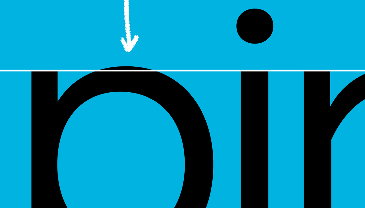
It turns out that this is one of those pesky optical illusions. Let’s abstract this to circles/squares for a moment. This circle looks much smaller than this square, right? And yet, they match exactly in height and width.
This is purely because any round shape will invite more negative space, compared to a square shape. Here’s the fix: adjust round stuff to be literally larger than square stuff. As a result, the shapes now appear to optically match in size.
This is why the glyphs of a typeface have ‘overshoot.’ Round shapes overshoot the landmarks of the design (like the baseline and x-height), in order to make them appear the same size as everything else.
The same illusion happens with spacing. For instance, the squares and circles below have literally identical margins between them. But it appears that there is much more space surrounding the circles.
By reducing the amount of margin for a round shape, we can make it optically appear to be the right distance from its neighbors.
And this is not exclusive to round shapes. Every glyph in a typeface is carefully spaced so that it optically relates (in a predictable, rhythmic way) to every other glyph. To some extent we can organize them into groups, for instance: letters with similar round sides.

Or glyphs with straight sides. Or glyphs with diagonal sides.

Soon enough you realize there are glyphs where… their shape requires a completely unique approach to spacing. The goal is always the same (make the glyph feel comfortable in context with the other glyphs), but the exact values are often completely unique.
While you’re solving for the right spacing on each glyph, you are also essentially ‘hard coding’ a default ‘tracking’ value for the entire font. As in, the general amount of air that exists between the glyphs of the typeface.
The ideal amount of ‘air’ is all based on rhythm, and it’s related to the space held within the counterforms of the glyph drawings. There is a theoretical ‘ideal tempo,’ if you will, for each font. Spacing and drawing happen in unison, to find this ideal tempo.
When you adjust ‘tracking’ (also called letter-spacing in CSS), you are modifying the amount of air in between the letters, by adding or subtracting from all margins equally. This is sometimes done for aesthetic reasons, for instance.
As it turns out, some additional illusions occur, which the system of spacing cannot solve on its own. A typical example would be the letter pair ‘AV.’ The two shapes lean in the same direction on the edges where they meet, so there appears to be too much space in between them.
We cannot fix this visual disparity by reducing the spacing margin on the edges of ‘A’ or ‘V.’ Because doing so would break the way ‘A’ and ‘V’ coexist with the other glyphs.
To solve this ‘AV’ problem we need a way to change the distance between A and V, exclusively when they occur next to each other. This is called kerning.
Kerning is a supplementary system that exists to intervene on the spacing between two glyphs. When spacing alone cannot solve a visual interaction, we introduce a kerning pair to add or remove space between those 2 glyphs.
Or what about the interactions between round glyphs and diagonal ones? As in the all-caps word ‘VOICEOVER.’
What about a sentence that ends with a ‘w,’ followed by a period? That should probably scoot over.
Or what happens when you type a 7, followed by a 4?
In case, at this point, you are wondering: do you really review all this stuff, and set all these pairs? The answer is yes. We do so methodically, setting thousands of relationships with care. Often more than once, as we find the visual relationships that look best.
The kerning menu in an Adobe application will often show options for ‘metrics’ and ‘optical.’ Metrics means the kerning the typeface designer carefully set. Optical refers to an algorithm that tries to add its own procedural kerning. I recommend always using ‘metrics.’

Typeface design is not just the art of drawing all these various glyphs. It also involves creating an extremely intricate puzzle-like system of spacing and kerning, which facilitates the cooperation between these glyphs. When done right, it seems to be invisible.
A train takes you from one predefined spot, to another. An automobile is designed to let you drive to many locations, in any order you please. Even to places, and in combinations, that no one has travelled before. A typeface is more like an automobile, than it is like a train.
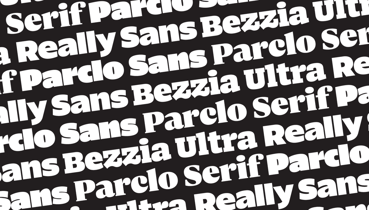
Really Sans supports over 200 languages. A vast majority of the possible words that have ever been defined in those languages, have never been typeset in Really Sans. But Really Sans is systematically designed to render those words correctly, when the time comes.
Thanks for reading! And if you’d like to be the first to typeset a particular word or phrase in Really Sans, you can do so on our brand new @lettermatic_abc website:
lettermatic.com/fonts/really-s…
lettermatic.com/fonts/really-s…
Special thanks to my wife @heather_cran who did a bunch of the animations for this thread. And to @danellecheney for the diagram of the Adobe type panel. 😀
Some folks can't see one of the tweets in this thread evidently? Twitter won't show it, as if it has been deleted? I'll repost it below just in case.
Kerning is a supplementary system that exists to intervene on the spacing between two glyphs. When spacing alone cannot solve a visual interaction, we introduce a kerning pair to add or remove space between those 2 glyphs.
• • •
Missing some Tweet in this thread? You can try to
force a refresh