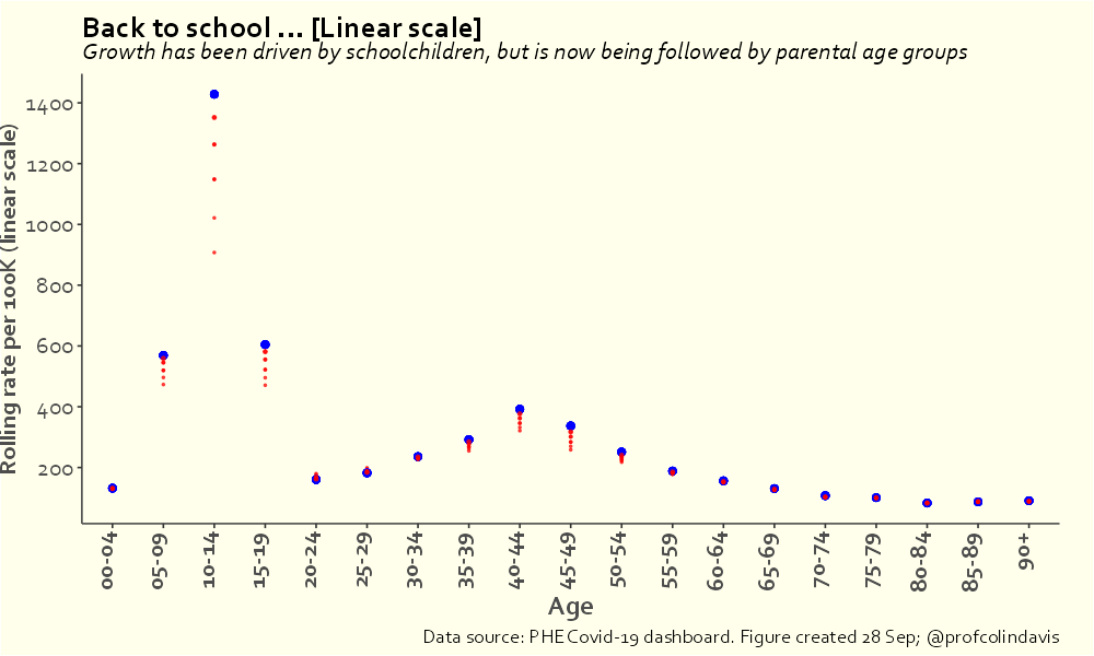
An argument I've been trying to make for a long time is that mass infection of children is not only bad for children, but also bad for adults, because rates in children affect rates in adults (because that's how infectious diseases work). Here's another way of looking at that.🧵
This plot answers the following questions:

a) if I know Covid rates in school-age children (5-9s & 10-14s), how accurately can I predict rates in adults?

b) which adult age bands will I be able to predict most accurately?

[SPOILER: There aren't going to be any surprises here]
The data set covers the entire pandemic to date in England (30 Jan 20 - 3 Oct 21). The y-axis measures how well we can predict rates for a given adult age group on a given day if we know the rates for 5-14 year olds from 2 days earlier. (A value of 1 would be perfect prediction).
The best predictions can be made for 40-44 year olds, but good predictions are possible throughout 30-49s. Accuracy of prediction falls off roughly symmetrically around the 40-44 peak, but then goes up again for 65-74 year olds, before dropping off rapidly for older age groups
Now sure, some proportion of the predictive power here relates to general "community transmission", but I don't think it's too much of a stretch to look at these peaks and suggest that they reflect parents and grandparents.
As I said, that plot covers the whole pandemic, so we might want to look at what's been happening more recently. Here's a plot of the correlations between rates in 10-14s and adult rates 5 days later since September.
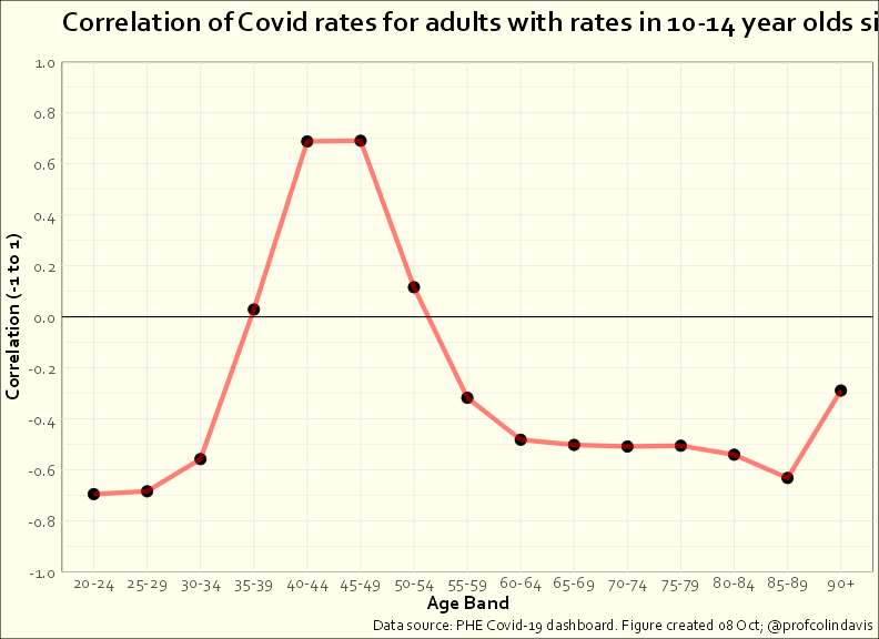
Correlations can range from -1 to 1, where 0 would mean no relationship and 1 would mean a perfect correlation. The value of about .7 for 40-49s shows again how closely this age group follows 10-14s.
The negative correlations for most groups is because rates have been falling in these groups even as they've been rising in 10-14s and 40-49s. What we're seeing in 35-39s and 50-54s is probably the result of the mixture of parents ⬆️ and non-parents ⬇️in these age groups.
None of this necessarily implies causality, of course. But when you combine graphs like the above with graphs that plot rates changing over time, I think it gets harder to deny that increases in rates in children tend to lead to (smaller) increases in rates in parents.

• • •

Missing some Tweet in this thread? You can try to force a refresh
 

Keep Current with Colin Davis

Colin Davis Profile picture

Stay in touch and get notified when new unrolls are available from this author!

Read all threads

This Thread may be Removed Anytime!

PDF

Twitter may remove this content at anytime! Save it as PDF for later use!

Try unrolling a thread yourself!

how to unroll video
  1. Follow @ThreadReaderApp to mention us!

  2. From a Twitter thread mention us with a keyword "unroll"
@threadreaderapp unroll

Practice here first or read more on our help page!

More from @ProfColinDavis

28 Sep
Yes, I understand that not all adults in their 40s are parents of 10-14 year olds (the dashboard data doesn't list parental status, sadly). And that some 20-29s and 55-64s are parents of 10-14s (though not that many). But I hope you can see what I'm driving at in this plot.
Reasonable people can disagree about both the meaning and the import of the extremely high infection rate that we're currently seeing in children. I'm not interested in arguing with people who want to say I'm alarmist.
I'll just note that, *given the scale of the numbers*, the following things can simultaneously be true:

1. Most children who get Covid will experience a relatively mild illness AND a large number of children will have long-lasting symptoms, some very serious.
Read 6 tweets
28 Sep
[28/9 update] I'm switching to a log scale today, partly because of the scale of the numbers (the rate for 10-14s is now > 1400/100k) and because this makes the trends easier to see: growth is slowing in 10-14s, but is increasingly apparent among those in 40s and adjacent ages.
If you're suspicious of log scales, or just want to compare, here's the same plot on a linear scale.
And here's the animated version (log scale).
Read 4 tweets
26 Sep
One of the points of contention about Covid transmission (for reasons I find hard to understand) has been whether children infect other members of the household, e.g., their parents. The question's a bit more interesting now that most parents are vaccinated. (1/4)
Although one can't provide definitive evidence by looking at Covid rates, it is at least possible to test a simple prediction that follows from a model in which children get infected at school and then infect their parents. (2/4)
In particular (all things equal):

a) increases in rates among children should precede those among adults, and
b) increases in rates among adults of parental age should precede those of other adults.

(3/4)
Read 4 tweets
27 Aug
Here we go again [LONG THREAD].

First we had “behavioural fatigue”. Now JCVI is invoking the notion of “vaccination fatigue” to explain falls in childhood immunisation.

theguardian.com/society/2021/a…
You might recall that “behavioural fatigue” was a previously unheard of phenomenon invoked by government advisers (chiefly Chris Whitty, it seems) to justify their (mistaken) belief that the public would not comply with lockdowns that lasted more than a couple of weeks.
In response, a large group of behavioural scientists signed an open letter asking for the evidence for this alleged phenomenon that they’d never heard of. (They never received an answer).

behavioralscientist.org/why-a-group-of…
Read 23 tweets
2 Aug
The minister for education is very keen for children to learn Latin. So here’s a thread with some Latin that I’d like @GavinWilliamson to learn. (All Latin etymology via etymonline.com).

An easy one for starters:

1)Virus. Latin for “poison”.
2)Transmission. From Latin transmittere "send across, cause to go across, transfer, pass on," from trans "across, beyond" + mittere "to release, let go; send, throw"
3)Mitigation. From the Latin mitigatus, past participle of mitigare "soften, make tender, ripen, mellow, tame," figuratively, "make mild or gentle, pacify, soothe".
Read 11 tweets
31 Jul
Order has been restored, and the link between cases and hospital admissions seems to be re-established. But this still leaves the puzzle of what happened in the middle of July, when cases and admissions briefly became unstuck. Image
On this graph, the black line shows the number of cases we'd expect, based on the number of (subsequent) admissions. The actual number fits the prediction (postdiction, technically) very nicely, except in the circled area. Image
The puzzle isn't what caused the spike. Pretty much everyone seems happy to lay the blame on football (people watching in groups indoors).

The puzzle is twofold:

1) Why didn't the case spike produce an admissions spike?
2) How did the spike dissipate so quickly without a trace?
Read 7 tweets

Did Thread Reader help you today?

Support us! We are indie developers!


This site is made by just two indie developers on a laptop doing marketing, support and development! Read more about the story.

Become a Premium Member ($3/month or $30/year) and get exclusive features!

Become Premium

Too expensive? Make a small donation by buying us coffee ($5) or help with server cost ($10)

Donate via Paypal Become our Patreon

Thank you for your support!

Follow Us on Twitter!

:(