Now that Covid samples from the South West are being sent to a different lab, rolling rates are undergoing a rather dramatic adjustment. Here's a thread 🧵illustrating that, focusing on the rates for 10-14 year olds.
As a reminder, samples from the South West were being sent to a lab that (for reasons that have not yet been explained) was producing a high rate of false negatives.
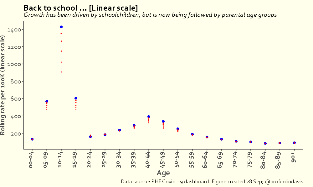
This thread from yesterday noted that it was already apparent in September that something was fishy.
Today's thread is about tracking the adjustment that results from having fewer false negatives.

First is Tewkesbury, where the Covid rolling rate has gone from 269 per 100k to over 2560 per 100k in 5 days. That's 3.3 doublings. I don't think I've seen a faster increase.
Next is Cheltenham, where the rate has gone from 548/100K on 10th October to 3154/100k on the 14th October (that's the most recent rate available, as there's always a 5-day lag on these rolling rates by specimen date). That's an increase of almost 500% in the space of 4 days.
Here's Stroud, which shows the same pattern. Note that pronounced (fake) drop in the first half of September, when there were lots of false negatives. Presumably those false negatives continued throughout September (yes, it's a complete mess).
Here's Bath and North East Somerset. Same pattern, but look at that y-axis! 😱
And Gloucester, another place where locals may have been lured into thinking that in mid-September they'd succeeded in getting the rate down lower than in the summer (they hadn't).
And finally, here's Bristol. I could keep going with South Gloucestershire, Swindon, North Somerset, Somerset West and Taunton (another place where the rate is >4000/100k), but you get the picture.
Areas that thought they had some of the lowest Covid rates in England now find themselves with the highest rates in the country, corresponding in some places to 1 in 22 children testing positive in the past week.

It's hard not to conclude we've been failed by Covid cronyism.

• • •

Missing some Tweet in this thread? You can try to force a refresh
 

Keep Current with Colin Davis

Colin Davis Profile picture

Stay in touch and get notified when new unrolls are available from this author!

Read all threads

This Thread may be Removed Anytime!

PDF

Twitter may remove this content at anytime! Save it as PDF for later use!

Try unrolling a thread yourself!

how to unroll video
  1. Follow @ThreadReaderApp to mention us!

  2. From a Twitter thread mention us with a keyword "unroll"
@threadreaderapp unroll

Practice here first or read more on our help page!

More from @ProfColinDavis

18 Oct
The case numbers for the South West of England had quite a few of us scratching our heads in September ... 🧵
I only just made that last graph now, and you might say it's easy to see in hindsight, but here's @OliasDave plotting the data a month ago (and already then, "Still convinced there is something odd going on").
This graph, also from @OliasDave in September, is a particularly nice way of visualising how weird the results for the South West were relative to the rest of the country.
Read 12 tweets
16 Oct
I've focused on Wellingborough and Trafford previously, so let's take a look at Ipswich, which has the third highest rolling rate in the UK.
In the recent spike, cases initially took off around September 15th, among 10-14s (following a pattern seen all around the country). The increase among 15-19s was less steep, presumably reflecting the fact that many in the latter group are vaccinated.
A week later, around September 22, we start to see cases taking off among those in their 40s. "Parents!", you say. I couldn't possibly comment.
Read 5 tweets
15 Oct
Today marks a milestone of sorts: the number of children under 14 who've tested positive for Covid in England just passed one million (1,003,787 to be precise). 🧵
This number underestimates the number of infections, of course, because a) there wasn't really any testing of children in the first wave (the graph shouldn't be flat prior to Oct 2020), and b) many children (especially younger children) are asymptomatic when infected.
And the figure doesn't include all children (15-17 year olds are in the same age band as 18 and 19 year olds, so it's hard to cleanly separate children and young adults).
Read 10 tweets
9 Oct
An argument I've been trying to make for a long time is that mass infection of children is not only bad for children, but also bad for adults, because rates in children affect rates in adults (because that's how infectious diseases work). Here's another way of looking at that.🧵
This plot answers the following questions:

a) if I know Covid rates in school-age children (5-9s & 10-14s), how accurately can I predict rates in adults?

b) which adult age bands will I be able to predict most accurately?

[SPOILER: There aren't going to be any surprises here]
The data set covers the entire pandemic to date in England (30 Jan 20 - 3 Oct 21). The y-axis measures how well we can predict rates for a given adult age group on a given day if we know the rates for 5-14 year olds from 2 days earlier. (A value of 1 would be perfect prediction).
Read 9 tweets
28 Sep
Yes, I understand that not all adults in their 40s are parents of 10-14 year olds (the dashboard data doesn't list parental status, sadly). And that some 20-29s and 55-64s are parents of 10-14s (though not that many). But I hope you can see what I'm driving at in this plot.
Reasonable people can disagree about both the meaning and the import of the extremely high infection rate that we're currently seeing in children. I'm not interested in arguing with people who want to say I'm alarmist.
I'll just note that, *given the scale of the numbers*, the following things can simultaneously be true:

1. Most children who get Covid will experience a relatively mild illness AND a large number of children will have long-lasting symptoms, some very serious.
Read 6 tweets
28 Sep
[28/9 update] I'm switching to a log scale today, partly because of the scale of the numbers (the rate for 10-14s is now > 1400/100k) and because this makes the trends easier to see: growth is slowing in 10-14s, but is increasingly apparent among those in 40s and adjacent ages.
If you're suspicious of log scales, or just want to compare, here's the same plot on a linear scale.
And here's the animated version (log scale).
Read 4 tweets

Did Thread Reader help you today?

Support us! We are indie developers!


This site is made by just two indie developers on a laptop doing marketing, support and development! Read more about the story.

Become a Premium Member ($3/month or $30/year) and get exclusive features!

Become Premium

Too expensive? Make a small donation by buying us coffee ($5) or help with server cost ($10)

Donate via Paypal Become our Patreon

Thank you for your support!

Follow Us on Twitter!

:(