I usually like to mix good news and bad news (“this.. but also that”). But I can’t find any bad news in today’s dashboard data, so here goes with a happy half-term round-up. Case growth continuing to fall, and now even more steeply in the under-20s: Image
And in the (un-averaged) detail for schoolkids, that trend looks *really* good. Image
Switching to look at cases (not growth), we can start to see the peak in the 10-14s emerging: Image
Looking back at the overview, the 80+ are in better shape as well. Note that last datapoint will get revised up, so may not really be below the axis, but it’s still heading in the right direction. Image
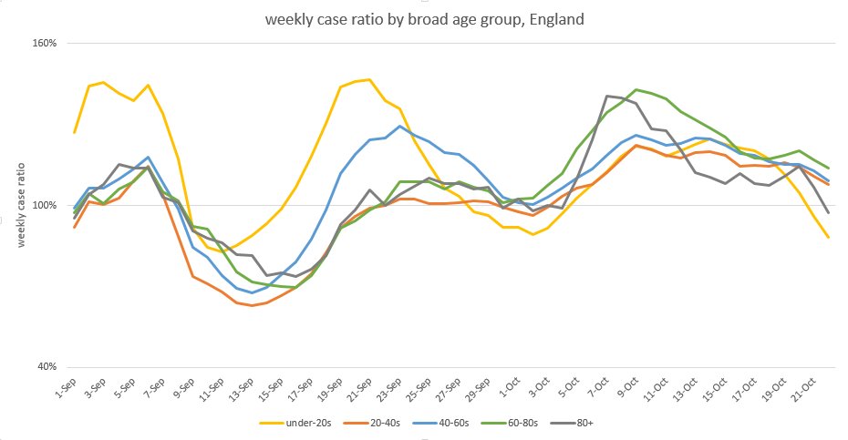
And the thing I like best in the case data isn’t very visible yet, but just a hint that cases in the 35-50 age groups are starting to stall as well – just a few days after cases in school-age kids did. Image
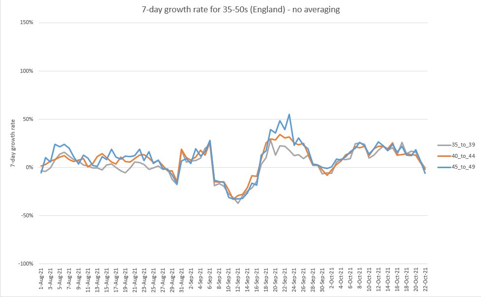
So if this pattern is sustained, and you think this whole thing is a testing artefact caused by people not wanting to test before going on holiday, you may now need to explain why the parents stopped testing roughly one infection cycle later than the kids did.
(rather than, for example, the kids being less infected, and hence not infecting their parents as much)
Now of course this could still be caused by some schools being off this last week (e.g. in Leics & Notts, private schools, some others taking 2-week half terms)…
…or by some schools having year groups closed for public health reasons. And to be clear I haven’t tried to estimate either of these effects, so welcome input from anyone who has.
But my intuition is that neither of those effects is large enough to cause the falls in case growth that we’re seeing here, so my sense is that the primary driver is immunity, from a combination of infection plus vaccination.
(I’d much prefer that we’d reached this point with a higher % of vaccination in kids, and less infection. But the fall in cases will be welcome nonetheless, and hopefully will go further and spread through the age groups over half term). 🤞 for more good news tomorrow. /end
@Coronavirusgoo1 this might be up your street

• • •

Missing some Tweet in this thread? You can try to force a refresh
 

Keep Current with James Ward

James Ward Profile picture

Stay in touch and get notified when new unrolls are available from this author!

Read all threads

This Thread may be Removed Anytime!

PDF

Twitter may remove this content at anytime! Save it as PDF for later use!

Try unrolling a thread yourself!

how to unroll video
  1. Follow @ThreadReaderApp to mention us!

  2. From a Twitter thread mention us with a keyword "unroll"
@threadreaderapp unroll

Practice here first or read more on our help page!

More from @JamesWard73

27 Oct
The news from today’s case data continues to be good, but because I can only do undiluted positivity for so long before providing some balance, I’m going to give you the good news quickly, and then give you four reasons to avoid premature celebrations.
First, the good news: case growth in school-age kids continues to decline, and even more quickly in the last day or two. (note: this latest cliff-edge is undoubtedly exaggerated by the impact of people doing fewer LFD tests last weekend, as half term started for most kids) Image
In particular we can see the 10-14s now clearly over a peak: (best to look at that orange dotted line, which is a 7-day centred average, for an indication of the trend) Image
Read 15 tweets
26 Oct
interesting article with some great quotes from @AdamJKucharski and @BristOliver. but unusually I disagree with @TomChivers on two counts:
1) I don’t think we can or should make our policy responses into an algorithm (it’s too complex a system, with strong human factors) and…
2) although “plan B” may feel low-cost to some, if we’re about to enter a downswing of cases (which seems quite likely, although not yet guaranteed) then implementing it now is as likely to make the next peak of hospitalisations higher, as it is lower.
this may seem counter-intuitive, but as the dynamics become more endemic-like, so they behave more like a pendulum. and if the pendulum is already moving in the direction you want it to, giving it a shove in that direction will certainly get you there faster (and for longer) but
Read 4 tweets
23 Oct
A bit of a mixed bag in today’s case data. The good news is in children, where the trend of recent days (stalling growth) continues: Image
And if we look into the detail, we can see weekly growth rates heading very slightly negative in all three school-age groups (although that last day will get revised up a bit, it does suggest we’re about at the peak of cases). Image
I note that (as @BristOliver mentions here) there’s a risk that the Immensa problems in the South West are now causing the growth to appear lower than the true underlying trend – so we should watch this closely over the coming days.
Read 6 tweets
10 Oct
I’m not liking the trend in over-60s case rates much at all – see chart of growth rates below. This will inevitably feed through into hospitalisations and deaths over the coming weeks, so boosters for this age group may be arriving not a moment too soon. 1/4
The more I look at this, the more I think I was wrong to nudge down the waning rates in the last model iteration. If I left the waning for vaccine effectiveness vs. infection at 7% a month (instead of reducing to 5% per month) I got this scenario: 2/4
Interestingly, if I take those assumptions and fit to the very latest data, I get a slightly different projection – which has the odd feature of a long, bumpy plateau through the winter. NB I’m not offering this as a forecast with any sense of confidence; 3/4
Read 4 tweets
3 Oct
Are you ready for Part 2 of the endemic “toy” model thread? I thought so. To pick up the story, we started yesterday (see thread below) with a non-seasonal model, and explored the effects of adding in controls and vaccines. Now we need to explore the impact of seasonality. 1/n
To start with, let’s see what happens if we inject some mild seasonality into the equilibrium model – here with a +10% variation in R during winter, and -10% in summer. (so about 20% overall peak-to-trough variation). With this, we get gentle oscillations in cases: 2/n
Now let’s dial up the seasonality a bit – to 20% either way. Unsurprisingly, the waves get bigger. 3/n
Read 31 tweets
2 Oct
I’m concerned that we haven’t quite got our heads round what the dynamics of the long-term endemic state for covid will feel like, and that some of the intuitions we built up in the epidemic phase won’t age well. I know I struggle with this at times. So, I built a model 😉 1/n
This time it’s just a “toy” model. Which means it’s not designed to forecast the endemic state in an accurate way – we don’t really have the data to do that yet. It’s just designed to illustrate the shapes and patterns that might arise. I hope it helps you, as it did me. 2/n
It’s just a very basic SIR model, for those of you familiar with that, and it covers a single sheet of Excel. In fact you can see it here – there’s more cells further down, but they’re just a copy of the earlier cells, extended further out into time. 3/n
Read 25 tweets

Did Thread Reader help you today?

Support us! We are indie developers!


This site is made by just two indie developers on a laptop doing marketing, support and development! Read more about the story.

Become a Premium Member ($3/month or $30/year) and get exclusive features!

Become Premium

Too expensive? Make a small donation by buying us coffee ($5) or help with server cost ($10)

Donate via Paypal Become our Patreon

Thank you for your support!

Follow Us on Twitter!

:(