The #economist is publishing a regularly-updated model of excess deaths due to COVID, which is being used to tell just-so stories about countries the Economist doesn’t like. Let’s talk about the dangers of using machine learning for analysis when you don’t have data.
Before we do, let’s just take a moment to appreciate the deep racism of this picture from a report using the Economist's numbers by the Centre for Strategic and International Studies. When you see a cover pic like this, you can guess what the contents are gonna be.
Having seen who is using this data and hazarded a wild guess at why, let’s look at some results. First, let’s compare the UK and Vietnam. According to the Economist, Vietnam had nearly as many excess deaths due to COVID-19 as the UK, despite containing the virus for a year.
Since the 1st August 2021 when Vietnam’s outbreak began, it has never once had more daily cases than the UK. Yet this country with this epidemic experience is supposed to have had as many deaths as the UK.
The economist believes China has had as many excess deaths as the USA. This is simply not credible. It’s not possible that China would have an epidemic on that scale and nobody would know.
This data is simply wrong. So how is it possible the economist got it so wrong? And why do they publish anyway? The answer to this question is also relevant to other projects that aim to estimate health data where that data is missing, like the #globalburdendisease studies.
The economist have limited data sources – they use complete mortality data from the human mortality database and the world mortality database, but these only cover about 110 countries. They don’t have anything for China or Vietnam, for example.
They then build a massive model based on this data to estimate what the true excess mortality might be using a machine learning method called gradient boosting. They predict deaths in other countries based on the countries with data.
For example, using data on covid tests per person, positivity rates, human development indices etc they can guess what deaths might be in countries without detailed death data. Gradient boosting selects the “best” variables and their effectiveness.
This has a huge and simple problem: you can’t apply relations that exist in countries with full pandemics to countries where COVID is contained. A model can’t tell that the low testing rate in China is because of no cases – it will assume under-testing.
They seem to have included some index of political freedom from “Freedom House” but failed to include any variable indicating whether the country *actually has a COVID epidemic*. Hence, the model assumes China and Vietnam are under-diagnosing. This is a bad and simple error.
China does not have half a million excess COVID deaths, Vietnam doesn’t have 100k, lots of Asian countries are doing better than the USA, and fancy models that serve to reinforce western wishful thinking don’t help. See also the IHME’s estimates of COVID deaths in Japan.
There are many other problems with the Economist’s work. First, they seem to apply a linear regression model to deaths, rather than over-dispersed Poisson regression. This allows the prediction of negative deaths in a country!
Next, they treat weeks and months as “fixed effects”, a weird obsession within economics, rather than fitting a spline or some other model that is less arbitrary. This is not how we do this in epidemiology.
They calculate excess deaths as a difference from the predicted deaths, even though deaths naturally change every year. They should generate uncertainty ranges around the predicted deaths for 2021, and then report excess/exiguous deaths *over or under those limits*.
This is ironic because they reference a BMJ paper of excess deaths in Hubei which tells them to do all of these things (except the prediction limits). There is a method for excess deaths, called the Farrington method, used by the CDC. But they ignored it!
If you want to see how excess deaths are actually calculated (when data is available), check out papers by some of my colleagues and I that find limited changes in Japan. doi.org/10.1016/j.psyc…
A general problem with these big multi-country studies that try to fill in data for countries they can’t acces is that they use data-driven methods to try and infer missing information. It’s at the core of the global burden of disease (GBD) study and it’s dangerous.
GBD estimates of depression prevalence in Africa, for example, can be based on a small number of studies in a handful of countries to generate evidence on the whole continent. We should be very careful about this process.
Also, wherever possible these multi-country studies should incorporate data and collaborators from every country they include. The GBD studies do this; the Economist clearly have not. Their conclusions are not reliable as a result.
To summarize: The Economist is doing a shoddy version of work that has already been done by experts in epidemiology, and conveniently confirming the suspicions of western ideologues that those shifty Asians are hiding the truth, and COVID-19 is really bad over here.
It’s not as bad over here. Western governments failed on COVID-19, and no amount of dodgy modeling and just-so stories by their mates in the dismal “science” will let them off the hook for their criminal response to this challenge.

• • •

Missing some Tweet in this thread? You can try to force a refresh
 

Keep Current with Stuart Gilmour

Stuart Gilmour Profile picture

Stay in touch and get notified when new unrolls are available from this author!

Read all threads

This Thread may be Removed Anytime!

PDF

Twitter may remove this content at anytime! Save it as PDF for later use!

Try unrolling a thread yourself!

how to unroll video
  1. Follow @ThreadReaderApp to mention us!

  2. From a Twitter thread mention us with a keyword "unroll"
@threadreaderapp unroll

Practice here first or read more on our help page!

More from @drStuartGilmour

6 Oct
In September 2021 an anti-vaccination meme started which claimed 70 members of Pfizer’s “investment board” are members of China’s Communist Party. Let’s look at how major news services and anti-China thinktanks drive anti-vaccination sentiments that kill Americans.
Snopes targeted this meme as false in September 2021, and briefly mentioned a news article in December 2020 that released the names, and says no government has verified it. Its role in helping to fuel anti-vax sentiment is clear from reddit subs like r/HermanCainAward.
This fabricated list was widely covered by The Daily Mail, the NY Post, the Epoch Times, the Australian, and Sky News. Foreign Policy’s supposed China expert Palmer referred to it as “an interesting data source for researchers”. Tory ex-leader Iain Duncan Smith wrote about it.
Read 10 tweets
19 Sep
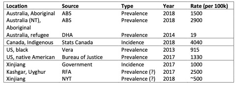
This table shows the rate of imprisonment of minorities in a couple of different countries. Let’s talk about genocide denialism among China “experts” who are laser-focused on proving genocide in Xinjiang while they ignore the legacy of genocide in their own countries.
These China “experts” are intent on uncovering these statistics and on activism in international forums to challenge mass imprisonment in China. Meanwhile their own countries are imprisoning indigenous people or minorities in huge numbers but they say nothing. Why?
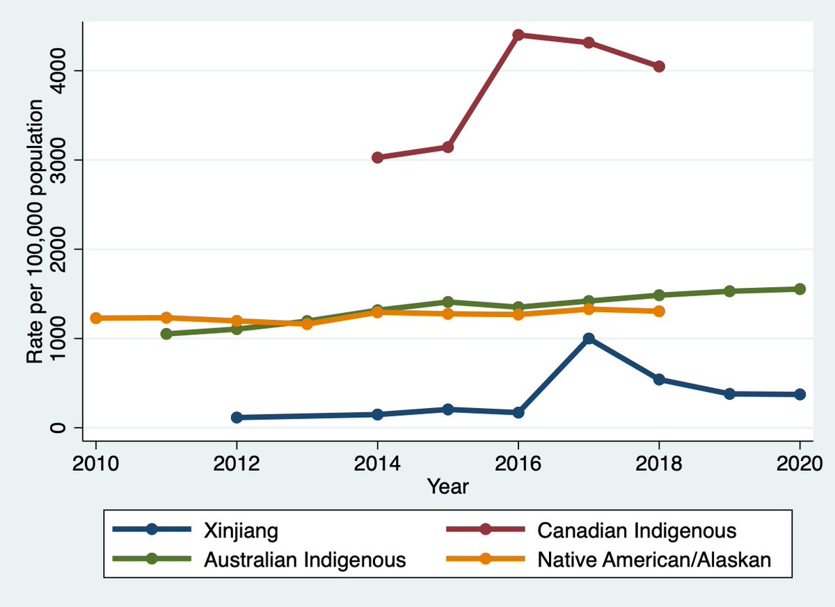
For example in this figure we can compare imprisonment rates in Xinjiang with rates for indigenous people in Australia (where @ASPI_org is active), Canada (@projectxinjiang) and the USA (@adrianzenz). Where do you think the problem is biggest?
Read 20 tweets
22 Aug
The Blitz (nazi terror bombing campaign of the UK) killed 40-50,000 people in a population of 41 million. #COVID19 has killed 130,000 people in a population of 65 million people – it is nearly twice as bad as the blitz. Let’s compare responses. Image
In response to the bombing of urban centres the UK Tory government evacuated a million women and children to the countryside, introduced a curfew, enforced a blackout and banned certain forms of speech harming the war effort. Image
They moved schools to the country or closed them, causing major social disruption. historyextra.com/period/second-…
Read 20 tweets
17 Aug
For those wondering at why the Australian government would abandon its Afghan “allies” and comrades of ADF soldiers to an uncertain fate after the Taliban have taken over #Afghanistan, a little history lesson in how Australia has historically treated Afghan refugees
In August 2001 the MV Tampa rescued 433 refugees at sea. 244 of them were Afghans, fleeing the Taliban, and following the laws of the sea Tampa attempted to land them in Australia. The Australian government refused to take them.
The Tampa’s captain refused to turn around so Australia sent in the SAS. The commander of the SAS force that raided that ship, Vance Khan, was ultimately in charge of a squad that killed tribesmen as part of Operation Slipper in Afghanistan. tinyurl.com/4y68z58z
Read 15 tweets
20 Jun
This figure shows the number of births that were “lost” in Japan due to falling birthrates since 2010. Nearly 1 million over just 10 years! Shocking! But no outcry from western thinktanks. Let’s discuss attributing sinister motives to good policy in @adrianzenz 's latest work
2/ here is the report, it’s a preprint and also accepted at the journal Central Asian Survey. papers.ssrn.com/sol3/papers.cf…
First, let’s discuss authorship. I don't think @adrianzenz reads Chinese, so how is he finding/translating these articles? He is the only author on this paper, but there must be another. Is there, Adrian? How are you finding and translating these articles?
Read 25 tweets
22 May
@adrianzenz @Nrg8000 @ASPI_org @GuardianAus This figure shows the change in birth rates in Japan from 1985 to 1990, with the municipalities where the change was >30% shown in red. Let’s talk about the problem with using demographic data to try and prove genocide. Image
@adrianzenz @Nrg8000 @ASPI_org @GuardianAus As you can see from that figure, birth rates in some municipalities (市区町村) in Japan dropped by more than 50%. Here are some example trajectories from 1970 – 2010. Image
@adrianzenz @Nrg8000 @ASPI_org @GuardianAus Let’s look at Prefectures, which have more stable populations, plotted by median drop: 50% of the prefectures saw a drop bigger than 17%. Prefecture populations in Japan range from 600,000 to 11,000,000, the same range as in Xinjiang. Image
Read 15 tweets

Did Thread Reader help you today?

Support us! We are indie developers!


This site is made by just two indie developers on a laptop doing marketing, support and development! Read more about the story.

Become a Premium Member ($3/month or $30/year) and get exclusive features!

Become Premium

Too expensive? Make a small donation by buying us coffee ($5) or help with server cost ($10)

Donate via Paypal Become our Patreon

Thank you for your support!

Follow Us on Twitter!

:(