Massive moves in short rates. Few bother with them as they are SUPPOSED to be tied to monetary policy. But they are "unanchoring."
The US 2-year note is up 8 bps today. This is the biggest daily rise since the bond market was losing its mind in March 2020.
3/4
The fed fund futures curve is having a HUGE move today.
4/4
Taking those fed funds futures, the probability rate hikes can be calculated. THREE rate hikes in 2022 are now priced in, as these charts show.
Yes, the Fed/economists are pushing back. But they might be in the denial stage of the 5 stages of grief. Check back in a month.
Bonus tweet
He did not send out this tweet thinking he was done with this subject. He going to act on it. And expect Powell, who has said "transitory" more than anyone else, to be in his sights.
Even though the cash bond market was closed today, the interest rate futures were open and had a fairly sizeable decline. Not like yesterday's sell-off, but they did continue yesterday's declines with even more losses.
Bond futures were off about 1/2 point.
2/8
Most interesting (to me, at least) was fed fund futures tanked AGAIN today.
This show the implied yields out to May 2023. Or, where the market is pricing in the funds rate out to May 2023.
3/8
Wonky chart alert ...
This chart shows the shifting of the forward curve from last Friday (red) to yesterday (orange) to today (blue).
In the last month, markets are pricing in more aggressive tightening of monetary policy across the globe, sending short rates higher. This move accelerated in the last week. Is this signaling the end of the “transitory” inflation era?
A thread to explain
2/12
The last two weeks have seen short-term interest rates around the globe shoot higher, as the following series of charts show.
3/12
This trend is most acute in Australia where it appears yield curve control is blowing up. The Reserve Bank of Australia cannot maintain its target of 0.10% (blue line).
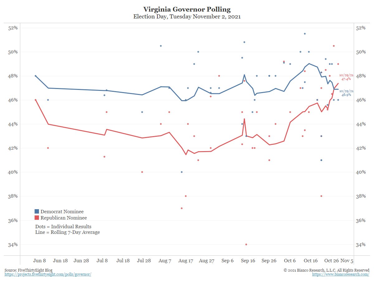
The election to watch this week is the Virginia Governor Race. Election day is Tuesday, Nov 2.
Biden won Virginia by 10 pts just a year ago.
The Democrat, Terry McAuliffe, might be staging what some political wags are calling 1 of the greatest collapses in a generation.
2/4
As late as a month ago, the McAuliffe had as much as a 15 pt lead over (R) Glenn Youngkin. Now, not only is that lead gone, but it might have reversed.
McAuliffe was a former Governor so he is hardly some obscure figure in Virginia politics. Youngkin has never held office.
3/4
Youngkin was at Carlyle for 25 years, rising to Co-CEO. He left in September 2020 to run for Governor.
We've seen numerous examples of the polls/bettors getting it wrong. So, maybe, McAuliffe wins by a bunch? We'll know in three days.
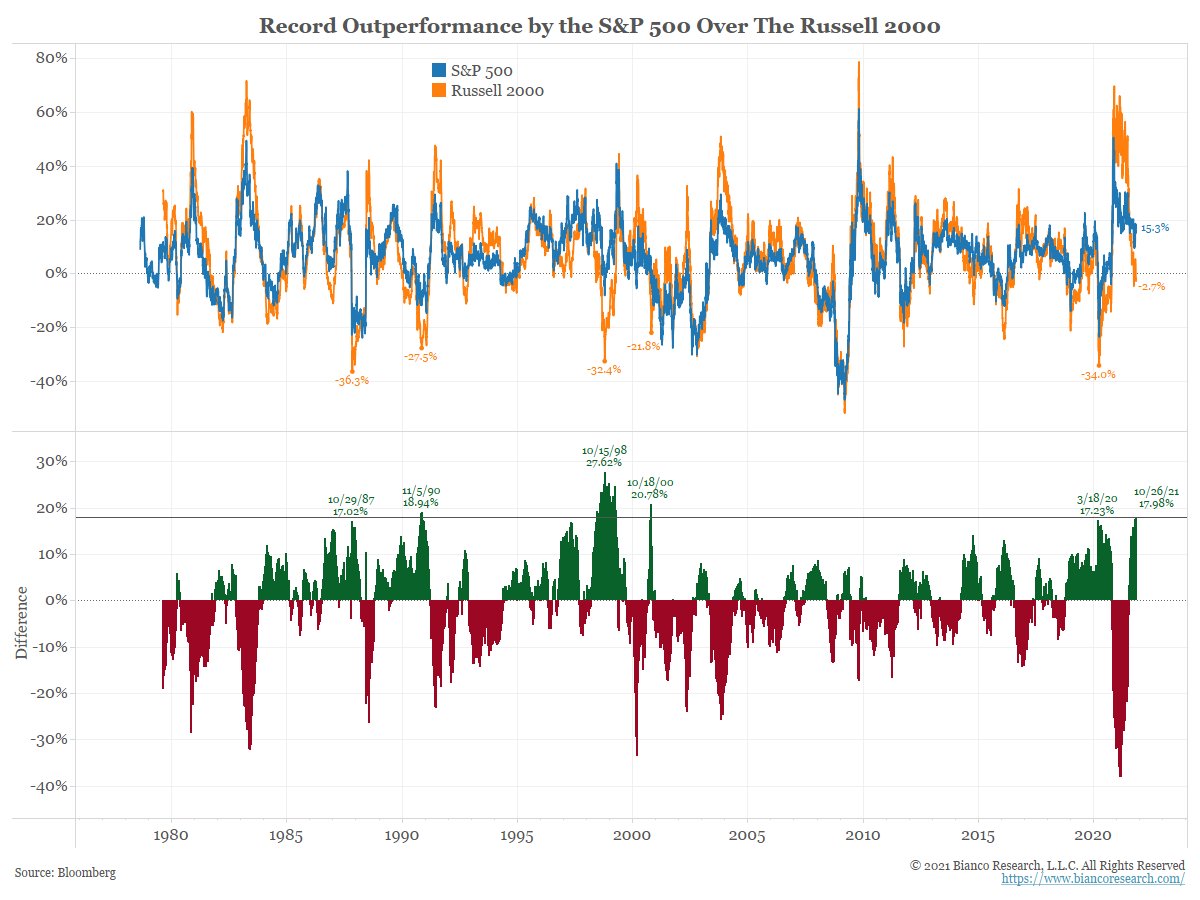
The S&P 500’s outperformance over the Russell 2000 is reaching historic extremes, something that typically only happens in a bear market. Investors have redirected government stimulus money into the stock market.
A thread to explain
2/11
The next chart starts on March 15 and shows the rolling return of the S&P 500 (blue) and the Russell 2000 (orange). Since this date, the S&P 500 is up 15.26% while the Russell 2000 is down 2.72%.
3/11
So, in the last 161 trading days, the S&P 500 has outperformed the Russell 2000 by 17.98%. This is the biggest outperformance by the S&P 500 over the Russell 2000 in 20 years!
The market is pricing in a far more aggressive response to inflation than economist or the Fed currently envision.
This matters are the market is major voice in setting policy. It is sending a powerful message.
A thread to explain.
2/16
The chart below shows selected fed funds futures curves since September 3 (blue).
The market is pulling rate hikes forward almost every day (curves shifting left), perhaps as a result of the higher inflation expectations in recent weeks.
3/16
The CME’s “Fed Watch” tool offers another way to view the market’s probability on Fed policy. This tool uses the fed funds futures forward curve shown above.
A probability over 50% signifies a rate hike is priced in.
1/6 What is the bond market signaling? And how to read it? A thread to detail.
This chart shows YTD 10-yr total return each year since 1973. Gray lines show past years’ returns, while the blue line shows this year’s returns. Through October 21, the 10-year has returned -5.60%.
2/6 Only 3 years posted worse total returns through Oct 21 – 2009 (worst), 1999, and 1994. 2021 is already one of the worst years in bond market history.
How much pain in the bond market does the transitory crowd demand before they acknowledge the market is signaling a problem?
3/6 Bond market volatility is also beginning to show signs of concern, as the next chart shows.