Learning stuff incoming! 🧵
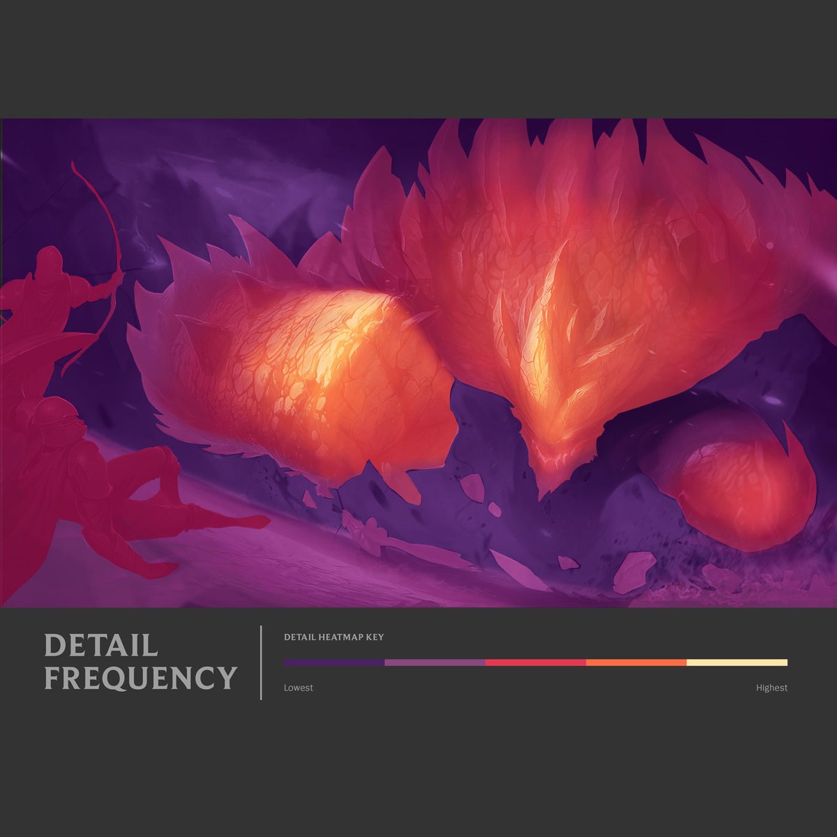
Detail Frequency, the amount of detail packed into an area of an image, is important to a highly rendered #splash #art. The goal is balancing high intensity and areas of rest to focus attention. Here are some heat maps I made to illustrate this.

Detail Frequency, the amount of detail packed into an area of an image, is important to a highly rendered #splash #art. The goal is balancing high intensity and areas of rest to focus attention. Here are some heat maps I made to illustrate this.


Splash art aims for 'cinematic believability', and controlling detail frequency is one way to get there - consider the illustration a camera lens, use ideas like depth of field to keep some areas blurred and others in focus.
More about camera lenses: tinyurl.com/jv8aprhh

More about camera lenses: tinyurl.com/jv8aprhh


With that basic structure in mind, I think it's easy to observe in splash art style how much detail frequency and material contrast is invested into the focal areas - usually around the champion's head and source of power - in this example, Graves's portrait and his gun. 


#Splash #art is borrowing this idea not just from film, but also painters we really admire. John Singer Sargent is a master at concentrating detail where he intended for your eye to go.
Same painting, same zoom-level, different sections.
'Lady Agner of Lochnaw', 1892

Same painting, same zoom-level, different sections.
'Lady Agner of Lochnaw', 1892


Some helpful suggestions for mastering Detail Frequency:
1. Paint small - to literally stop myself from getting too noodly too soon, this is the same splash at actual size, left is ~2000px wide. Right is render time, scaled up to ~7000 px wide.

1. Paint small - to literally stop myself from getting too noodly too soon, this is the same splash at actual size, left is ~2000px wide. Right is render time, scaled up to ~7000 px wide.


2. Save time to resolve the Detail Frequency. I STILL go too far when I paint, so in my polish / post fx time, I make sure to step back and look at the whole image. I use tools like the smudge brush and blur filters to push and pull the balance. 


WHEN do you zoom in? I think that can be flexible. For me, I leave this pretty late into the process - the last week or so of a 6 week project. Alot of the render can happen from a more zoomed out view. Experiment with it!
😊
😊
Lady Agnew - my typos remain legendary
😅
😅
• • •
Missing some Tweet in this thread? You can try to
force a refresh


