New Learning Thread Incoming! 🧵
When talking about Lighting + Values for #splash #art that means the lighting design and the structure of the full range of light-to-dark tones in an illustration. We're going to look at alot of grayscale today.

When talking about Lighting + Values for #splash #art that means the lighting design and the structure of the full range of light-to-dark tones in an illustration. We're going to look at alot of grayscale today.


#Splash #art style is rooted in cinematic believability, that means literally studying lighting design and value structire from life, film and media. The goal is to achieve a potent sense of light and atmosphere with a strong mood and tone. 

Gandalf is here to show you some of the varieties of light sources we can observe and use ourselves. Exaggerate, experiment, mix and match to find the best fit for your exciting, emotional moment. Keep hierarchy in mind so that lights compliment one another rather than compete. 

Lighting goes hand in hand with time of day and weather, even in interior settings. This is another opportunity to experiment with what best fits the emotional tone and the storytelling moment. 

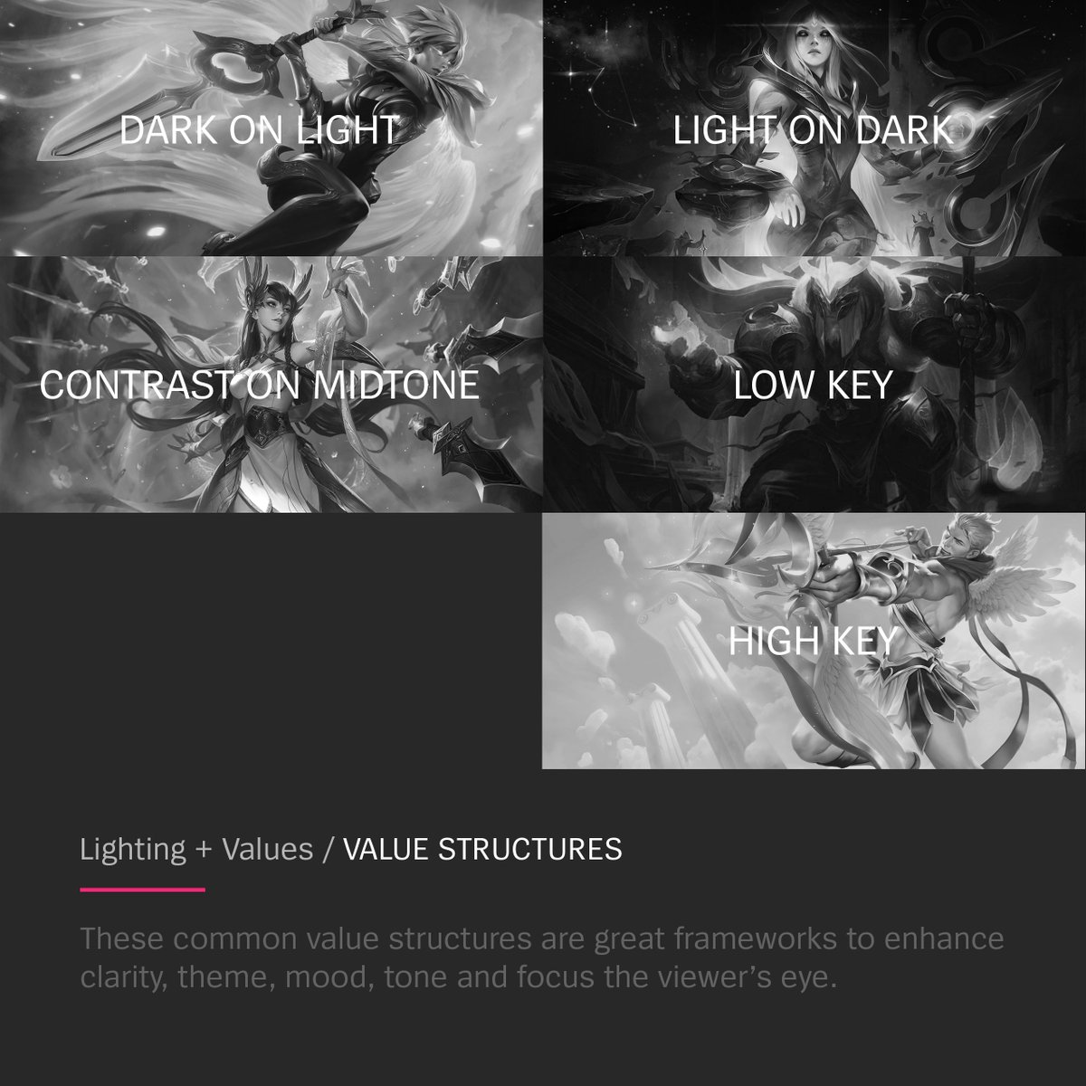
Here are a handful of helpful value structures - these are common frameworks to enhance clarity, theme, mood, tone and focus the viewer's eye.
Dark on Light
Light on Dark
Contrast on Midtone
Low Key
High Key
Dark on Light
Light on Dark
Contrast on Midtone
Low Key
High Key

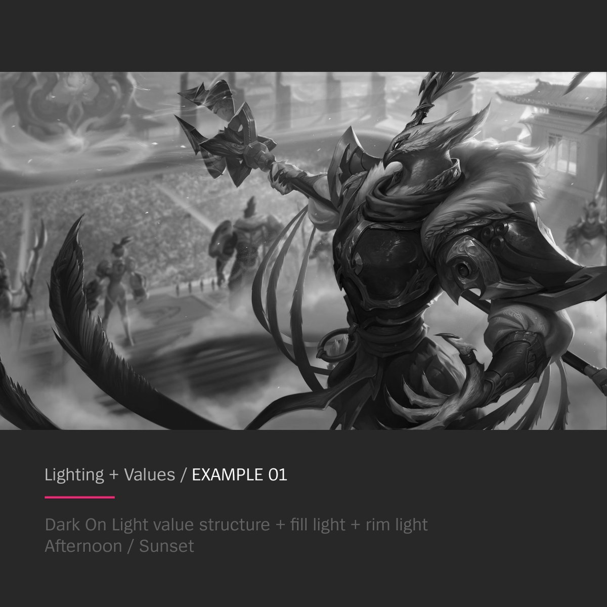
And some examples of how value structure + lighting combinations + time of day are combined into one splash image. 


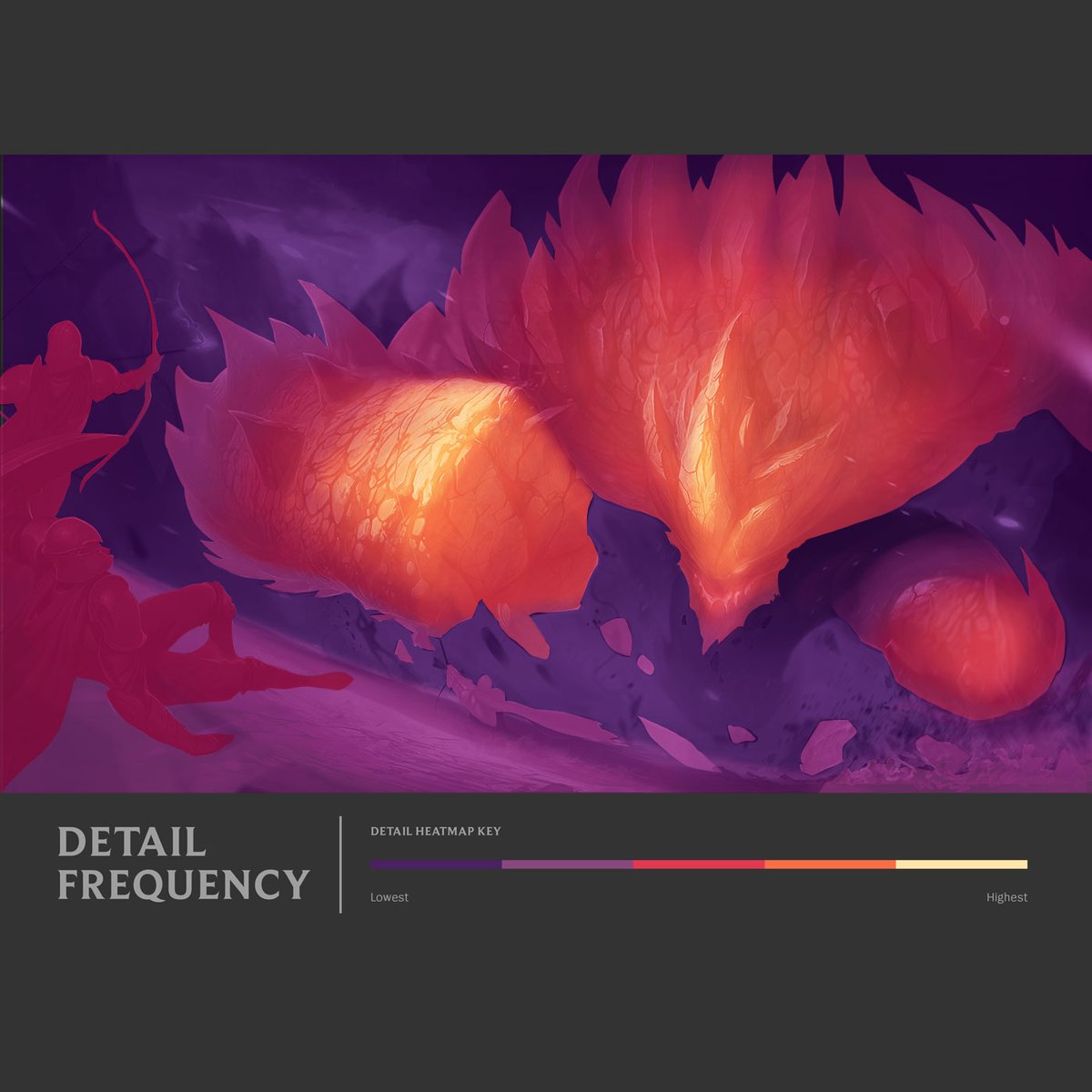
Along with values - the whole range of tints and tones - contrast is very important. This is about how the values are arranged in the image - areas of high contrast (very dark + very light) draw the eye, areas of low contrast (similar values) are restful 

The way value contrast is arranged in an image also supports the depth and readability of the space. Higher contrast will tend to come forward to the viewer, lower contrast will recede away from the viewer. 

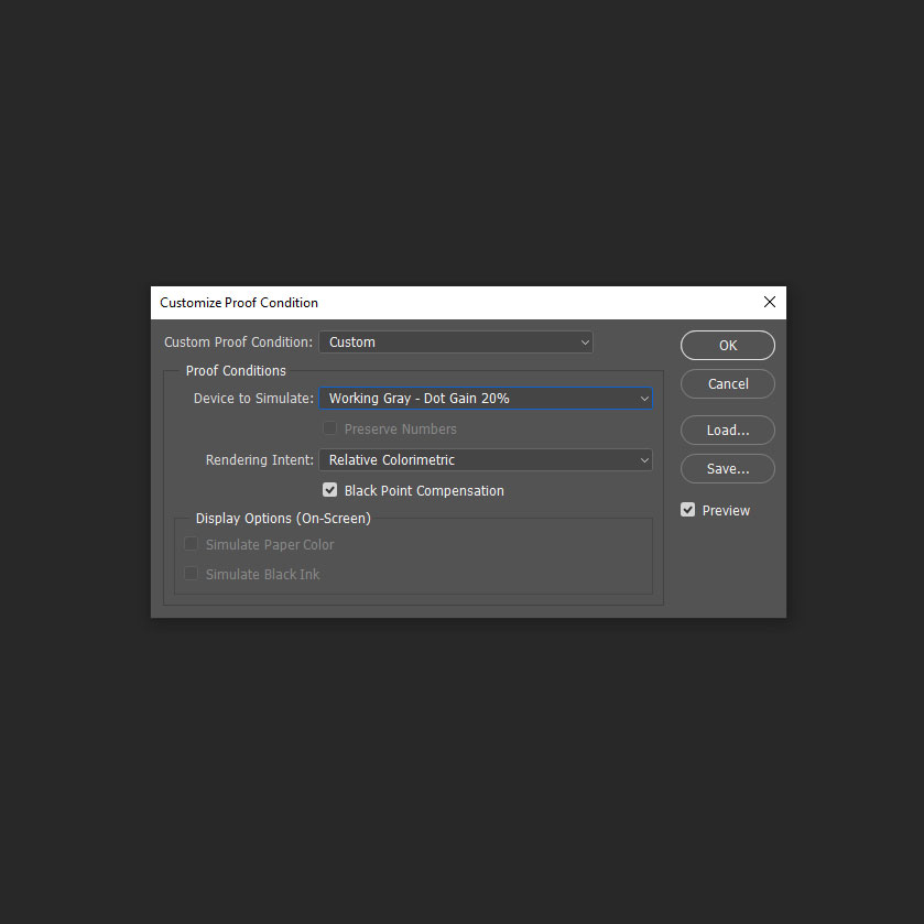
A little tip for #photoshop users - you can use the proof setup to have a quick hotkey (ctrl + y) for checking values throughout the painting process.
Get those good value structures in your illustrations!

Get those good value structures in your illustrations!


• • •
Missing some Tweet in this thread? You can try to
force a refresh


