
Design is as crucial as copy for a successful marketing campaign.
In 1959, Bill Bernbach wrote an ad for Volkswagen…
A small, ugly car brand that wanted to break into the US where people loved big muscular cars.
Here's why this ad became the greatest ad of the 20th century👇
In 1959, Bill Bernbach wrote an ad for Volkswagen…
A small, ugly car brand that wanted to break into the US where people loved big muscular cars.
Here's why this ad became the greatest ad of the 20th century👇

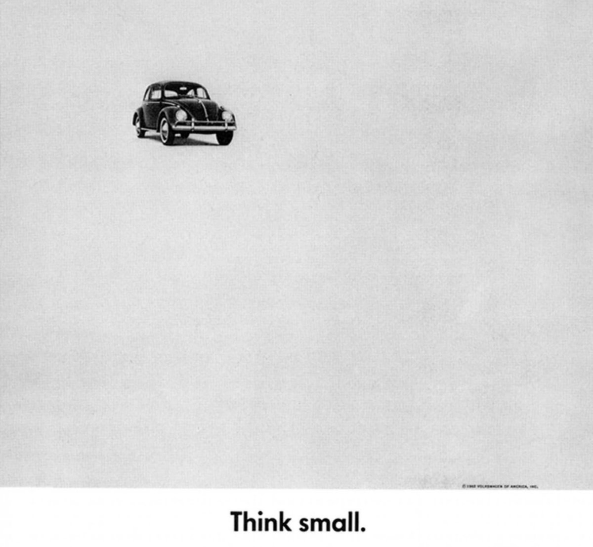
When you look at this ad…
All you see is text, a huge white space, and a one tiny car picture.
It looks basic.
But the basic look contributed to the massive success of the campaign.
All you see is text, a huge white space, and a one tiny car picture.
It looks basic.
But the basic look contributed to the massive success of the campaign.
Before we look at the design elements that made this ad thrive…
You must know this:
If you want to catch your audience's attention…
You must do things differently than everyone else.
You must know this:
If you want to catch your audience's attention…
You must do things differently than everyone else.
As you'll soon see…
It’s okay to model things that already work.
But you should also find a way to put your spin to it...
So that you get lost in the crowd.
Let's now take a look at how design played a huge role in the success of this campaign -
It’s okay to model things that already work.
But you should also find a way to put your spin to it...
So that you get lost in the crowd.
Let's now take a look at how design played a huge role in the success of this campaign -
1. They used the traditional ad format
Old traditional automobile ads look the same.
There's a nice picture of the car sitting on top of the page, and some text below talking about the car.
Bill didn't try to change this.
Old traditional automobile ads look the same.
There's a nice picture of the car sitting on top of the page, and some text below talking about the car.
Bill didn't try to change this.

If you find something that works for other brands like yours, model it.
2. The ad was in black and white
Even though they followed the traditional ad format...
Bill and his team created their own trend.
They only had $600k to run ads compared to other top automobile brands with $30M ad spend...
Even though they followed the traditional ad format...
Bill and his team created their own trend.
They only had $600k to run ads compared to other top automobile brands with $30M ad spend...
So they designed their page in black and white to save money.
After people scrolled through other colored ads...
Theirs stood out.
It made people say “Okay, what's this?”
After people scrolled through other colored ads...
Theirs stood out.
It made people say “Okay, what's this?”
3. The image had a purpose
Sometimes…
You see images and videos in ads and wonder “Why?”
“Why is it there?”
“How does it relate?”
But that was not the case with this Volkswagen ad.
Sometimes…
You see images and videos in ads and wonder “Why?”
“Why is it there?”
“How does it relate?”
But that was not the case with this Volkswagen ad.
Instead of having a large vehicle with lots going on in the background…
They opted for whitespace and a tiny vehicle placed in it.
This image fit with the big idea of their campaign “Think small”
They opted for whitespace and a tiny vehicle placed in it.
This image fit with the big idea of their campaign “Think small”
Since everyone has been driving big cars for a while to show their power status…
This one grabs attention.
This one grabs attention.
Also…
Take a look at the car’s position.
When people stare at the car, the next place their eyes go to is the headline…
Because that's where the car is pointing to.
This makes people then go on to read the rest of the copy.
Take a look at the car’s position.
When people stare at the car, the next place their eyes go to is the headline…
Because that's where the car is pointing to.
This makes people then go on to read the rest of the copy.
Remember...
The role of your image is to lead to the text...
The role of the headline...
Is to lead to the first line...
The role of your image is to lead to the text...
The role of the headline...
Is to lead to the first line...
4. They used a different font
The normal font for traditional ads in the 1950s was Serif.
Bill and his team used Sans serif…
This also caught people's eyes as they flipped through pages.
The normal font for traditional ads in the 1950s was Serif.
Bill and his team used Sans serif…
This also caught people's eyes as they flipped through pages.
Anything that differs from the norm grabs attention.
5. They placed the Volkswagen logo in the copy
At the time…
Other brands put their logos on other areas of their page.
But it doesn't interrupt the copy
At the time…
Other brands put their logos on other areas of their page.
But it doesn't interrupt the copy
Bill and his team did the opposite.
They set the logo at the bottom of the page.
This creates a pattern interrupt because it sits where the copy should be.
Once again…
People's eyes are drawn to it.
They set the logo at the bottom of the page.
This creates a pattern interrupt because it sits where the copy should be.
Once again…
People's eyes are drawn to it.
if you're been paying attention…
You'll notice one thing about the elements I've showed you so far -
They all draw attention to the copy.
You'll notice one thing about the elements I've showed you so far -
They all draw attention to the copy.
This is what you must do when trying to sell online.
People are scrolling fast through their phones…
And will only stop to look at things that grab and hold their attention.
People are scrolling fast through their phones…
And will only stop to look at things that grab and hold their attention.
Your ad creatives must be exciting enough that people watch and click to see what you have to offer.
Even if you model something that works…
Put your own twist to it and see how well it performs.
That's the only way you become a trendsetter.
Even if you model something that works…
Put your own twist to it and see how well it performs.
That's the only way you become a trendsetter.
Now…
You've seen that everything points to the copy.
And there's no way I'll end this thread without talking about the copy.
So let's see 4 things about the copy that made it successful.
You've seen that everything points to the copy.
And there's no way I'll end this thread without talking about the copy.
So let's see 4 things about the copy that made it successful.
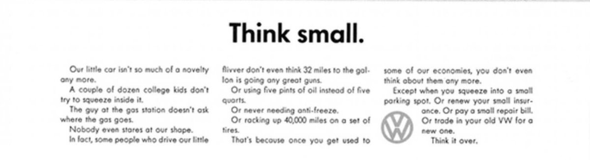
1. It's short and simple
There's no fluff.
Every word in this copy serves a purpose and is easy to understand.
And people can read through fast!
There's no fluff.
Every word in this copy serves a purpose and is easy to understand.
And people can read through fast!
Read your copy aloud.
If it works fine without some words and sentences in it…
Remove them.
The tighter your copy… The more powerful it is.
If it works fine without some words and sentences in it…
Remove them.
The tighter your copy… The more powerful it is.
2. It’s honest
This was one of the most important things about this ad that drew people to Volkswagen.
It talked about features other cars had and it didn't.
But...
This was one of the most important things about this ad that drew people to Volkswagen.
It talked about features other cars had and it didn't.
But...
They made their weaknesses their selling points.
And helped people realise that having a small car may not be so bad after all.
And helped people realise that having a small car may not be so bad after all.
3. Every sentence paints a picture.
Seriously…
If you want to keep people hooked on your copy…
You have to create an image in their heads with your words.
If you can't do this…
They’ll leave before they get to the CTA.
Seriously…
If you want to keep people hooked on your copy…
You have to create an image in their heads with your words.
If you can't do this…
They’ll leave before they get to the CTA.
4. They understood the customers
None of what Bill and his team did in this ad in would have been possible if they didn't understand their audience.
They wanted to appeal to the younger people…
And they did.
None of what Bill and his team did in this ad in would have been possible if they didn't understand their audience.
They wanted to appeal to the younger people…
And they did.
They proposed a car that cost less to maintain and didn't have all the problems of bigger vehicles.
Young people saw into the idea and started buying beetles.
Young people saw into the idea and started buying beetles.
That's the end of this beautiful thread.
You’re going to retweet it now.
But before you do...
I wrote a summary of the main points I made…
So you can remember them when next you're creating a marketing campaign...
You’re going to retweet it now.
But before you do...
I wrote a summary of the main points I made…
So you can remember them when next you're creating a marketing campaign...
▪️Model things that work.
▪️Be honest about your product.
▪️Understand your customers first
▪️Remove every fluff from your copy.
▪️Don’t copy. Put your own twist on your ads.
▪️Every element in your ad must have a purpose.
▪️Be honest about your product.
▪️Understand your customers first
▪️Remove every fluff from your copy.
▪️Don’t copy. Put your own twist on your ads.
▪️Every element in your ad must have a purpose.
That's all for today's thread!
If you enjoyed it…
Retweet the first tweet to share with fellow copywriters and marketers to help them run better campaigns👇
If you enjoyed it…
Retweet the first tweet to share with fellow copywriters and marketers to help them run better campaigns👇
https://twitter.com/jakevictor_/status/1471929103498588162
And don't forget…
Follow me @jakevictor_ for more threads on
▪️Copywriting
▪️Marketing
▪️Persuasion
▪️Storytelling…
And some good ol’ encouragement to keep smashing your goals🙂
Follow me @jakevictor_ for more threads on
▪️Copywriting
▪️Marketing
▪️Persuasion
▪️Storytelling…
And some good ol’ encouragement to keep smashing your goals🙂
• • •
Missing some Tweet in this thread? You can try to
force a refresh


