#Omicron can kiss my a$$.
Now that that's out of the way, a brief #Florida update.
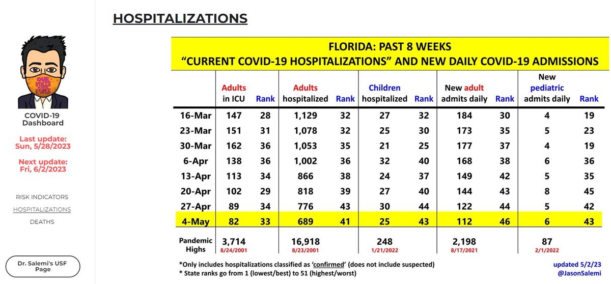
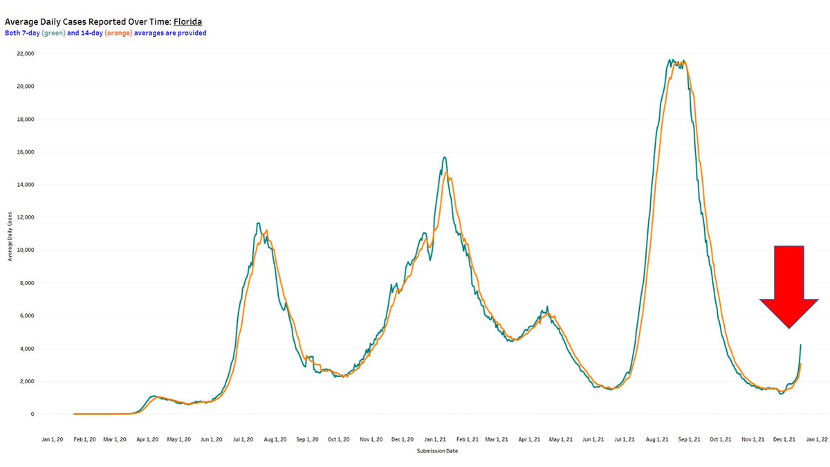
Well, as expected, cases are increasing at a rapid rate. More than a doubling from last week.
1/12
Now that that's out of the way, a brief #Florida update.
Well, as expected, cases are increasing at a rapid rate. More than a doubling from last week.
1/12
As we dive deeper to the county level, although the increases are pretty consistent, our 3 largest counties in the southeastern part of the state are skyrocketing.
1-week change in 5 largest counties:
- Dade 322%
- Broward 213%
- PB 160%
- Hillsborough 60%
- Orange 50%
2/12
1-week change in 5 largest counties:
- Dade 322%
- Broward 213%
- PB 160%
- Hillsborough 60%
- Orange 50%
2/12

The percent changes for this past week (far right bar) reflect increases for every age group, but most pronounced for those 20-49.
The smallest increase is in the most vaccinated age group (and the most likely to take precautions), those people 65+.
3/12
The smallest increase is in the most vaccinated age group (and the most likely to take precautions), those people 65+.
3/12

You can also see this age effect in the figure below, which just shows the age distribution of cases over time. As the rightmost point in the graph, you can see the abrupt shift to younger ages.
4/12
4/12

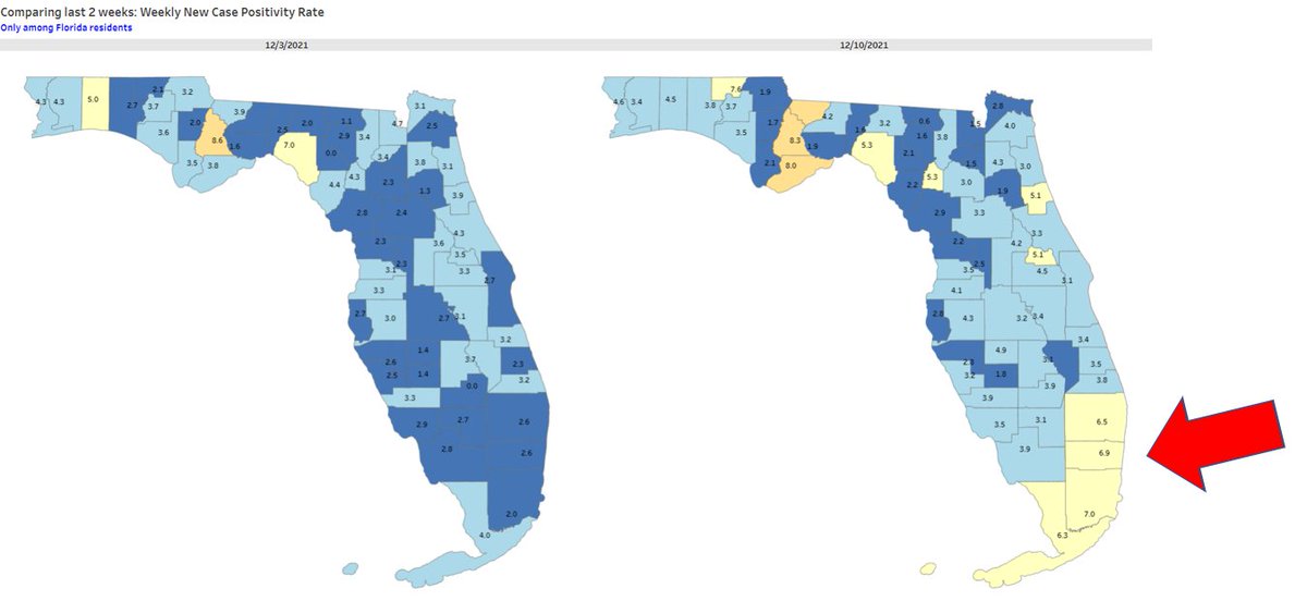
Positivity has also more than doubled, now back above 5%.
Again, the most pronounced increases were in our large southeastern counties: Dade, Broward, and Palm Beach.
5/12
Again, the most pronounced increases were in our large southeastern counties: Dade, Broward, and Palm Beach.
5/12
Here's the national look at cases over time. Sorted by recent 7-day rate per capita, from worst-to-best.
On my dashboard, I also added a color to each line, reflecting the % change over the past week.
Florida is red because it increased by >100%.
6/12
On my dashboard, I also added a color to each line, reflecting the % change over the past week.
Florida is red because it increased by >100%.
6/12

Here's another way to visualize it. This plots average daily cases per capita (y-axis) vs. % change in the past week (x-axis).
Further 'north', the higher your current rate (bad)
Further 'right', the more you increased over the past 7 days (also bad)
Red arrow = Florida
7/12
Further 'north', the higher your current rate (bad)
Further 'right', the more you increased over the past 7 days (also bad)
Red arrow = Florida
7/12

Though adults hospital admissions are up about 17% in the past week, I want to wait 7-10 days after this current surge in cases to see the extent to which it results in an increase in adult and pediatric admissions for COVID-19.
More soon on how that metric changes.
8/12
More soon on how that metric changes.
8/12
Finally, the all-important vaccinations.
Only about half of all seniors are estimated to be 'optimally immunized' meaning:
- vax in the past 6mo (Pfizer/Moderna) or vax in last 2mo (J&J)
- vax before the above windows, but received a booster to address waning immunity
9/12
Only about half of all seniors are estimated to be 'optimally immunized' meaning:
- vax in the past 6mo (Pfizer/Moderna) or vax in last 2mo (J&J)
- vax before the above windows, but received a booster to address waning immunity
9/12

This is the national look. The figure is sorted by the % of the senior population that is optimally immunized, from best-to-worst.
Florida is middle of the pack.
Very worrisome when we look at the small % of the large 18-64 age group who is optimally vaccinated.
10/12
Florida is middle of the pack.
Very worrisome when we look at the small % of the large 18-64 age group who is optimally vaccinated.
10/12

One final way to look at the % optimally immunized by state.
On the left: all age groups combined - NO STATE has >50% of people in this ideal category.
On the right: 65+ - any state not in a blue shade has at least 4 in 10 seniors not optimally immunized.
11/12
On the left: all age groups combined - NO STATE has >50% of people in this ideal category.
On the right: 65+ - any state not in a blue shade has at least 4 in 10 seniors not optimally immunized.
11/12

There's your quick run-down.
Remember, nothing is inevitable despite #omicron's transmissibility and immune escape capability looking pretty sucky.
There really is plenty you can do to protect yourself, your friends and family, and your community.
Stay safe!
12/12
Remember, nothing is inevitable despite #omicron's transmissibility and immune escape capability looking pretty sucky.
There really is plenty you can do to protect yourself, your friends and family, and your community.
Stay safe!
12/12
For those of you inquiring about the vac status algorithm...
13/12 BONUS 😉
https://twitter.com/JasonSalemi/status/1468337824202059777?t=Z_e7j1Qpv2hHyZkHMRKtsg&s=19
13/12 BONUS 😉
• • •
Missing some Tweet in this thread? You can try to
force a refresh


