In Python ...

You can combine Numpy arrays vertically or horizontally using np.concatenate

#Python #pythoncode #datascience
The first argument to the function is a list (or collection) of arrays that you want to combine.

You can actually combine many arrays ...just put them inside the list.
The axis parameter controls the direction along which you combine the arrays.

For 2D arrays ...

'axis = 0' combines vertically
'axis = 1' combines horizontally
Instead of np.concatenate, you can also use np.hstack or np.vstack to stack arrays horizontally or vertically, respectively.
Being able to split and combine Numpy arrays is useful ... particularly when you're doing machine learning.

In most cases, datasets for Python machine learning will be in the form of a Numpy array.

#Python #pythonlearning #machinelearning
To be able to do machine learning in Python ...

... you need to be able to split, combine, and wrangle Numpy arrays.

#Python #pythonlearning #machinelearning

• • •

Missing some Tweet in this thread? You can try to force a refresh
 

Keep Current with Joshua Ebner

Joshua Ebner Profile picture

Stay in touch and get notified when new unrolls are available from this author!

Read all threads

This Thread may be Removed Anytime!

PDF

Twitter may remove this content at anytime! Save it as PDF for later use!

Try unrolling a thread yourself!

how to unroll video
  1. Follow @ThreadReaderApp to mention us!

  2. From a Twitter thread mention us with a keyword "unroll"
@threadreaderapp unroll

Practice here first or read more on our help page!

More from @Josh_Ebner

30 Dec
Merging two or more datasets is extremely important in data science.

Here's a quick thread that covers the basics of data merges in Python.

🧵[1/19]

#Python #datascience #DataAnalytics ImageImageImageImage
[2/19]

In Python ...

You can combine two Pandas dataframes using the "merge" function.

You can also use the "join" function (which defaults to joining on the index)

#Python #datascience #DataAnalytics
[3/19]

When you merge dataframes, you'll typically have a so-called "key" variable.

This is the variable upon which you'll join the dataframes.

#Python #datascience
Read 19 tweets
29 Dec
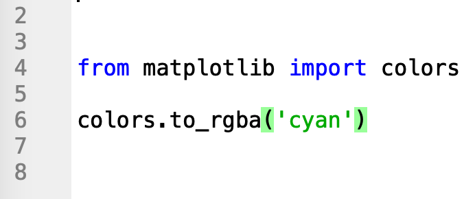
In Matplotlib ...

You can get the RGBA representation of a color with the to_rgba() function.

#Python #pythoncode #datavisualization
You'll notice that the output of to_rgba is a tuple with four floats: (%red, %green, %blue, alpha)

#Python
In RGBA, the alpha channel represents the opacity of the color, where:

– 0.0 is fully transparent
– 1.0 is fully opaque
Read 4 tweets
28 Dec
In Python, you can visualize images with the Plotly IMshow function.

🧵[1/8]

sharpsightlabs.com/blog/plotly-im…

#Python #pythonlearning #datascience #datavisualization
[2/8]

You can use Plotly IMshow for a few uses.

You can use it to plot heatmaps ...

But you can also use it to plot images.
[3/8]

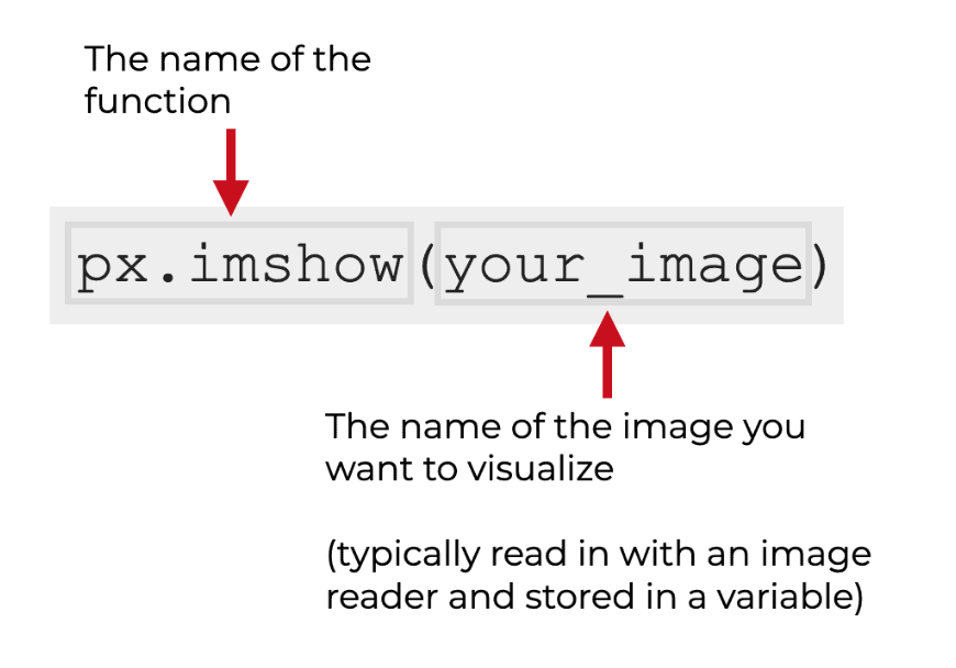
The syntax for Plotly IMshow is pretty simple.

You call the function as px.imshow and then provide the name of the image file you want to visualize.

(This assumes you've imported Plotly express as px)

#Python #pythoncode Image
Read 8 tweets
28 Dec
In Python ...

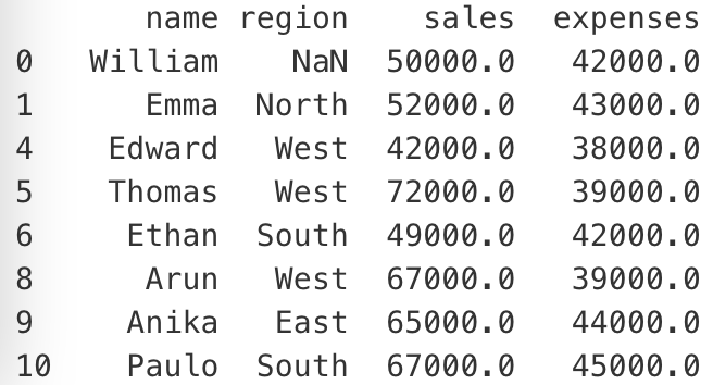
You can use the Pandas dropna method to drop rows with missing values.

#Python #pythoncode #datascience ImageImageImageImage
As seen above, you can limit dropna to specific columns with the 'subset=' parameter.

With 'subset=', you can specify the columns in which dropna will look for missing values

#Python #pythonlearning #datascience
If it finds missing values in any of those columns, it will drop the row.

But it will ignore missing values in other columns.
Read 6 tweets
28 Dec
In Python ...

You can use Numpy all to test conditions about the properties of a Numpy array.

#Python #pythoncode #datascience ImageImageImageImage
☝️

So for instance, in the example above, I test if all of the values are greater than 2, by column.

#Python
To do this, you need to know how np.all works ...

But you also need to know how to use axes.

#Python #pythonlearning
Read 5 tweets
31 Aug
The big thing that I'd change here is the color palette.

This color palette is hard to interpret and frankly, just look a little ugly.

#datascience #DataVisualization

[1/11]
[2/11]

The fix here is pretty simple.

The data are sequential in nature. There's a low and a high.

When you have sequential data, you should almost always look at sequential color palettes.

[3/11]

More specifically:

For sequential data, your go-to palettes should almost always be perceptually uniform sequential palettes like viridis or magma.

Read 11 tweets

Did Thread Reader help you today?

Support us! We are indie developers!


This site is made by just two indie developers on a laptop doing marketing, support and development! Read more about the story.

Become a Premium Member ($3/month or $30/year) and get exclusive features!

Become Premium

Too expensive? Make a small donation by buying us coffee ($5) or help with server cost ($10)

Donate via Paypal

Or Donate anonymously using crypto!

Ethereum

0xfe58350B80634f60Fa6Dc149a72b4DFbc17D341E copy

Bitcoin

3ATGMxNzCUFzxpMCHL5sWSt4DVtS8UqXpi copy

Thank you for your support!

Follow Us on Twitter!

:(