The big thing that I'd change here is the color palette.
This color palette is hard to interpret and frankly, just look a little ugly.
#datascience #DataVisualization
[1/11]
This color palette is hard to interpret and frankly, just look a little ugly.
#datascience #DataVisualization
[1/11]
https://twitter.com/Josh_Ebner/status/1432827174453661698

[2/11]
The fix here is pretty simple.
The data are sequential in nature. There's a low and a high.
When you have sequential data, you should almost always look at sequential color palettes.
The fix here is pretty simple.
The data are sequential in nature. There's a low and a high.
When you have sequential data, you should almost always look at sequential color palettes.
https://twitter.com/Josh_Ebner/status/1432483276791353351?s=20
[3/11]
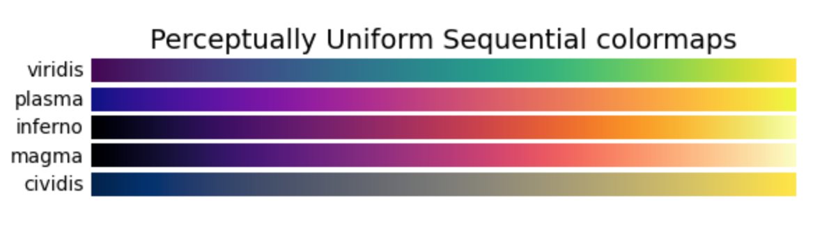
More specifically:
For sequential data, your go-to palettes should almost always be perceptually uniform sequential palettes like viridis or magma.
More specifically:
For sequential data, your go-to palettes should almost always be perceptually uniform sequential palettes like viridis or magma.
https://twitter.com/Josh_Ebner/status/1432483283435200516?s=20
[4/11]
In this particular case, I'd probably test out viridis, magma, and plasma ...
And see which one "pops"
Sometimes, you try a few out and one just looks great.
In this particular case, I'd probably test out viridis, magma, and plasma ...
And see which one "pops"
Sometimes, you try a few out and one just looks great.
[5/11]
Moreover, I'd probably reverse the orientation of the colors.
In the original seen above, 1790 is mapped to a bright color
And 2020 is mapped to black.
Moreover, I'd probably reverse the orientation of the colors.
In the original seen above, 1790 is mapped to a bright color
And 2020 is mapped to black.
[6/11]
Effectively, the orientation of the color mapping seen above highlights the older dates.
That might be fine if you want to tell a story about the places in the USA that demographically "peaked" a long time ago.
Effectively, the orientation of the color mapping seen above highlights the older dates.
That might be fine if you want to tell a story about the places in the USA that demographically "peaked" a long time ago.
[7/11]
But in my opinion the more interesting and timely story is about the places that are still getting demographically stronger right now.
But in my opinion the more interesting and timely story is about the places that are still getting demographically stronger right now.
[8/11]
To visually tell that story, you want to map your dark/desaturated color to the older dates.
And map the brighter or more saturated color to the recent dates.
To visually tell that story, you want to map your dark/desaturated color to the older dates.
And map the brighter or more saturated color to the recent dates.
[9/11]
Remember:
The color palette you choose and how you map that palette to your data will change the story you tell with your visualization.
#DataVisualization #data
Remember:
The color palette you choose and how you map that palette to your data will change the story you tell with your visualization.
#DataVisualization #data
[10/11]
Again ...
If you want to be great at "telling stories with data"
Then you need to understand how to use color palettes.
#DataVisualization #data
Again ...
If you want to be great at "telling stories with data"
Then you need to understand how to use color palettes.
#DataVisualization #data
https://twitter.com/Josh_Ebner/status/1432483263218692099?s=20
[11/11]
To learn more about data visualization and data science, follow me here: @Josh_Ebner
Almost every day, I post tutorials and threads about data science in R and Python.
#datascience #DataVisualization #Python #rstats
To learn more about data visualization and data science, follow me here: @Josh_Ebner
Almost every day, I post tutorials and threads about data science in R and Python.
#datascience #DataVisualization #Python #rstats
• • •
Missing some Tweet in this thread? You can try to
force a refresh