
Estimates of minimum % Canadian population infected since start of Omicron wave (Nov 15)
Take home:
🔵Min 2% pop likely infected by Dec 30
🔵Case burden similar in most regions
🔵Any differences erased in days by exponential growth
🔵Most important region to watch: Quebec
🧵
Take home:
🔵Min 2% pop likely infected by Dec 30
🔵Case burden similar in most regions
🔵Any differences erased in days by exponential growth
🔵Most important region to watch: Quebec
🧵

The sheet here shows numbers of tests, cases, % test positivity, tests conducted/1,000 population, new cases/1,000 people from Nov 15 (day Omicron first identified in Canada) to Dec 30.
Collated official data come from @covid_canada dashboard, run by Saskatchewan volunteers FYI
Collated official data come from @covid_canada dashboard, run by Saskatchewan volunteers FYI

@covid_canada Something that's very important to know about the Omicron wave is that some provinces have scaled up testing in proportion to need, until becoming overwhelmed recently. Many did not.
@covid_canada If you look at the sheet, you can see that Quebec has conducted 2X more tests/capita than any other Canadian region since Nov 15, and its overall % test positivity is lower than the national average.
Huh? Isn't QC doing worse than everywhere else?
No.
Huh? Isn't QC doing worse than everywhere else?
No.

Because Quebec has conducted a lot more testing per capita, it's identified a lot more cases than most other provinces.
Test positivity since Nov 15 is also higher than QC for every province west of Quebec, plus the Yukon, Northwest Territories and New Brunswick.
Test positivity since Nov 15 is also higher than QC for every province west of Quebec, plus the Yukon, Northwest Territories and New Brunswick.

You can adjust the number of new per cap cases in every region by per cap testing rate to estimate the number of new cases that would likely have been identified if testing was conducted at QC's per cap rates.
These are the pale orange/yellow columns on the left in this image.
These are the pale orange/yellow columns on the left in this image.

You can also adjust the new per capita cases by test positivity rate for provinces with higher % positivity than QC (4%) to estimate number of new cases if enough people had been tested to give the same overall % positivity observed in QC.
See pinky-orange columns.
See pinky-orange columns.

What we really want to know is what is the minimum percentage of the Canadian population (and individual regions) that has been infected since Nov 15.
Why? Because if we know this and the Omicron doubling time, we can estimate roughly when 100% of population could be exposed.
Why? Because if we know this and the Omicron doubling time, we can estimate roughly when 100% of population could be exposed.
We'll never reach 100% infection (I'll talk more about that on another day), but we can definitely reach at least 50% infection. Everything depends on how fast we get there, and how much time we can buy to get other protective measures in place.
FYI, the Omicron doubling time is 1-3 days in most countries, 3 days for the most recent (Dec 22) Ontario estimate before holiday testing and reporting problems plus extreme testing shortages made it almost impossible to know what's happening.
OK, what's the best way to estimate the minimum % of the Canadian population that has been infected from Nov 15 to today?
It's clear the new cases/capita identified by each province cannot be taken at face value, and that Quebec per capita case numbers are likely most reliable.
It's clear the new cases/capita identified by each province cannot be taken at face value, and that Quebec per capita case numbers are likely most reliable.
In the white columns to right of the pink columns I show the minimum % of the population in each region that has likely been infected as a range: from the % estimated by correcting to the QC test positivity rate, to the % estimated by correcting for QC per cap testing rate.

The midpoints of these ranges are shown in column M. I calculate the avg of these midpoints, 95% CI etc to get an idea of which provinces are statistically similar to others. It's kind of crude, but good enough.

You can see that BC, NWT, NS, ON, QC, SK likely all have had the same per capita burden of cases since November 15.
AB, MB, NB, YK burden may be 50% higher than national average, but with exponential growth most other provinces will have same per cap burden in 1-2 days.
AB, MB, NB, YK burden may be 50% higher than national average, but with exponential growth most other provinces will have same per cap burden in 1-2 days.
NL, PEI and Nunavut have a per capita burden about 50% lower than the national average, but again, if they experience exponential spread in a few days they'll be at the same point as other regions are today.

The most important take-home:
1. No matter where you live, assume your region is experiencing what QC is experiencing or will soon, even if you don't see it in your provincial data.
2. To understand what is happening or may happen soon, watch Quebec.
I keep saying this. Why?
1. No matter where you live, assume your region is experiencing what QC is experiencing or will soon, even if you don't see it in your provincial data.
2. To understand what is happening or may happen soon, watch Quebec.
I keep saying this. Why?
First, as we described in an earlier excess mortality report, in 2020 Quebec conducted a lot more testing per capita and per case than most Canadian regions, and Canada in general tested 2X less than our international peers.
rsc-src.ca/en/covid-19-po…
rsc-src.ca/en/covid-19-po…
Second, all excess mortality in QC to end of Nov/20 was accounted for by reported C19 deaths, but ~50% of C19 deaths outside QC were likely undetected and/or not reported provincially. Some of these are now showing up in the national mortality database, but that's another story.
Third, the % of expected C19 hospitalizations, ICU admissions and deaths that are reported provincially can be estimated for provinces that report detailed, cumulative case numbers in each age group, using OECD age-specific infection fatality, hospitalization, ICU admission rates
You can find the sources for these rates in the methods section at the bottom of the sheet here:
docs.google.com/spreadsheets/d…
docs.google.com/spreadsheets/d…
These rates are for the original SARS-CoV-2 strain, which was "milder" than Delta, and probably similar to or slightly "milder" than Omicron. They're useful for estimating what may come next with Omicron, which is what the spreadsheet in the tweet above shows.
If you take the age-specific case numbers from Oct 1-Dec 15/20 for QC, ON, AB and BC (which report these data), and multiply these by corresponding age-specific OECD hospitalization, ICU admission and mortality rates, you get an approximation of expected severe outcomes.
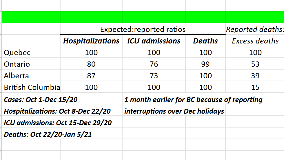
For hospitalizations, these expected numbers are compared to reported hospitalizations from Oct 8-Dec 22 (1 week lag). For ICU admissions, the lag is 2 weeks (Oct 15-Dec 29). For deaths, it's 3 weeks (Oct 22/20-Jan 5).
In general, Canada's hospitalization, ICU admission and mortality rates have historically been higher than expected based on what's been observed in OECD countries. This is likely at least partly because we prioritize testing of more severe cases.
To control for this, I calculate the % of expected severe outcomes that were reported for each province, then normalize these ratios to the ratios for QC.

As you can see below both QC and BC fully report hospitalizations and ICU admissions for the cases they detect. However hospitalization and ICU admission numbers in AB and ON are either incompletely reported (or possibly reported very late).

The problem with using BC data to monitor the day by day progress of the Omicron epidemic is that reporting in BC is VERY slow and typically delayed by 1-2 weeks, so it's impossible to use to understand what is happening with an epidemic where cases double every 3 days.
In addition, as you can see on the far right of this image, the % of toxic drug death-adjusted all-cause mortality that was accounted for by reported COVID-19 deaths in BC during Fall 2020 was only 15% (compared to 100% in QC), suggesting that BC missed quite a few C19 deaths.
Sorry. Here's the image.
You can also see that 53% and 39% of excess deaths in Fall 2020 were reported as C19 deaths in ON and AB. The report linked discusses this.
Basically, QC data are more complete and timely than other Cdn regions, probably not least because QC tests more.
You can also see that 53% and 39% of excess deaths in Fall 2020 were reported as C19 deaths in ON and AB. The report linked discusses this.
Basically, QC data are more complete and timely than other Cdn regions, probably not least because QC tests more.

Assume that wherever you live is just like Quebec, or will be in the next few days. Don't think your province is different, better or will magically escape what you see happening in Quebec.
Quebec just reports better and faster, and has since the beginning of COVID.
/fin
Quebec just reports better and faster, and has since the beginning of COVID.
/fin
• • •
Missing some Tweet in this thread? You can try to
force a refresh


