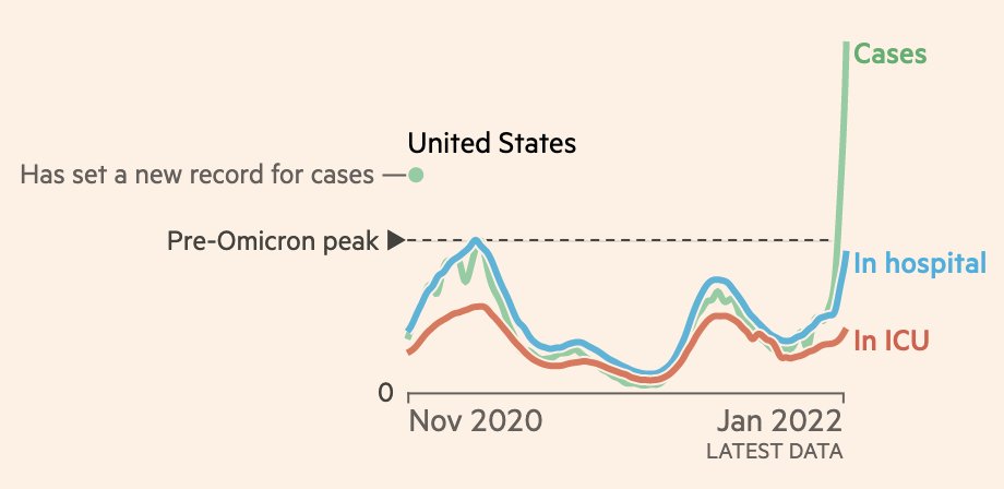
NEW chart for US Covid-watchers:

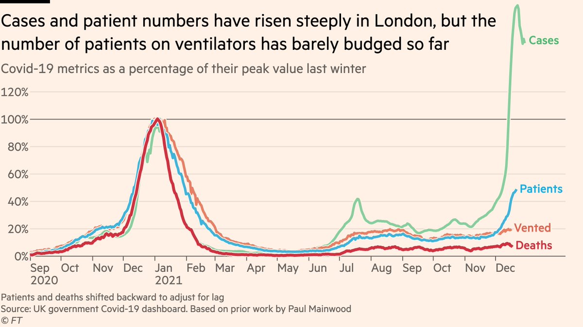
Key question with Omicron wave is whether severe disease — hospitalisations & ICU — decouples from cases.

In the UK it has, but there are signs the US decoupling is weaker, perhaps due in part to lower vax rates.

Track it here for every state:
Here’s a quick recap of how to read these charts:

Black dotted line is peak level for each metric before Omicron arrived.

Crossing that line means a new record has been set in recent days.

I’ve put a little coloured circle below the name of each state to indicate new records.
For example, almost all states in the north-east have set new records for cases in recent days.

New Jersey, Maryland and DC have also seen hospitalisations hit an all-time high, and the latter two are now also at record Covid ICU occupancy.
In Florida on the other hand, Delta wave was so fierce that relative to that, Omicron hospitalisations are so far less than half as high

But as you can hosp & ICU are still rising steeply. Anything close to Delta peak here would be a sign that the US is faring much worse than UK
Here’s the full graphic again for all states
And if you want to drill down into more detail on the precise hospital situation at the local level, I recommend this brilliant tracker from @bhrenton and @jeremyfaust
And for those wondering what I mean when I say lower vax rates in US than UK, it’s this:
Edit: error in the national-level ICU data on my United States chart. Shape was right, level was not.

Should look like the one of the left (incorrect version on right)

• • •

Missing some Tweet in this thread? You can try to force a refresh
 

Keep Current with John Burn-Murdoch

John Burn-Murdoch Profile picture

Stay in touch and get notified when new unrolls are available from this author!

Read all threads

This Thread may be Removed Anytime!

PDF

Twitter may remove this content at anytime! Save it as PDF for later use!

Try unrolling a thread yourself!

how to unroll video
  1. Follow @ThreadReaderApp to mention us!

  2. From a Twitter thread mention us with a keyword "unroll"
@threadreaderapp unroll

Practice here first or read more on our help page!

More from @jburnmurdoch

4 Jan
NEW: first thread of 2022 is an Omicron situation update, starting with a detailed look at UK hospitals, before going international.

Let’s start with severity, and the most important chart:

Despite steep rises in cases and patients, the number on ventilators has barely risen.
I’ve adjusted for lag between positive test and severe disease, so the divergence between patients and ventilated is a marked difference between this and previous waves when they were in lockstep.

The link between cases and severe disease has significantly weakened with Omicron.
We also continue to track "excess ICU pressure" — total number of people in ICU, for any reason, Covid or otherwise, compared to past winters:

Latest data show that the number of people in London ICUs has fallen in recent weeks, and is not following the same path as last winter.
Read 41 tweets
23 Dec 21
NEW: situation update from Gauteng, where cases, test-positivity and admissions are all now falling (no, this is not driven by testing capacity/behaviour or by migration).

Deaths and excess deaths still rising, but based on timing of peak will not come close to Delta levels.
Another way of looking at same data:

Cases climbed to 90% of their Delta peak, but admissions peaked at 50% and deaths will peak below 50%, demonstrating how immunity — both acquired since Delta, and differentially present among Omicron cases — reduces rates of severe disease.
As ever, a big thanks to the brilliant people at @nicd_sa who make this data available, and to the likes of @lrossouw and @tomtom_m who have consistently been providing invaluable data and commentary from South Africa.
Read 4 tweets
23 Dec 21
NEW: weekly breakdown of hospital patients being treated *for* Covid vs those *with* Covid as an incidental finding is out.

Here’s London:

Though incidentals are still rising at unprecedented rates, there is also a clear and steep rise in patients being treated for severe Covid
Comparing the current rise to the Delta wave side-by-side, we can see that although there are far more "with, not for Covid" incidentals this time around, the number of patients being treated for Covid is rising faster than it did in the summer
But the summer Delta wave never came close to overwhelming the NHS, so key question is how this stacks up vs last winter

Numbers still well below last Christmas, and recent uptick is clearest on a log scale. Long way to go to approach Alpha wave, but direction of travel is clear
Read 9 tweets
22 Dec 21
Thread summarising all of today’s Omicron severity data:

Story from me, @mroliverbarnes and @rmilneNordic, running through new data from South Africa, Denmark, England & Scotland ft.com/content/19065f…

Top-line: share of Omicron cases requiring hospital is lower than for Delta
Critical first caveat: this is *not* comparing Omicron now to Delta waves months ago.

This is comparing Omi vs Delta in the same populations, at the same time.

So we’re not just saying "Omicron appears less severe because loads of people got vaxxed/infected in recent months".
So, what do the studies show?

In all four countries, the share of Omicron cases that require hospitalisation is lower than the share of Delta cases, after adjusting for age, sex, underlying health conditions etc (but not adjusting for vax/infection: more on this in a sec)
Read 20 tweets
21 Dec 21
Some quick thoughts about the important new paper out of South Africa looking at Omicron severity medrxiv.org/content/10.110…
1) Study finds that controlling for time period, Omicron cases markedly less likely to be hospitalised
To me this is two things:
• "The @nataliexdean point": Omi’s immune evasion means lots of mild cases in people w/ good protection against severe disease
• And there may also be some innate reduction in severity at work here (but we don’t know yet)
Read 9 tweets
19 Dec 21
For no particular reason ...

A Sunday thread highlighting just a tiny sample of the brilliant women whose tireless work has shaped my understanding of Covid-19
To kick off, who else but @chrischirp — staggeringly clear, accessible science communication throughout the pandemic, sharing critical data and charts virtually round the clock! Half the time I'm scrambling to catch up with my own work
@nataliexdean — creator of some of the most powerful, accessible visual communication on Covid that I've seen, certainly far more effective than anything of mine! Just consistently outstanding
Read 23 tweets

Did Thread Reader help you today?

Support us! We are indie developers!


This site is made by just two indie developers on a laptop doing marketing, support and development! Read more about the story.

Become a Premium Member ($3/month or $30/year) and get exclusive features!

Become Premium

Too expensive? Make a small donation by buying us coffee ($5) or help with server cost ($10)

Donate via Paypal

Or Donate anonymously using crypto!

Ethereum

0xfe58350B80634f60Fa6Dc149a72b4DFbc17D341E copy

Bitcoin

3ATGMxNzCUFzxpMCHL5sWSt4DVtS8UqXpi copy

Thank you for your support!

Follow Us on Twitter!

:(