As anticipated, the ONS infection survey, jewel in the crown of the UK’s pandemic surveillance efforts, is expected to be continued beyond this spring, though in a slightly scaled-down form.
Exact details of this downsizing will be critical to the question of how good a surveillance tool the survey remains, but it’s certainly possible to significantly reduce the number of households taking part while still having good quality, representative estimates of prevalence.
More good news: this may soon be supplemented with similar efforts from other countries.
Spain has published documents outlining proposals for its own sentinel testing programmes, which would monitor prevalence of not only Covid but also flu and RSV isciii.es/QueHacemos/Ser…
A few people responding to my chart of Covid’s falling IFR with "how do you know it fell because of vaccines, and not natural immunity?"
Here’s IFR overlaid on immunity levels via vax vs via infection. Spot which source of immunity rockets just as IFR collapses... 🧐
The period from Jan to July 2021, when IFR plummets almost 10-fold from 1.3% to 0.15%, coincides perfectly with vaccine rollout going from 0 to 90%.
During same period, share of adults who’d had Covid inches up from 20% to 25%. Not nothing, but tiny in comparison to vaccination.
To be clear: as I’ve written many times, infection-acquired immunity played a significant role in building England’s immunity wall, esp in second half of 2021, but steep drop in IFR during first half of the year was very clearly primarily due to vaccines
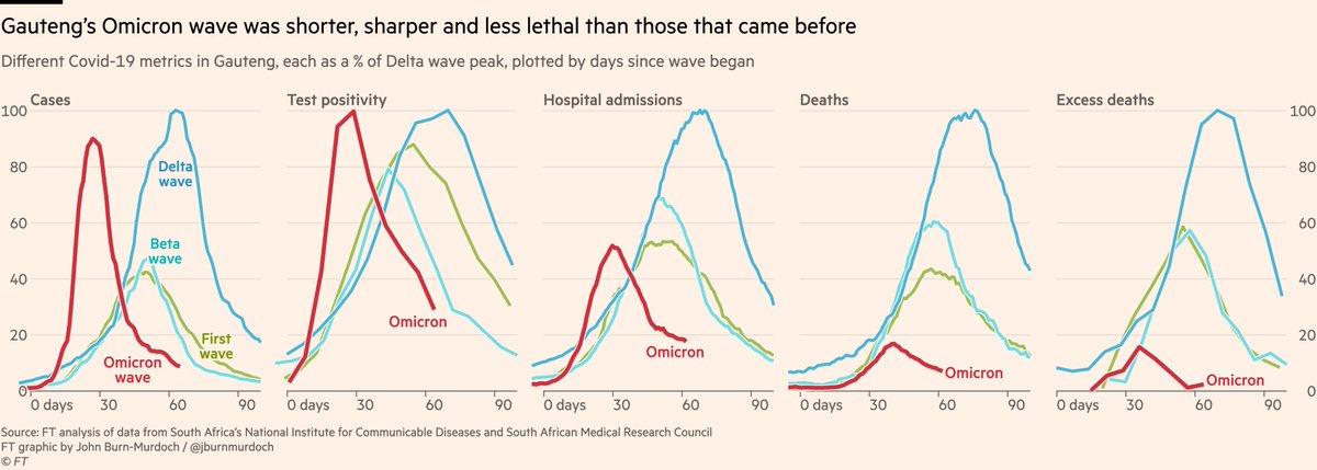
The steepness of Omicron’s rise and fall in South Africa really is something to behold.
Here’s Gauteng first, where it all began.
Cases, test positivity, admissions, deaths and excess deaths too all down almost as steeply as they rose, and in much less time than past waves.
We’ve all got used to comparing the height of "new daily x" charts over the last couple of years, but at the end of the day it’s not just wave height but also wave duration that determines the ultimate toll on public health, so it’s worth looking at each wave cumulatively...
And here we are:
*Daily* cases peaked close to Delta, but shorter wave means total cases much lower
With more acute outcomes it’s striking:
• Less than 40% as many hospitalisations
• 10% as many deaths, and excess deaths lower still
Lots of people asking if UK cases are really falling, or have we just exceeded testing capacity or seeing effect of the pause in requiring confirmatory PCRs
By comparing ONS infection survey to dashboard cases, we see the trends match. The fall in cases in recent days is real ✅
There is of course some variation, e.g prevalence in Yorkshire still climbing when reported cases began falling, but even there we clearly see a slowdown in ONS series, and looking across all regions it’s clear that those minor discrepancies are the exceptions that prove the rule
On top of that, new cases in hospitals — where testing capacity is certainly not limited — are flat or falling in all UK nations & regions, with that peak coming a week or so after cases turned, exactly as expected. Absolutely zero reason not to trust that infection peak is real.
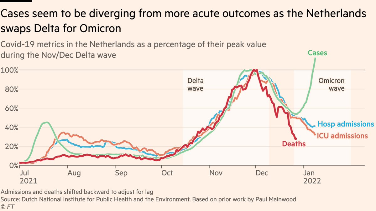
The Netherlands is one of the most interesting places for tracking the divergence of cases from more acute outcomes as Omicron takes over
Timing of its winter Delta wave meant numbers rose *and fell* before Omicron took off, so any rise now can reasonably be attributed to Omi
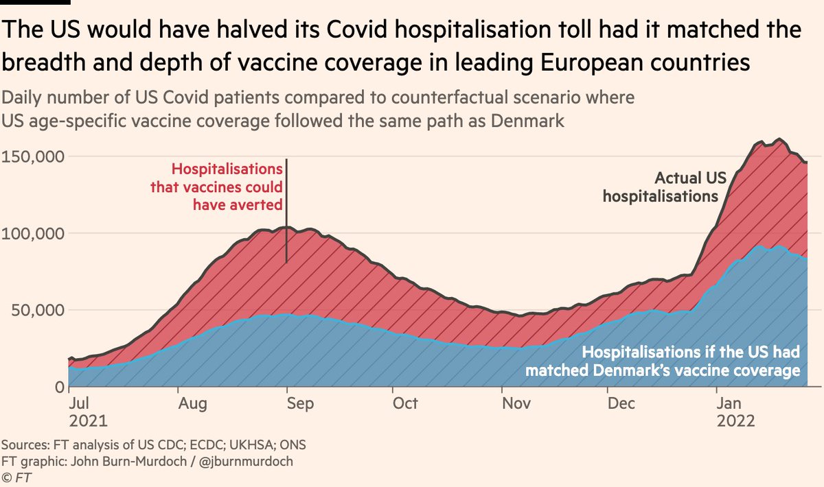
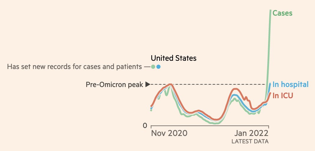
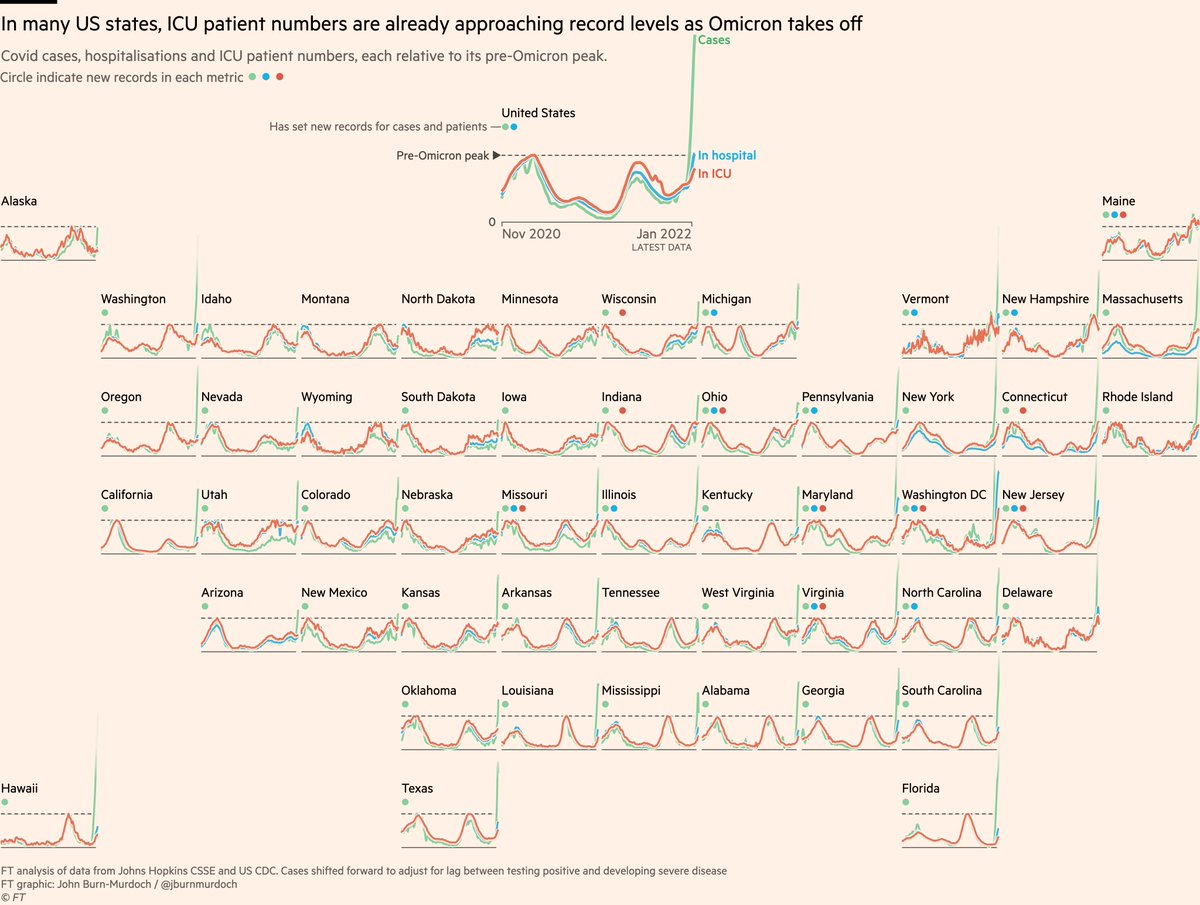
This is in contrast to places like the US where Omicron is piggy-backing on top of a fierce winter Delta wave, making it tricky to know whether it’s Omicron or Delta that’s sending hospitalisations ever higher