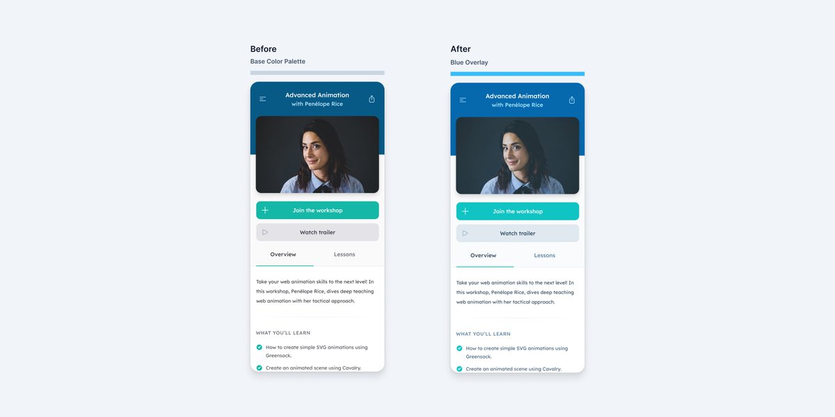
💡 An experiment you can try on your next web/app project to get a more interesting color palette is color grading your design.
🧵
🧵

[1/6] To try this, it will be easier to experiment if your design is finalized with your color palette defined up front.
I’m using @tailwindcss colors here but we talk about building a color palette in this Refactoring UI chapter:
refactoringui.com/previews/build…
I’m using @tailwindcss colors here but we talk about building a color palette in this Refactoring UI chapter:
refactoringui.com/previews/build…

[2/6] Once you’re satisfied with your design, in your design tool (I'm using Figma), draw a rectangle layer on top covering the entire design.
Experiment by changing the layers colors, blending modes and opacity — I find it’s best to keep things subtle by using a low opacity.
Experiment by changing the layers colors, blending modes and opacity — I find it’s best to keep things subtle by using a low opacity.
[3/6] Once you’re happy with the results, overlay a layer with the same color/blending mode/opacity values on top of your already defined color palette and sample the new hex values with the eye dropper to create your new color palette.
[4/6] If you’re working with images, you can also add a colored layer with reduced opacity on top to give it a similar tint as the rest of the design.
HT to @hanspagel for this idea 🙌
HT to @hanspagel for this idea 🙌

[5/6] Just experiment!
The results may be subtle depending on the original palette and adjustment levels you made, but the overall effect may add a bit more emotion to your design and make things feel more “glued” together.
The results may be subtle depending on the original palette and adjustment levels you made, but the overall effect may add a bit more emotion to your design and make things feel more “glued” together.

[6/6] Overall, this is a pretty basic method and you might get more interesting results by using Photoshop and working with the adjustment layers. @JustinMezzell goes more in depth on that technique in this article he wrote that inspired this thread:
medium.com/@JustinMezzell…
medium.com/@JustinMezzell…
• • •
Missing some Tweet in this thread? You can try to
force a refresh


