
TECHNICAL CHARTS
This thread contains all the basic knowledge about charts used in technical analysis
#technicalanalysis #charts
This thread contains all the basic knowledge about charts used in technical analysis
#technicalanalysis #charts
1/ Charts
A stock chart is a central tool for technical analysis which provides a graphical representation of the price movement, either historical or live, of a security over a specific period of time. In a price-time series chart, price is plotted on y-axis and time on x-axis
A stock chart is a central tool for technical analysis which provides a graphical representation of the price movement, either historical or live, of a security over a specific period of time. In a price-time series chart, price is plotted on y-axis and time on x-axis
2/ Practical Efficacy of Chart
There are three premises of the technical approach:
Price discounts everything
Price moves in trends
History repeats itself
There are three premises of the technical approach:
Price discounts everything
Price moves in trends
History repeats itself
All of them can be conveniently validated through the lens of charts.
The technical approach claims that market action discounts everything. The technician can observe the effect of key events on the price of a security by simply observing the price action on the chart.
The technical approach claims that market action discounts everything. The technician can observe the effect of key events on the price of a security by simply observing the price action on the chart.
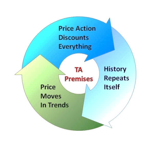
The technician can easily identify up, down or sideways trend of the security by observing the price action on the chart and hence validates the second premises which states that the price moves in trends.
Identifying price patterns on a chart is practically more efficient and it provides the evidence of reoccurrence of price patterns, which validates the third claim that history repeats itself.
Besides that, it’s also possible to analyze the performance of the security relative to the overall market as well as against the mother sector to which that security belongs.
Charts help in making approximations about the future price projections
Charts help in making approximations about the future price projections
3/ Arithmetic Vs Log Charts
Most new traders get confused when it comes to arithmetic and log charts. These charts have some basic differences which make them useful for short term and long term analysis
Most new traders get confused when it comes to arithmetic and log charts. These charts have some basic differences which make them useful for short term and long term analysis
Arithmetic charts also known as linear scale charts display the absolute value and represent the price at equal vertical distance on vertical axis.
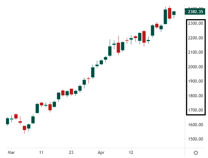
For example,the 100point progress on the daily chart of Adani Enterprises is represented as the same distance throughout the chart. When the stock moved from say 1700 to 1800 the distance on the vertical axis will be the same when the stock moved from 2000 to 2100 or 2100 to 2200
On the other hand, Log charts measure the movement of an instrument in percentage term. For example, in the Adani Enterprises log chart a 4.04% move is represented as equidistant throughout the chart.

The movement of the price from 1485 to 1545 represents the same %age points as that of the move from 1545 to 1605 or 1605 to 1685 and so on. Notice that the distance in absolute numbers is not the same on the scale but %age is the same
Traditionally, arithmetic charts are used for short-term price movements and the log charts to accommodate long-term price changes.
4/ Major Forms of Charts
In this section, we are going to discuss only the most popularly used types of charts. It does not mean at all that the other types are not useful. It all depends upon the trader’s personal preference and the trading timeframe.
In this section, we are going to discuss only the most popularly used types of charts. It does not mean at all that the other types are not useful. It all depends upon the trader’s personal preference and the trading timeframe.
The major types discussed below are the bar charts, candlestick charts, point and figure charts, and Renko charts.
5/ Bar Charts
Bar charts are the most widely used type of charts. It requires open, high, low and close data of a security to plot a vertical bar chart.
Bar charts are the most widely used type of charts. It requires open, high, low and close data of a security to plot a vertical bar chart.

On a daily bar, the top and low of the bar represent the high and low of the day respectively. The tic on the left of the vertical bar represents the open price and the tic on the right represents the closing price of the day.
In order to draw one vertical daily bar of security, it would need an open, high, low, and closing price of one day. The data set of the next day will be used to draw the next vertical bar and so on.

Bar charts are very effective in accommodating more data (number of bars) on a chart due to less thickness of the bars. It keeps the presentation clearer and hence makes them ideal for identifying chart patterns.
6/ Candlestick charts
Candlestick charts are basically the Japanese variation of bar charts. With their 400 years of historical background, they have become very popular among traders and investors.
Candlestick charts are basically the Japanese variation of bar charts. With their 400 years of historical background, they have become very popular among traders and investors.
Like bar chart they also record four data sets namely, open, high, low and close. Candlestick charts are more colorful with thick candles and hence they are more appealing and easier to visualize.
In a candlestick chart if close of a candle is higher than the open, the candle colour would be green but in case the close is lower than the open, the colour of the candle would be red.

This colored portion of the candle is known as the ‘body’ of the candle. Projections at the top and bottom of the body are known as the upper and lower ‘wicks’. The top of the upper wick represents the high and the bottom of the lower wick represents the low of the day.
In a green daily candle, the lower and upper end of the body represents the open and close of the day respectively. While in a red candle the upper and lower end of the body represents the open and close of the day respectively.
Practically similar technical tools can be applied to the bar as well as candlestick charts. Even patterns like rectangles, flags, etc. would appear the same on both charts.

However, the specific candlestick patterns, such as, hammer, marubozu, hanging man etc. are more commonly associated with candlestick charts due to easier visualization.
“Japanese candlestick signals possess one major attribute that is not present in other technical systems” Stephen Bigalow.
7/ Point and Figure Charts
P&F technique of plotting charts is over 100 years old and was first introduced by ‘Hoyle’.
P&F technique of plotting charts is over 100 years old and was first introduced by ‘Hoyle’.
The P&F charts are unique in the sense that, unlike their counterparts, they only represent price and not time. Hence, they represent price against change in direction only.

These charts give little or no importance to insignificant price movements. Only those price movements are recorded that qualify a defined range known as Box Size.
The box size can be decided on the bases of either the ‘average true range’ of the security or any other specific value defined by the chartist. If the price moves up by one box range, an ‘X’ is plotted on the chart.
The second value to be set for plotting P&F charts is the Reversal Size which is usually kept 1 or 3. For eg. with a 1 box reversal, an O will be plotted in the next column for one box down move. Any price movement that is less than the box size will not be plotted on the chart
The major advantage of these charts is that they filter out the noise and give a clearer picture of the trend. On the Asian Paint P&F chart shown in the figure, we can clearly see how support, resistance, and breakout levels are visually easier to spot on these charts.
8/ Renko Charts
Renko and P&F charts are alike in the sense that both are plotted independently of time. The Renko charts derived their name from the Japanese word ‘renga’ which means brick. The price is represented in the form of bricks.
Renko and P&F charts are alike in the sense that both are plotted independently of time. The Renko charts derived their name from the Japanese word ‘renga’ which means brick. The price is represented in the form of bricks.
Each successive brick is plotted, either up or down, at an angle of 45 degrees to its previous brick in the next column. So, there will be only one brick in one column. In these charts too, the size of the brick is either defined by the chartist or is automatically set to ATR
As long as the price remains within the range of its previous brick, no new brick is plotted on the chart. A new brick is formed when the price moves outside the range of its previous brick.
For example, if the brick size is set to 5, a new brick will be plotted when the price moves either up or down by 5 points.

A brick may take any amount of time to get formed. It may take hours in some cases while in other cases it may be formed in minutes. Generally, an up brick is plotted with green color and a down brick with red color.

Besides discovering trend, these charts also help in riding the trend and hence prevent a trader from early exits. For example, a very clear trend can be seen on Tata Steel weekly Renko chart.
No red brick is formed between 23 March 2020 and 09 August 2021 time period, which offers the trader an excellent opportunity to stay in the trade until there is a trend reversal with red bricks.
9/ Concluding Remarks
Charts are indispensable tools for a technical trader or investor. They are the record keepers of a particular stock or the market indices. Charts in addition to other tools help in stock picking and making other trading decisions.
Charts are indispensable tools for a technical trader or investor. They are the record keepers of a particular stock or the market indices. Charts in addition to other tools help in stock picking and making other trading decisions.
We know that timing a trade is an important principle of a technical approach. With the help of charts, a chartist can evaluate high probability stock patterns having favorable risk to reward ratio and hence time his trades well.
Besides representing the activity of a security in any timeframe, charts also reflect the strength and weaknesses of a security in relation to the overall market.
Trend is the traders’ friend and the stock charts can keep a trader away from the non-trending phases while helping in riding the trending phase
That’s it for today
Like and retweet for our wider reach
Stay tuned @finkarmaIN for such threads in the coming days
Thanks for reading
Like and retweet for our wider reach
Stay tuned @finkarmaIN for such threads in the coming days
Thanks for reading
• • •
Missing some Tweet in this thread? You can try to
force a refresh


