1. As we approach the grim marker of #COVID19 #deaths in the US, but hopefully have much brighter days ahead, I looked at the most current NCHS data thru May 7.
Below are age-adjusted COVID-19 mortality rates by state, with rankings and state comparisons to the national total.
Below are age-adjusted COVID-19 mortality rates by state, with rankings and state comparisons to the national total.

2. Here's what those data look like by year. Obviously some dramatic diffs depending on time of the surge.
Many of the NE states had comparatively higher rates in 2020 (NY, NJ, CT, MA) due to the early pandemic surge, whereas the SE was hit hard in 2021 with a bad delta surge.
Many of the NE states had comparatively higher rates in 2020 (NY, NJ, CT, MA) due to the early pandemic surge, whereas the SE was hit hard in 2021 with a bad delta surge.
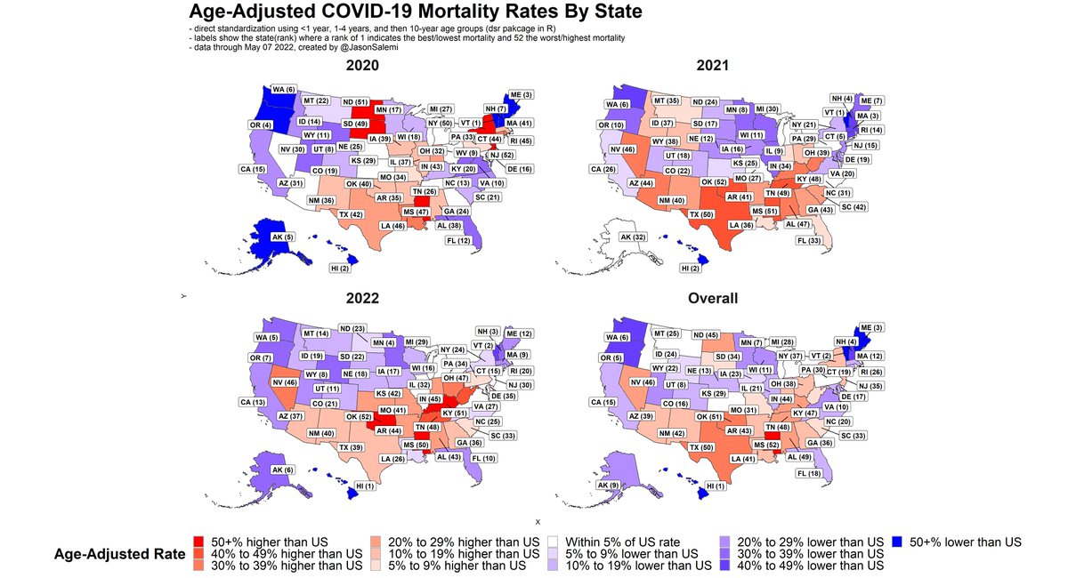
3. Below are age-specific mortality rates by age group. States can have very different results depending on the age group in question.
For example, #Florida is in the top 10 (best) for people 75 or older, but have comparatively worse rankings for younger age groups.
For example, #Florida is in the top 10 (best) for people 75 or older, but have comparatively worse rankings for younger age groups.

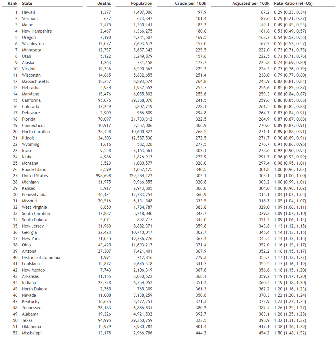
4. Some raw numbers are below.
This only touches on mortality in which #COVID19 was a documented cause of death. Does not touch on other serious outcomes.
And this only adjusts for age and there are many other factors that can make state comparisons still apples to oranges.
This only touches on mortality in which #COVID19 was a documented cause of death. Does not touch on other serious outcomes.
And this only adjusts for age and there are many other factors that can make state comparisons still apples to oranges.
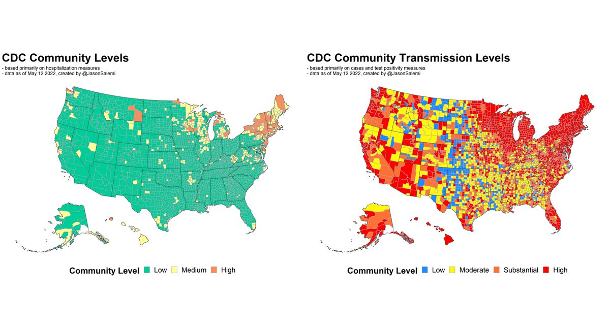
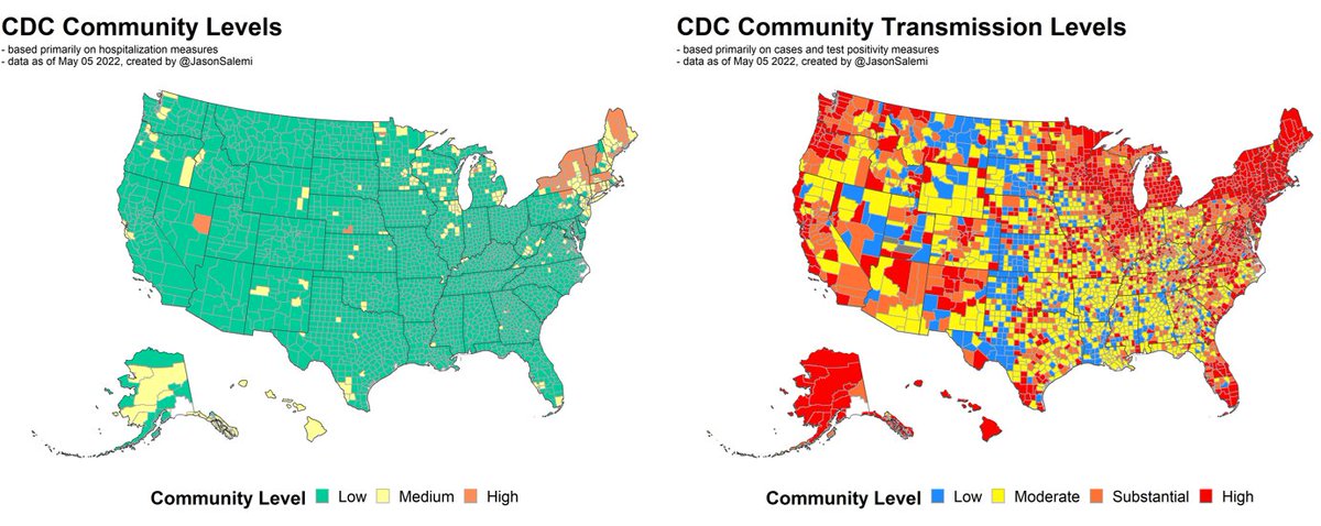
I plan to look at the most recent all-cause excess death data in the near future - as well as our updated hospitalization data and community levels.
Until then, this is a great thread about excess deaths, from @astokespop.
Until then, this is a great thread about excess deaths, from @astokespop.
https://twitter.com/astokespop/status/1522207008987877378?s=20&t=OiLE_W88Z5o80jXk-VtoWA
• • •
Missing some Tweet in this thread? You can try to
force a refresh