1. I'm still waiting for an update of the Community Transmission levels needed to run my typical risk levels analysis, but here's where we'll be with the hospital-based measures.
2. Here's how things have changed from last week.
Blue is improvement
Red is worsening
Gray is no change
3. Another way of looking at the change in levels from last week
When speaking with NPR last week, I said the plateauing of hospitalizations for 3 weeks made me feel like a downturn was coming.
In FL, the data are suggestive of improvements in the # of people being hospitalized w/ COVID.
1/
The state-specific trends in the COVID hospital census since June 1 also suggest we are seeing a recent decrease in FL (dk purple), the US as a whole (black), and a number of states.
Yes, FL still has among the highest rates, but we also have one of the oldest populations.
2/
If we indeed see a prolonged decrease in COVID hospitalization census, many of the largest states, who have been below previous pandemic years, will start their decrease right as they approach (but do not exceed) 2022 rates.
Sorry for the delay everyone, a lot going on personally. But I have modified my dashboard to accommodate the CDC reporting changes.
My site focuses on: 1) Hospitalization-based county risk levels 2) Detailed hosp trends 3) Deaths
with links out for wastewater, variants, vax
1/
The "Risk Indicators" page is similar to the older page, but the data upon which indicators are based has changed. There are no longer "risk levels" and "transmission levels", rather levels based exclusively on "confirmed" COVID hospital admission rates over the prior 7 days.
2/
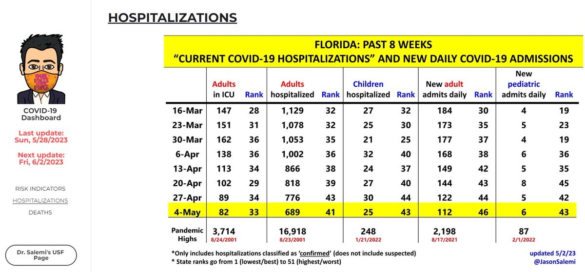
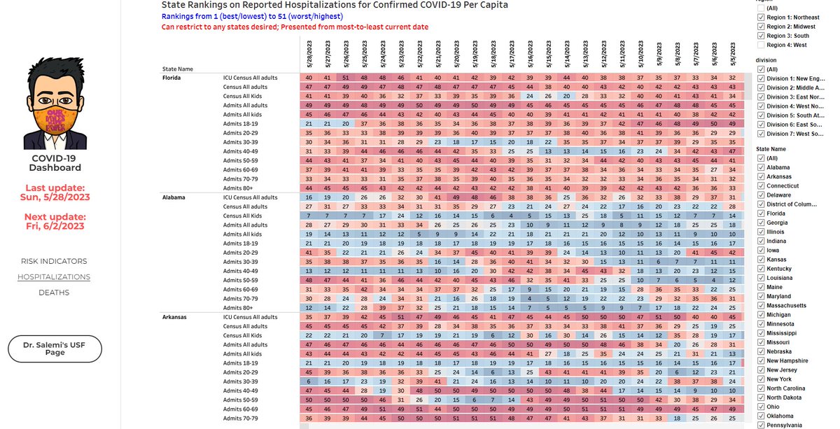
The "Hospitalizations" page has not changed much. Still starts out with a Florida-centric look and then gives a lot of state- and age-specific census and admission numbers, rates, and rankings.
It's been a while since I've done a #COVID update.
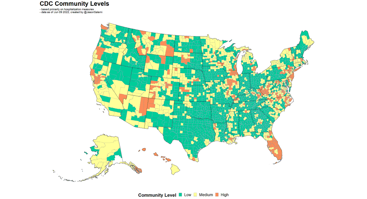
These are national weekly @CDCgov "community levels" based primarily on hospitalization rates.
This past week has been the "best" since April of last year with <1% of the population living in a high-level county.
1/
Of course, this comes with the following caveats according to the CDC, with likely underestimation of levels in Hawaii and Mississippi, and overestimation in several counties in Georgia and Arizona.
2/
Transmission levels are likely to be grossly underreported, but as we look at them over time, are showing modest improvement (LEFT).
This is in agreement with the regional wastewater monitoring data, which also shows improvements over the last 6 weeks (RIGHT).
2/ Below are adult inpatient hospital census rates for each state since May 1, 2022. Only "confirmed" (as opposed to suspected) COVID hospitalizations are included.
The orange and red coloring suggests recent increases over the past week.
3/ But for context, below are the inpatient census stats for adults throughout the pandemic - for most states, we remain well below the worst parts of the pandemic (not that that should be the bar we are trying to avoid).
2/ Clearly, part of our genomic surveillance efforts are to have TIMELY information when more concerning variants are increasing in relative prevalence. In this case, it appears we lost some time (I was wondering why those variants were not yet showing up).
3/ BUT, I don't tend to jump to an accusation of something nefarious.
The beginning of the footnote states that variants circulating <1% are grouped into "other".