Albert Rapp Profile picture
Aug 11 9 tweets 5 min read
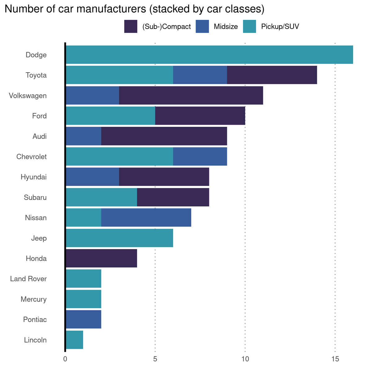
Forget regular heat maps. Use bubbles on a grid instead 🔵 🟢 🤯

A short #dataviz thread 🧵 🧵

#rstats #ggplot2

1/8 Image
Regular heat maps have the crucial flaw of not showing how much samples were used. 🤔

That's totally fine when the different sizes are shown (e.g. with colors). It's what I did with my calendar plot a while back (special heat map)


2/8
But look what happens when I use a color gradient for a summary statistic.

Here, I try to show a relationship between sale price of a house and a property's size + location.

This looks right. But it isn't. Some medians were estimated with ridiculously small samples. 😱 💔

3/8 Image
Bubble charts make sample sizes obvious.

So, let use bubbles. They have the power to reveal that some medians were based on really small samples.

Crisis averted! 😤 But we can make this even more explicit 👌

4/8 Image
Since we use circles instead of rectangles, we have a bit of room to spare.

We can use that room to double-code the information with text labels. This will make the sample sizes REALLY obvious.

We could even add labels for the medians (if it's not too much clutter for you)

5/8 ImageImage
Want to know how to create these visuals with ggplot?

My new blog post tells you how. But I will give you the main actors right here in this thread.

albert-rapp.de/posts/ggplot2-…

6/8
Bubbles ▶️ geom_point()
Correct bubble size ▶️ scale_size_area()
Pretty labels ▶️ custom string manipulation
Customization of colorbar ▶️ guides()

Heat maps ▶️ geom_tile()
Labels right next to tiles ▶️ coord_cartesian(expand = F)

7/8 ImageImage
Did you enjoy this thread? I hope you did. For more content like this follow @rappa753

Also, please do me a favor and like or retweet the first tweet below. This would help me generate a little bit more engagement for my content 😊

8/8
Want to see even more content like this? Check out my biweekly newsletter.

Every other week I talk about
📈 dataviz,
🌐 Shiny
🧮 statistics.

And it's completely free! alberts-newsletter.beehiiv.com/subscribe

• • •

Missing some Tweet in this thread? You can try to force a refresh
 

Keep Current with Albert Rapp

Albert Rapp Profile picture

Stay in touch and get notified when new unrolls are available from this author!

Read all threads

This Thread may be Removed Anytime!

PDF

Twitter may remove this content at anytime! Save it as PDF for later use!

Try unrolling a thread yourself!

how to unroll video
  1. Follow @ThreadReaderApp to mention us!

  2. From a Twitter thread mention us with a keyword "unroll"
@threadreaderapp unroll

Practice here first or read more on our help page!

More from @rappa753

Aug 14
This is a🧵🧵 about small steps you can take to learn #dataviz.

It's mainly a collection of things I wish I had known when I started learning. (And it comes with many resources)
I used to get stuck trying to create something "big". But building a dataviz from scratch is waaay too much effort at first.

Learning just 1 new trick, that's doable.

Baby steps. They're not as exciting as a flashy new viz. But they're motivating bite-size chunks of success.
1 // Data

First you need data.

Don't overthink what may be exciting or not. Just grab this week's #tidyTuesday data set.

(There are advantages of using TidyTuesday data. I'll come to that next) github.com/rfordatascienc…
Read 13 tweets
Jul 27
💎💎🧵🧵
5 hidden gems from well-known #rstats packages to spice up your #dataviz game.

(with many code examples from the R twitter community)
1 // Bump charts

With {ggbump} it's easy to show rankings over time. Most of the heavy-lifting comes from its geom_bump() function.

Here's a nice example from @steodosescu.

Clearly, geom_bump() is the star of this package. But don't ignore its lesser-known helper functions.
1b // geom_sigmoid()

The smooth curved lines in bump charts are powered by geom_sigmoid().

You would think that this function is only a minor character in {ggbump} but NOOOOO! It's a hidden gem 💎.

Check out how @geokaramanis used it to create a stunning visual. 🤯
Read 19 tweets
Jul 10
The #rstats ecosystem makes splitting a stacked bar plot simple. 🥳 This way, comparing groups is sooo much easier! 👌🏽

✂️ Split stacked bars with facet_wrap()
🪢 Combine splits with totals via {patchwork}

Code: gist.github.com/AlbertRapp/cd8…

Details in thread 🧵
#dataviz
I picked up this trick of splitting bar charts from "Better Data Visualizations" by Jonathan Schwabish. amzn.to/3AEE4DB

I haven't finished the book yet but it contains many great nuggets of dataviz wisdom from page 1.

Now, let's implement this trick in ggplot.
The stacked bar plot can be created with geom_bar(). You will need to map the car classes to `fill`.

Here, I have used the mako color palette from {viridisLite}. I learned about this beautiful color palette from @c_gebhard today.
Read 9 tweets
Jun 18
Ever heard of logistic regression? Or Poisson regression? Both are generalized linear models (GLMs).

They're versatile statistical models. And by now, they've probably been reframed as super hot #MachineLearning. You can brush up on their math with this 🧵. #rstats #Statistics
Let's start with logistic regression. Assume you want to classify a penguin as male or female based on its

* weight,
* species and
* bill length

Better yet, let's make this specific. Here's a data viz for this exact scenario. It is based on the {palmerpenguins} data set.
As you can see, the male and female penguins form clusters that do not overlap too much.

However, regular linear regression (LR) won't help us to distinguish them. Think about it. Its output is something numerical. Here, we want to find classes.
Read 25 tweets
May 31
I am rebuilding my #rstats blog from the bottom up with #quarto. This will let me use quarto's cool new tricks like tabs and easy columns.

I've already spent hours using quarto's great docs to build a custom blog. If you want to do the same, let me show you what I did. ImageImage
Today, I will show you the first of many steps to your own quarto blog. First, create a new quarto blog project via RStudio.

Make sure to create a git repo as well. This lets you revert changes when you break your blog. You can follow along my repo at github.com/AlbertRapp/qua…
You can render your blog with `Render Website` from RStudio's `Build` tab.

The first easy changes happen in the `_quarto.yml` file.

1⃣ Set `theme: default`
2⃣ Name your blog via `title`
3⃣ Link your GitHub profile etc.

This will change the navbar at the top of your blog. ImageImage
Read 10 tweets
Apr 19
Last week, I held a short workshop teaching #RStats to Economics students without prior programming experience.

Here are 6 lessons I learnt that I wish I had known in advance.
1⃣ Do less.

An ambitious curriculum is usually my thing. But I did not anticipate how much time it would take to get students back on track.

Without any programming experience, students will get stuck in unexpected places. Plan to do less and you will feel less pressured.
2⃣ Teach through typing

I thought letting students literally type along was silly.

Well, I thought wrong. Having typed a code snippet themselves seemed to make students have a better feeling for the code. Later on during exercises, they were better at adjusting the code.
Read 9 tweets

Did Thread Reader help you today?

Support us! We are indie developers!


This site is made by just two indie developers on a laptop doing marketing, support and development! Read more about the story.

Become a Premium Member ($3/month or $30/year) and get exclusive features!

Become Premium

Don't want to be a Premium member but still want to support us?

Make a small donation by buying us coffee ($5) or help with server cost ($10)

Donate via Paypal

Or Donate anonymously using crypto!

Ethereum

0xfe58350B80634f60Fa6Dc149a72b4DFbc17D341E copy

Bitcoin

3ATGMxNzCUFzxpMCHL5sWSt4DVtS8UqXpi copy

Thank you for your support!

Follow Us on Twitter!

:(