This is a🧵🧵 about small steps you can take to learn #dataviz.
It's mainly a collection of things I wish I had known when I started learning. (And it comes with many resources)
It's mainly a collection of things I wish I had known when I started learning. (And it comes with many resources)
I used to get stuck trying to create something "big". But building a dataviz from scratch is waaay too much effort at first.
Learning just 1 new trick, that's doable.
Baby steps. They're not as exciting as a flashy new viz. But they're motivating bite-size chunks of success.
Learning just 1 new trick, that's doable.
Baby steps. They're not as exciting as a flashy new viz. But they're motivating bite-size chunks of success.
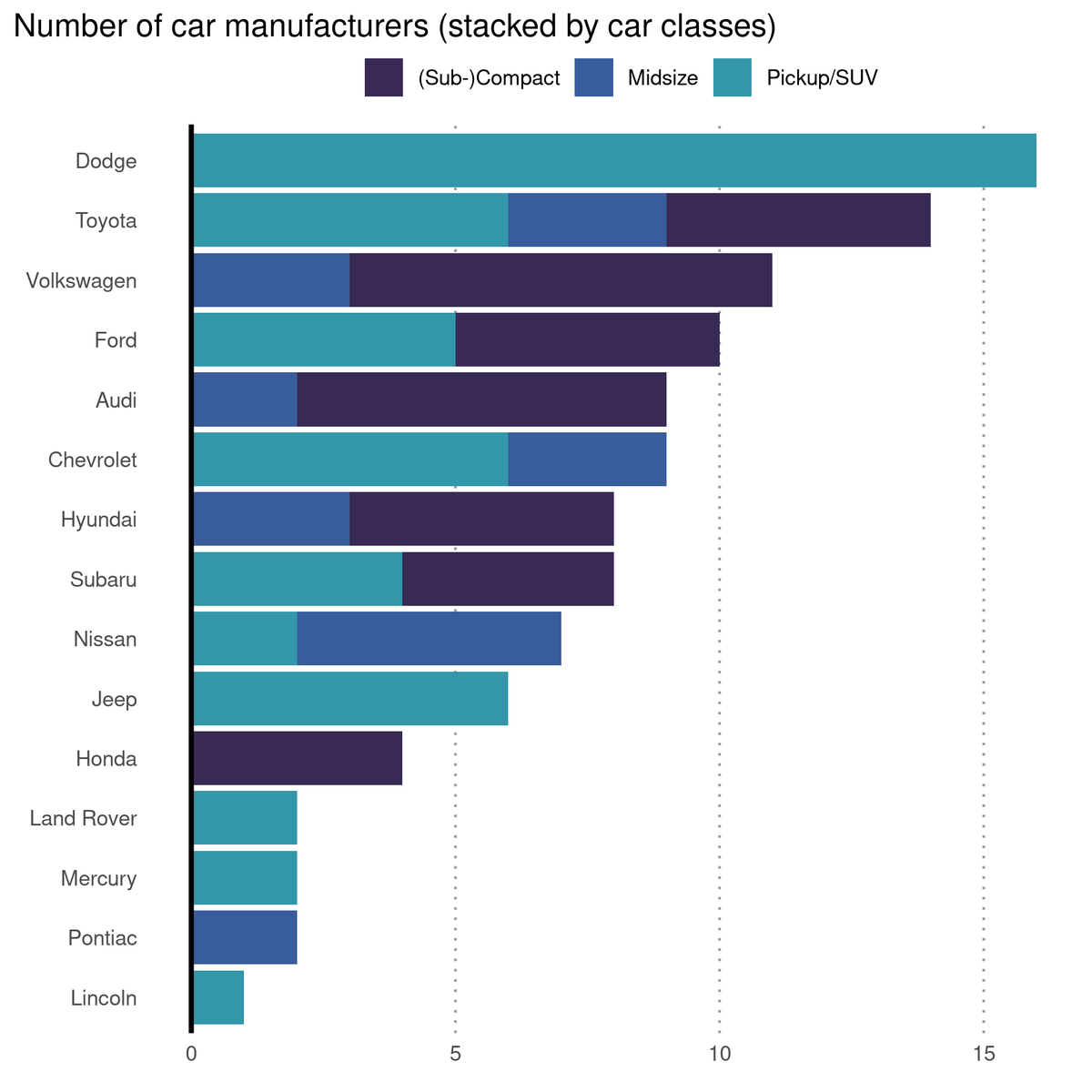
1 // Data
First you need data.
Don't overthink what may be exciting or not. Just grab this week's #tidyTuesday data set.
(There are advantages of using TidyTuesday data. I'll come to that next) github.com/rfordatascienc…
First you need data.
Don't overthink what may be exciting or not. Just grab this week's #tidyTuesday data set.
(There are advantages of using TidyTuesday data. I'll come to that next) github.com/rfordatascienc…
2 // Need help wrangling the data?
If you use tidyTuesday data, you can copy code from others. Check Twitter and use someone's code as a template.
There's no shame in copying code to learn.
If you use tidyTuesday data, you can copy code from others. Check Twitter and use someone's code as a template.
There's no shame in copying code to learn.
// Sidenote
Just so we're clear. I don't want you to take someone else's code and then claim that you've done all the work. That's stealing.
But there's a middle ground between stealing and learning bits and pieces from other people. Details ⬇️
albert-rapp.de/posts/ggplot2-…
Just so we're clear. I don't want you to take someone else's code and then claim that you've done all the work. That's stealing.
But there's a middle ground between stealing and learning bits and pieces from other people. Details ⬇️
albert-rapp.de/posts/ggplot2-…
3 // Need help creating a viz?
If you're not ready to create a viz of your own yet, you have two options. Grab code from
1) a tidyTuesday contribution
2) r-graph-gallery.com/index.html (available for python and JS as well)
Throw that code at your data and you have your first viz.
If you're not ready to create a viz of your own yet, you have two options. Grab code from
1) a tidyTuesday contribution
2) r-graph-gallery.com/index.html (available for python and JS as well)
Throw that code at your data and you have your first viz.
4 // Baby steps
You've got yourself a viz now. Maybe you've relied on a bit of copy-and-paste to get here. That's totally fine.
The important thing is that you have something to play around with. Now begin the baby steps. Let's start with something easy.
You've got yourself a viz now. Maybe you've relied on a bit of copy-and-paste to get here. That's totally fine.
The important thing is that you have something to play around with. Now begin the baby steps. Let's start with something easy.
5 // Colors
Try to change the colors. Don't just throw in "red", "green", "darkblue". Try using colors that work well together. Maybe one of these palettes.
1️⃣ Viridis sjmgarnier.github.io/viridisLite/in…
2️⃣ OkabeIto mikemol.github.io/technique/colo…
3️⃣ Coolors generator coolors.co/7c6c77-aaa694-…
Try to change the colors. Don't just throw in "red", "green", "darkblue". Try using colors that work well together. Maybe one of these palettes.
1️⃣ Viridis sjmgarnier.github.io/viridisLite/in…
2️⃣ OkabeIto mikemol.github.io/technique/colo…
3️⃣ Coolors generator coolors.co/7c6c77-aaa694-…
6 // Specific color use
Here are other ways to play around with colors
1️⃣ Highlight only specific elements and grey out everything else
2️⃣ Get rid of a legend and label directly
Do you use ggplot? If so, one of my blog posts can help you albert-rapp.de/posts/ggplot2-…
Here are other ways to play around with colors
1️⃣ Highlight only specific elements and grey out everything else
2️⃣ Get rid of a legend and label directly
Do you use ggplot? If so, one of my blog posts can help you albert-rapp.de/posts/ggplot2-…
7 // Fonts or icons
Try a new font or use icons in your viz. You can find inspiration at fonts.google.com.
This may sound simple but it can be infuriatingly hard to implement new fonts. That's why I've put together a tutorial for ggplot albert-rapp.de/posts/ggplot2-…
Try a new font or use icons in your viz. You can find inspiration at fonts.google.com.
This may sound simple but it can be infuriatingly hard to implement new fonts. That's why I've put together a tutorial for ggplot albert-rapp.de/posts/ggplot2-…
8 // New chart types
It's always nice if something just works out of the box. Many chart types come wrapped in such a box.
For example, want to do a bump chart? R's {ggbump} package makes that really simple.
It's always nice if something just works out of the box. Many chart types come wrapped in such a box.
For example, want to do a bump chart? R's {ggbump} package makes that really simple.
https://twitter.com/rappa753/status/1552329221459943425
9 // Recreate someone's viz
Already mastered a few tricks? Then it becomes time for something really fun.
Try to recreate a viz that you've seen in the wild.
This is daunting bc you have no code to copy. But it's thrilling as you become more confident in your own skills.
Already mastered a few tricks? Then it becomes time for something really fun.
Try to recreate a viz that you've seen in the wild.
This is daunting bc you have no code to copy. But it's thrilling as you become more confident in your own skills.
https://twitter.com/rappa753/status/1500213701370171392
These were a few ideas I often come back to myself.
You have other great strategies for practicing dataviz? Do share them! Can't wait to hear them.
Want to see more posts like this? Then, follow @rappa753. And if it's not too much trouble please Like/Retweet the first tweet ✌️
You have other great strategies for practicing dataviz? Do share them! Can't wait to hear them.
Want to see more posts like this? Then, follow @rappa753. And if it's not too much trouble please Like/Retweet the first tweet ✌️
https://twitter.com/rappa753/status/1558787021891465217
Want to see more content like this? Check out my biweekly newsletter.
Every other week I talk about
📈 dataviz,
🌐 Shiny
🧮 statistics.
And it's completely free! alberts-newsletter.beehiiv.com/subscribe
Every other week I talk about
📈 dataviz,
🌐 Shiny
🧮 statistics.
And it's completely free! alberts-newsletter.beehiiv.com/subscribe
• • •
Missing some Tweet in this thread? You can try to
force a refresh