With #rstats, it's dead-simple to implement logistic regression or Poisson regressions. Or any other kind of generalized linear model.
Here's how you can do that with {stats} or with {tidymodels}. 🧵
#Statistics #MachineLearning
Here's how you can do that with {stats} or with {tidymodels}. 🧵
#Statistics #MachineLearning
Need to brush up on the math behind these models before we get started?
My most popular thread may help you.
My most popular thread may help you.
https://twitter.com/rappa753/status/1538156165535760384
One more hint before we start:
All of my code examples can be copied from my newest blog post.
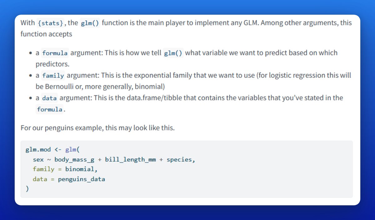
The data that I use here comes from {palmerpenguins}. And we're going to classify a penguin's sex based on its weight, species and bill length. 🐧 🐧
albert-rapp.de/posts/14_glms/…
All of my code examples can be copied from my newest blog post.
The data that I use here comes from {palmerpenguins}. And we're going to classify a penguin's sex based on its weight, species and bill length. 🐧 🐧
albert-rapp.de/posts/14_glms/…
Let's start with the {stats} way. The key function here is glm().
A logistic regression is a GLM using the binomial distribution. Thus, set `family = binomial` in glm().
Of course, you need response and predictor variables. Specify this with a formula and a data.frame/tibble.
A logistic regression is a GLM using the binomial distribution. Thus, set `family = binomial` in glm().
Of course, you need response and predictor variables. Specify this with a formula and a data.frame/tibble.
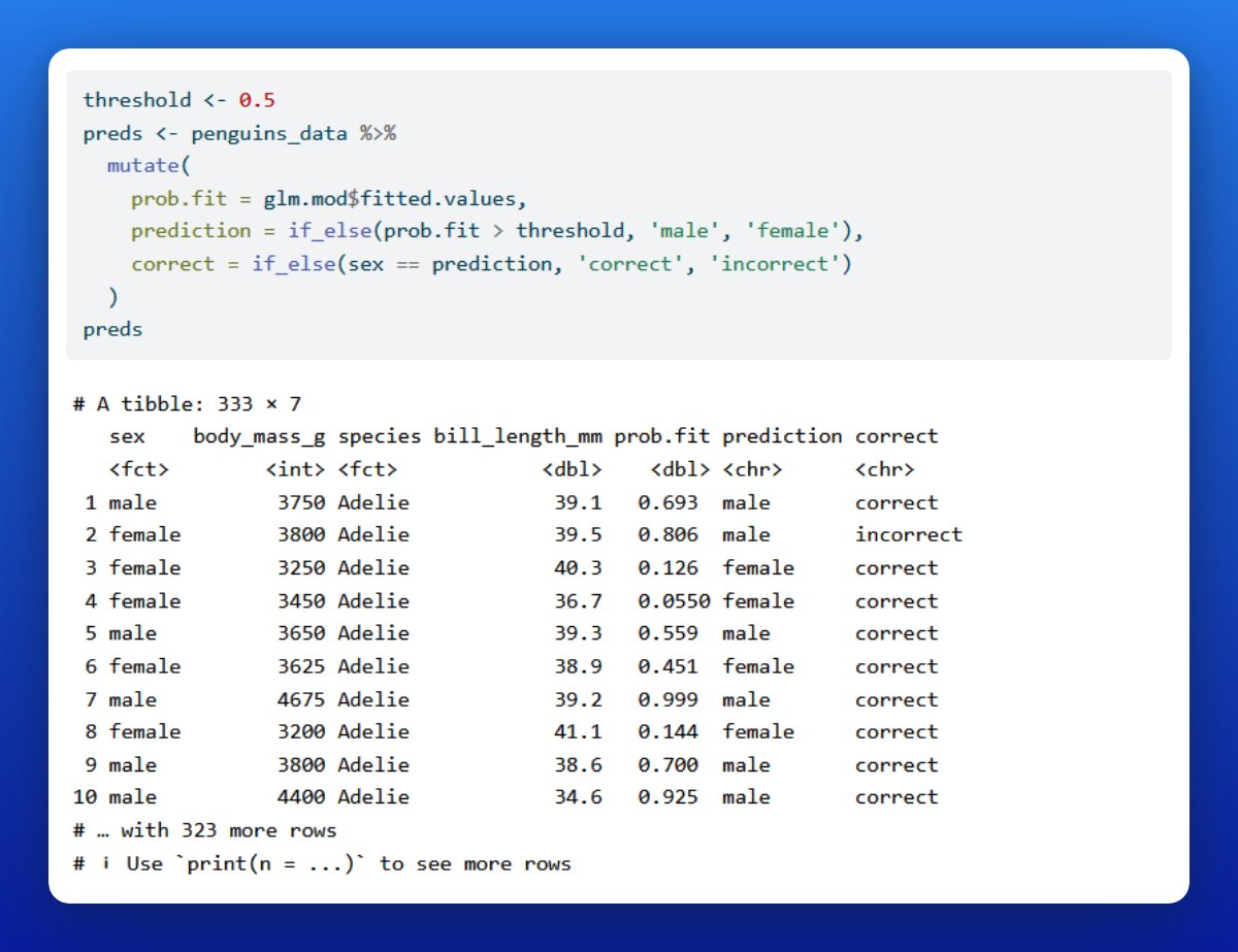
You can save the output from glm() in a variable. Treat that variable like a list that contains the fitted values.
In this case, these values are probabilities. Using a threshold, say 50%, we can turn these predicted probabilities into predictions of our penguins' sex.
In this case, these values are probabilities. Using a threshold, say 50%, we can turn these predicted probabilities into predictions of our penguins' sex.
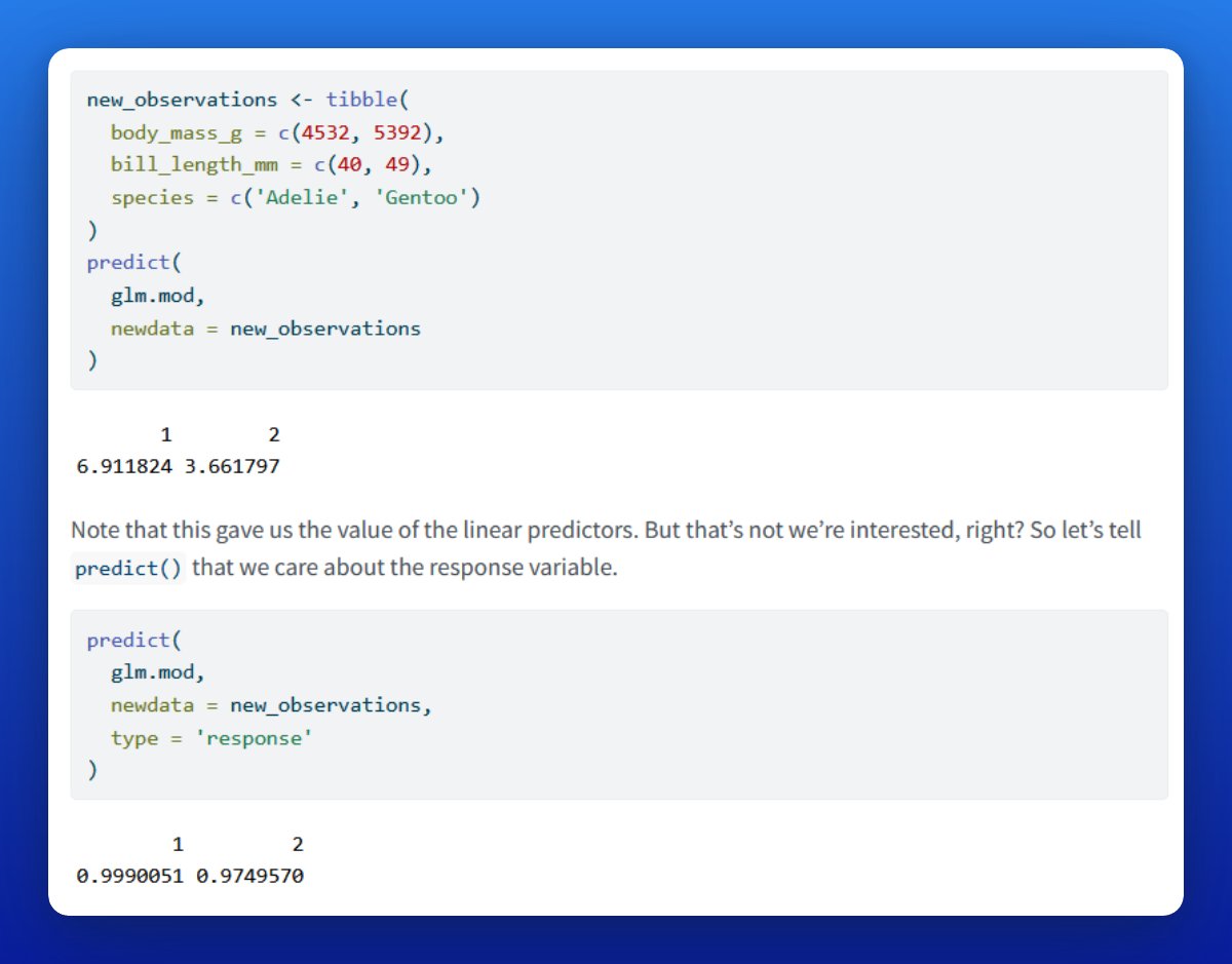
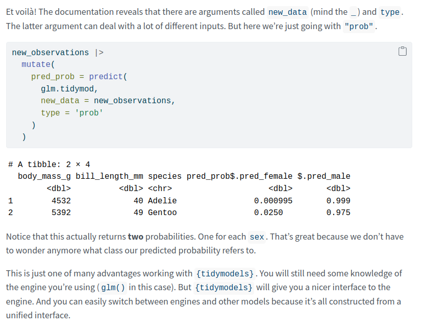
We can also use our glm object with predict() to, well, predict probabilities from observations that have not been in the training data set.
Note that predict() will show you the value of the linear predictor by default. But what you really want is the response (via type).
Note that predict() will show you the value of the linear predictor by default. But what you really want is the response (via type).
Now you know how to do logistic regression with stats::glm(). The same approach works for any other GLM.
For example, to do a Poisson regression change "family = binomial" to "family = poisson".
Also, you can change the link function, e.g. family = binomial(link = "probit")
For example, to do a Poisson regression change "family = binomial" to "family = poisson".
Also, you can change the link function, e.g. family = binomial(link = "probit")
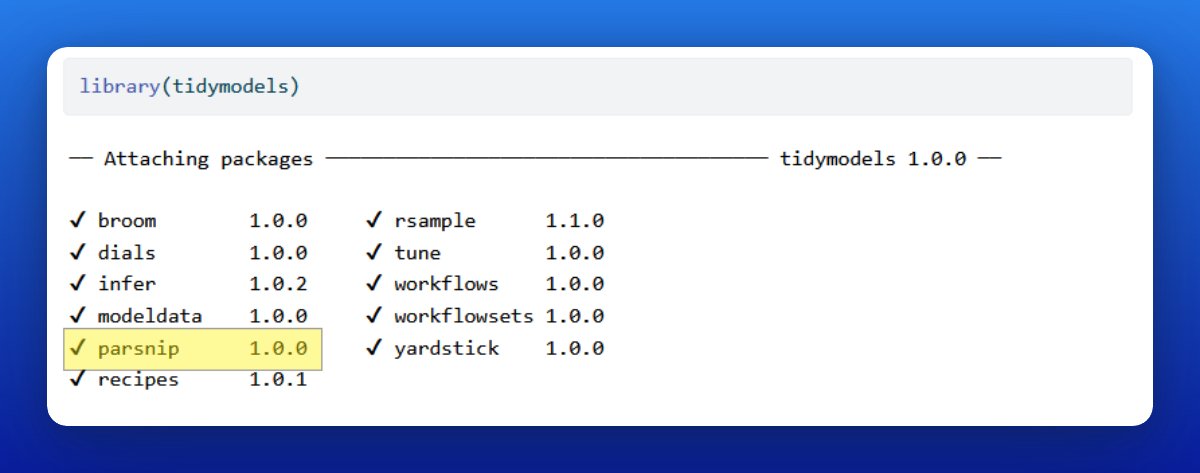
Next, let us do the {tidymodels} way.
Notice that - just like {tidyverse} - {tidymodels} is not actually one package but a whole ecosystem of packages.
So technically speaking, let's do the {parsnip} way (that's the package handling model specifications.)
Notice that - just like {tidyverse} - {tidymodels} is not actually one package but a whole ecosystem of packages.
So technically speaking, let's do the {parsnip} way (that's the package handling model specifications.)
At first, {parsnip} looks way more complicated than glm(). That's because it's more general.
But the beautiful thing is that you can use the same interface to use different engines or even models.
For example, you could decide to switch from GLM to random forest.
But the beautiful thing is that you can use the same interface to use different engines or even models.
For example, you could decide to switch from GLM to random forest.
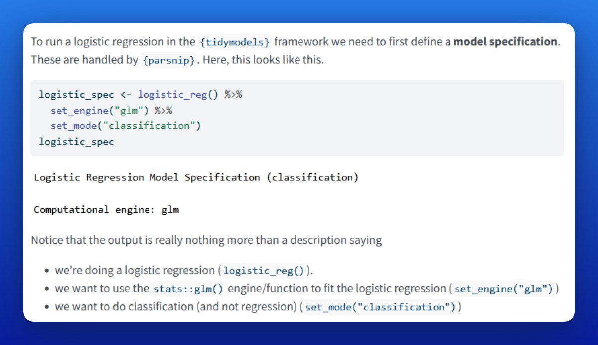
To define a logistic regression, use logistic_reg() and apply set_engine() + set_mode() to it.
Each part in that chain refers to 1 part of the model spec. And you can easily exchange each one.
More on that later.
Each part in that chain refers to 1 part of the model spec. And you can easily exchange each one.
More on that later.
You could also do everything in one line by specifying logistic_reg(engine = "glm", mode = "classification").
If you ask me, that's just a matter of taste. I prefer the set_engine() and set_mode() way.
If you ask me, that's just a matter of taste. I prefer the set_engine() and set_mode() way.
In the end, our model specification is really nothing but an instruction to do
- a classification
- using a logistic regression
- based on the stats::glm() function/engine (and not e.g. "keras" or "glmnet")
- a classification
- using a logistic regression
- based on the stats::glm() function/engine (and not e.g. "keras" or "glmnet")
Saving that specification in a variable allows us to fit the described model using data.
To do so, pass the model spec to fit() and describe response and predictor variables.
This is similar to what you've done with glm().
To do so, pass the model spec to fit() and describe response and predictor variables.
This is similar to what you've done with glm().

Saving that fitted model into a variable let's us do predictions.
Once again, this is done with predict(). And it isn't actually much different from using {stats} (other than that the output is a bit nicer).
Once again, this is done with predict(). And it isn't actually much different from using {stats} (other than that the output is a bit nicer).
Finally, if you want to do a Poisson regression, exchange logistic_reg() for poisson_reg() and set the mode to "regression".
In fact, that’s how you switch to any other model, e.g. to random forests via `rand_forest()`. Within {parsnip} it's always one and the same interface 👌
In fact, that’s how you switch to any other model, e.g. to random forests via `rand_forest()`. Within {parsnip} it's always one and the same interface 👌
Alright, alright, alright. That's a wrap for today. 🥳 Hope you learned a lot from this thread.
If you've enjoyed this thread, then feel free to follow @rappa753 to not miss out on any of my upcoming adventures.
If you've enjoyed this thread, then feel free to follow @rappa753 to not miss out on any of my upcoming adventures.
And Remember: This thread is based on my newest blog post. It contains both, the math and the implementation, of GLMs.
Enjoy the rest of your day and see you next time 👋
albert-rapp.de/posts/14_glms/…
Enjoy the rest of your day and see you next time 👋
albert-rapp.de/posts/14_glms/…
One more way to stay in touch is via my biweekly newsletter. Every other week, I write about
📈 dataviz,
🌐 Shiny or
🧮 statistics
Subscribe to the newsletter and all content goes straight into your inbox. 👌 alberts-newsletter.beehiiv.com/subscribe
📈 dataviz,
🌐 Shiny or
🧮 statistics
Subscribe to the newsletter and all content goes straight into your inbox. 👌 alberts-newsletter.beehiiv.com/subscribe
• • •
Missing some Tweet in this thread? You can try to
force a refresh