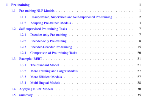
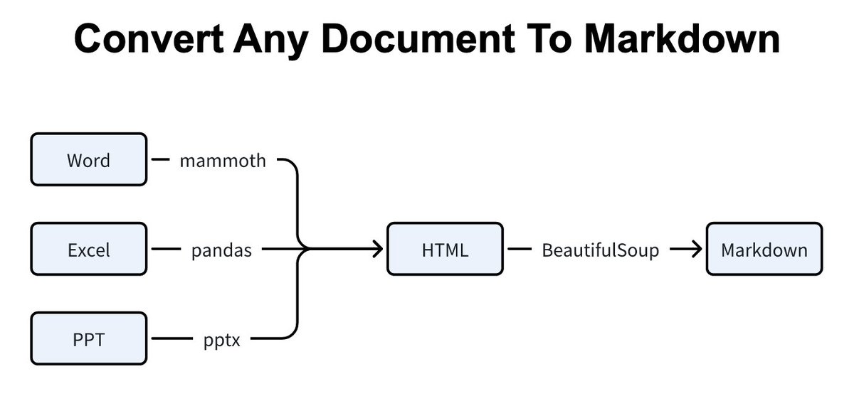
Shiny is a powerful tool that data scientists can use for web apps & production.
But most data scientists struggle.
Here are 7 resources on shiny that helped me.
#rstats #shiny #excel #python
But most data scientists struggle.
Here are 7 resources on shiny that helped me.
#rstats #shiny #excel #python


2. Flexdashboard website
Flexdashboard combines Rmarkdown & Shiny to make quick apps.
pkgs.rstudio.com/flexdashboard/
Flexdashboard combines Rmarkdown & Shiny to make quick apps.
pkgs.rstudio.com/flexdashboard/
3. Shiny Widgets gallery
See dozens of example reactive widget input / outputs for shiny
shiny.rstudio.com/gallery/widget…
See dozens of example reactive widget input / outputs for shiny
shiny.rstudio.com/gallery/widget…

4. shinyWidgets by dreamrs
Advanced & customizable reactive widgets that can really take your shiny apps to the next level
dreamrs.github.io/shinyWidgets/i…
Advanced & customizable reactive widgets that can really take your shiny apps to the next level
dreamrs.github.io/shinyWidgets/i…

7. Bslib
Upgrade shiny From Bootstrap 3 to 4 or 5 and makes it easy to make custom themes.
rstudio.github.io/bslib/
Upgrade shiny From Bootstrap 3 to 4 or 5 and makes it easy to make custom themes.
rstudio.github.io/bslib/

And if you want all of these 7 R packages plus 93 more in one consolidated #cheatsheet, download my ultimate #R cheat sheet.
business-science.io/r-cheatsheet.h…
business-science.io/r-cheatsheet.h…

One last resource.
If you've been struggling to learn R, I’d like to help.
I put together a free R webinar that consolidates the 10 secrets that helped me in my career.
learn.business-science.io/free-rtrack-ma…
If you've been struggling to learn R, I’d like to help.
I put together a free R webinar that consolidates the 10 secrets that helped me in my career.
learn.business-science.io/free-rtrack-ma…

• • •
Missing some Tweet in this thread? You can try to
force a refresh