Mike Hoerger, PhD MSCR MBA Profile picture
Sep 26, 2022 11 tweets 12 min read Read on X
Empowered communities want free #N95 masks!

Our new pre-print shows that people are excited to use N95s during COVID surges when given them for free w/helpful information on their evidence & how to use them.
1/
psyarxiv.com/f76vw Study abstract: People want...Project banner: Free N95 Qu...Aegle N95, given away in th...
You might remember when we posted about the study back in December!

I hope you find the results useful. We tried to make the figures relatable, even if you're not reading science articles every day. Please let me know if you have questions!
2/

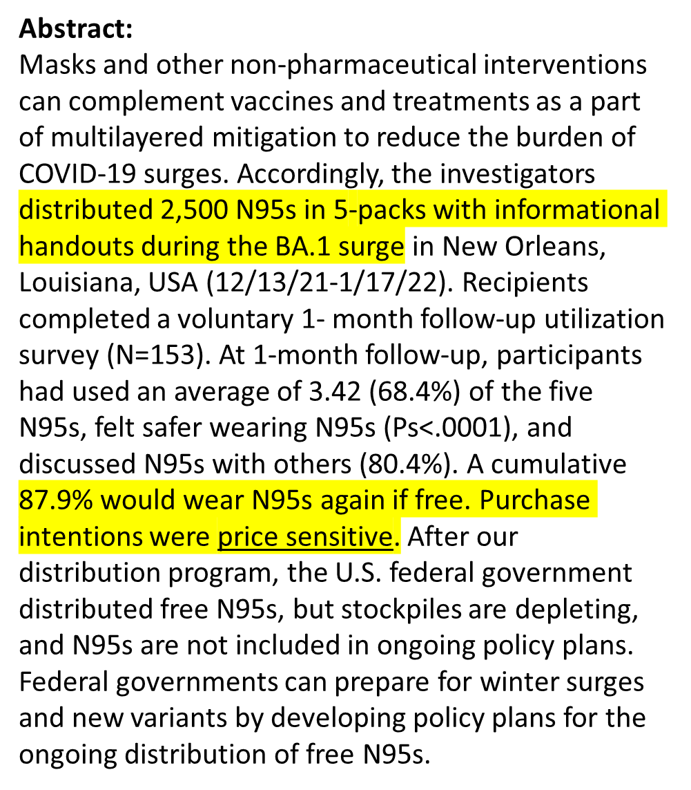
We gave out 2,500 #N95 masks in 5 packs to our racially & socioeconomically diverse community. Many used N95s for the 1st time. People treated us like we were giving them kidneys. So grateful!

97% used at least 1 N95 & 40% used all 5 within 1-mo!

3/
We called our #N95 giveaway study "Project #Bandura," named for the famous #psychologist who studied social learning.

Well -- people learned, socially! >80% of participants told others about N95s. Several enthusiasts shared w/dozens of ppl!
4/
Cost was the biggest barrier to sustained #N95 use!

Still, ppl planned to buy an average of >10 more N95s in the near future (2x what we gave them).

More interesting, if FREE, 88% would use N95s again. Once you pop, you can't stop!
5/
We only gave away 2,500 N95s. It was labor intensive b/c we included educational materials, had a follow-up survey, went through IRB, etc.

However, it validates @amandalhu's 17,000 mask giveaway, those of cities and fed govt's.

Free N95 & #BetterMasks are hugely popular!
6/
As a #psychologist, there is 1 big truth I believe w/my heart. If you talk to most ppl in a way that's reasonable, about 97% will feel empowered to take actions to improve their lives & communities.

As true for COVID as anything else. We just need more courageous leadership.
7/
With N95s extremely popular during #COVID surges, what's the national strategy?

The U.S. had a stockpile and started giving them out for free (after my psychology research team 🤣). There are no known plans to buy and distribute more.

8/11
Domestic manufacturers are selling off #N95 inventory & equipment after boom-and-bust cycles. Many are closing their doors.

It's a low-cost filter. For your face. That keeps you from getting sick & becoming disabled or dying.

What are we doing???
9/11
Thanks if you posted about #CovidisAirborne. The study is dedicated to you.

You converted me from cloth masks to N95s.

Shouldn't we have federal #policy priorities to make high-quality masks available to everyone during surges?

10/11

• • •

Missing some Tweet in this thread? You can try to force a refresh
 

Keep Current with Mike Hoerger, PhD MSCR MBA

Mike Hoerger, PhD MSCR MBA Profile picture

Stay in touch and get notified when new unrolls are available from this author!

Read all threads

This Thread may be Removed Anytime!

PDF

Twitter may remove this content at anytime! Save it as PDF for later use!

Try unrolling a thread yourself!

how to unroll video
  1. Follow @ThreadReaderApp to mention us!

  2. From a Twitter thread mention us with a keyword "unroll"
@threadreaderapp unroll

Practice here first or read more on our help page!

More from @michael_hoerger

Sep 10
PMC COVID-19 Forecasting Model, Sept 9, 2024
🧵1/7

Nationally, we appear to have passed the peak of our late-summer wave, and it's not pretty.

At peak:
🔹>1.3 million daily infections
🔹2.8% (1 in 36) actively infectious
🔹Transmission higher than 90.5% of the pandemic

We are showing a peak around Aug 10, but as you look closely at the graph and in later Tweets, you'll see it was bimodal, with near-identical transmission on Aug 10 and Aug 24.

The CDC consistently corrects historical data, so in hindsight, we might expect the official peak date to flip to the 24th, or for the stats on the 10th to jump higher.

We had expected that Friday's data release might show this was the largest summer peak all-time (by the slimmest of margins), but the prior week's data were retroactively corrected downward by about 5%.

This is a common occurrence, which is why it's important to focus on the big-picture forecast (very bad transmission the remainder of 2024) as opposed to minute details.

Let's walk through the details in this Thread....Figure shows the 9 waves of the U.S. COVID-19 pandemic. We are in the 5th-largest wave, and the 2nd largest summer wave. The statistics in the Tweet summarize the peak of the current wave.
PMC COVID-19 Forecasting Model, Sept 9, 2024
🧵2/7

The current year-over-year graph on Covid transmission is troubling. We just had the worst August of Covid transmission in the U.S.

We are likely to have our worst September, worst October, and potentially worst November of transmission.

We expect to bottom out around 850,000 daily infections in early November, before the winter surge picks up.

These new monthly records for Covid transmission are the consequence of #LaissezFairePublicHealth, especially the 1-day isolation policy, but more generally that public health officials are not describing transmission frankly and the need for multi-layered mitigation.Graph of year-over-year transmission. The current surge appears to have peaked, just under the daily peak of the 2022 summer wave, and is setting the stage for four months of monthly records in transmission, based on year-over-year monthly comparisons.
PMC COVID-19 Forecasting Model, Sept 9, 2024
🧵3/7

Zooming in, see the forest for the trees: About 74 days in a row with 1 million daily infections.

The peak date is somewhat arbitrary, and either Aug 10 or 24 may be estimated the peak in hindsight.Graph shows the prior year of transmission and 1-month forecast. Daily infections will remain >1 million for nearly another month, and are projected to reach 74 days in total.   Once below 1 million, only expect daily infections to get down to about 850,000/day in early November, then get much worse.
Read 7 tweets
Sep 2
PMC COVID-19 Forecasting Model, Sept 2, 2024
🧵1/8

We've headed from a false summit toward a larger peak in back-to-school transmission. Next week we'll know whether this is the largest or 2nd largest summer wave all-time. Expect 1.4-1.5 million daily infections at the peak.

This secondary peak is larger than anticipated previously, even when accounting for patterns of back-to-school transmission in prior years.

One, the West and South were peaking earlier, and the Northeast and Midwest have transmission picking up much faster than its falling off elsewhere. These are atypical regional differences.

Two, the 1-day isolation policy and general decline in school-based mitigation have unleashed transmission at higher levels than would be anticipated in prior years, even when accounting for the already-high levels of transmission as children went back to school.

Three, our model uses a combination of CDC and Biobot (former CDC contractor) data, using a 60% versus 40% mix for current case estimation. Biobot has not updated their data the prior two weeks without explanation. They were running much cooler than the CDC data, whether reflective of reality, or merely reporting delays. We have downgraded them to 20% in the model, and they will be downgraded further to 0% if they do not update their data this week.

You can take points 1 and 2 to account for the secondary and higher peak (shape of transmission), when models accounting for prior years would have suggested transmission slowing already, and point 3 accounting for a shift toward a slightly higher overall estimate of transmission.Graph of the 9 waves. 1 in 35 infectious nationally. Peak currently estimated at 1.4 million, but that may shift to as high as 1.5 million.
PMC COVID-19 Forecasting Model, Sept 2, 2024
🧵2/8

This graph shows year-over-year transmission. It clarifies the unusual shape of the transmission distribution. A "peak" or false summit, followed by a very slight decline in transmission (negligible), then a 2nd (true) peak.Graph of year-over-year transmission. Much higher than most prior years. The peak may or may not surpass that of 2 years ago. It will be very close.
PMC COVID-19 Forecasting Model, Sept 2, 2024
🧵3/8

Presently, we estimate a peak at 1.4 million daily infections. Next week, we will have a much better sense. It could be in the 1.3-1.5 million range. There's about a 50% chance it will be the largest summer wave.Zoomed in graph on transmission the past year, with 1-month forecast. Shows a peak estimated near 1.4 million daily infections.
Read 8 tweets
Aug 27
PMC COVID-19 Forecasting Model, August 26, 2024
🧵1/8

We're in uncharted territory during the back-to-school period.

1.2 million people in the U.S. are getting infected per day.

1 in 41 people (2.5%) are actively infectious.Figure shows the 9 waves of the pandemic and the figures cited in-Tweet.
PMC COVID-19 Forecasting Model, August 26, 2024
🧵2/8
The year-over-year graphs shows that we are experiencing much high transmission than during previous back-to-school periods.

This is a much higher and wider wave than Y1, Y2, and Y4 of the pandemic. Year 3's summer wave was very bad, but much earlier.

The 1-day isolation period, decline in most other mitigation, and a culture of denialism ("post pandemic," "Covid is over,") will fuel many infections among young people, teachers, school staff, and parents.

Expect absences at schools. Expect substantial workforce problems related to sick parents.Graph shows year-over-year transmission, emphasizes the current wave is much higher and wider than in prior Augusts.
PMC COVID-19 Forecasting Model, August 26, 2024
🧵3/8
Here's a zoomed in version of current transmission and the forecast.

Notice that transmission will likely remain >1 million infections per day for the next month and counting.

Note that the national peak appears just behind us. The CDC graphs may suggest that we're currently peaking, but note their data are >1 week old. The forecast provides an updated best estimate for today. The peak and shape of the observed wave could change as CDC and Biobot retroactively correct numbers (perhaps a bigger, earlier spike). Alternatively, Biobot has been slow to update their data, and their data were suggesting a later peak. However, I suspect the current picture won't change terrible much in hindsight.

We're seeking a less spiky, more plateau-like peak because there is substantial regional variation. The West and South regions have extremely high transmission and have likely peaked. The Midwest and Northeast are lower but rising.

Keep an eye on regional or local data, and overall remember that local peaks could occur weeks before or after the national peak. Also, 50-60% of transmission commonly occurs on the back end of waves.Graphs shows the most recent year of transmission and 1-month forecast. Daily infections surpassed 1 million around July 1 and are expected to continue beyond the next month.
Read 8 tweets
Aug 12
BREAKING: Version 2.0 of the PMC COVID-19 Forecasting Model, August 12, 2024
🧵1/7

The U.S. now tops 1.3 million daily infections. 2.8% of the population (1 in 36) are actively infectious.


Deep Dive on Version 2.0 of the Model...

Welcome to version 2.0 of the PMC Model. The “C” in PMC is for Collaborative, and the work to improve this model is grounded in feedback from readers like you over the past year. Thank you for your support.

What’s New?

In short, the new model has substantial data quality improvements by combining multiple data sources for estimating transmission in unique ways that will hopefully increase forecasting accuracy, provide a truer representation of what has happened and is happening during the pandemic, and linkages to some statistics you will find helpful in day-to-day decision making.

Here is a deeper dive into the changes (skip to next section if desired). The new model is designed to provide a “true” picture of what has happened during the pandemic. It integrates three main data sources: the IHME true case estimation model, Biobot SARS-CoV-2 wastewater surveillance data, and the current CDC NWSS SARS-CoV-2 wastewater data. IHME provided a comprehensive case estimation model through April 1, 2023. Biobot was the CDC wastewater subcontractor through last fall and continues to do extensive non-CDC wastewater work. The CDC NWSS data are currently subcontracted with Verily, a subsidiary of Alphabet, which is the parent company of Google. Over the past year, we have seen Biobot scale back their public data and visualizations, and Verily has made steady improvements in their work with the CDC.

We previously relied solely on Biobot for forecasting and a Biobot-IHME data linkage for case estimation. It was a Biobot-heavy model. The current model is not tied strictly to any data set, but rather the PMC’s best estimate of the truth, a true-case model that uses multiple data sources in the spirit of IHME’s original work in this area. Essentially, we link all three data sources, which have been active over different points of the pandemic to derive a composite “PMC” indicator of true levels of transmission. The indicator is weighted based on which data sources were available and their perceived quality at each point in time. We scale this composite PMC indicator to the metric the CDC uses when helpful for comparisons with their website, and scale it with the true case estimates of the IHME otherwise, as true cases are more relevant than arbitrary wastewater metrics.

A great feature of the model is that it continues to integrate real-time data from Biobot and the CDC. From the perspective of Classical Test Theory, this is a huge advantage, as it provides a much more reliable indicator of what is currently happening with transmission. Both sources often make retroactive corrections for the most recent week’s data, sometimes sizable, and pitting the two indicators against one another reduces measurement error on average, which offers vital improvements in forecasting.

What are the Biggest Improvements in the Model?

· Accuracy in Real-Time Data – In integrating two active surveillance data sources, the real-time data will be more accurate. The biggest predictor of next week’s transmission levels, and the shape of how transmission is increasing or decreasing, accelerating or decelerating, is the current week’s real-time data. If the real-time data are off by 5% or 10%, the big-picture take on the forecast will still be reasonable, but a more precise estimate allows for greater accuracy in estimating the height and timing of waves.
· Regional Statistics – We are already integrating some regional data. Like you, we miss the vast and high-quality regional data and visualizations Biobot provided. We are hoping to take back some of those advantages through the new model and will improve them over time.
· Credibility – Although Biobot and CDC have unique strengths and limitations, a clear strength of adding the current CDC data set is that many people prefer to defer to the credibility of the CDC. The PMC model can be characterized fairly as a “CDC-derived case estimation and forecasting model,” which should lend more credence with those who are not deep enough in the weeds to evaluate the data as critically and prefer appeals to authority. We also provide some statistics that will allow you to draw more useful inferences from the CDC website.

What’s the Same in the Current Model?

The analytic assumptions underlying the forecasting model remain the same. It uses regression-based techniques common across all industries, using a combination of historic data (median levels of transmission for each day of the year) and emerging data from the past four weeks to characterize how transmission is growing or shrinking. Holidays and routine patterns of behavior that map on well to a calendar are “baked in” to the historic data. “New variants” and atypical patterns of behavior are baked into the data on recent patterns of transmission. It’s a top-down big picture model.

What are the Biggest Drawbacks of the New Model?

· Disruptions in Longitudinal Comparisons – You will notice some inconsistencies between the current and prior model that use additional data to form more accurate estimates, which is sometimes frustrating. A few examples. In the early pandemic, we estimated cases linking Biobot to IHME case estimates. Biobot transmission estimates were a bit “hotter” than others during that time period, the IHME estimates “cooler.” Our composite model depicts each of the first 4 waves somewhat smaller, which we believe provides a better picture of the “truth” as we can estimate it, but it is annoying psychologically to re-envision what has happened. This also throws off some of the big-picture statistics; for example, as of August 12, 2024, we estimate that Americans have had about 3.3 infections on average. A few months ago, we estimated nearly 3.5, so this is consistent with “cooler” picture of early-pandemic transmission. Presently, the CDC transmission estimates are running much hotter than those of Biobot, leading to estimates of a larger and earlier peak in the present wave. We would have preferred the CDC re-up with Biobot at the potential contract renewal to promote continuity in the data, but these sorts of changes in model estimation are the expected consequences of such a transition.

· Constantly-updating Historical Data – The CDC updates all of their historical estimates of transmission frequently, any time a new site comes on board, and twice annually to standardize the data longitudinally. This can sometimes create weird issues, where transmission is going up, but real-time values are lower than what was reported in real time the prior week because recent data were corrected downward. It will also throw off some of the helpful statistics we provide. These are minor nuisances, but be aware of them in case you spot something that seems strange.
· Documentation of Accuracy – We have excellent data on the accuracy of the prior model and will submit a report for publication shortly. All prior reports are publicly available. Many report quick facts on longitudinal accuracy, international comparisons, use in news articles, and references to use in peer-reviewed scientific journal articles. We cannot document the real-time accuracy of the new model yet, but know that when using historical data, the model accounts for 98% of the variability in wastewater transmission 1-week into the future, which is 2% higher than our prior model. The vast majority of forecasting errors have been and will continue to be based on inaccuracies in the real-time data wastewater surveillance companies report, and the model changes reduce those issues. We hope you will trust our history and that the methodologic changes represent improvements.

What Improvements Should We Expect in the Future?

There are many improvements we hope to roll out in the future. These include changes based on your feedback, the addition of confidence intervals in some of the graphs, and regional forecasting models. We may incorporate additional data sets if they can improve real-time estimates of current transmission.pmc19.com/data/Figure showing transmission throughout the entire pandemic, shows we are entering a 9th wave and provides CDC levels as well as the PMC estimate of daily infections, now at 3.3 million.
🧵2/7

Our graph of year-over-year transmission shows we have likely never had such high COVID transmission in mid-August.

Many classrooms will have a >50% chance someone is infectious. Expect K-12 schools and universities to be hotbeds for COVID outbreaks unless they are using serious multilayered mitigation.

🔹Indoor air quality that meets ASHRAE Standard 241 (if they have never heard of this or cannot explain how they are meeting the standard, they likely are not meeting the standard).
🔹Surveillance testing.
🔹Free on-demand testing.
🔹Universal masking.

This is uncharted territory in terms of such low mitigation coupled with high transmission with school starting. The possibility of a slightly larger wave than what we forecast remains.Figure showing year-over-year Covid transmission. We are presently just below the largest peak for a summer all-time, and we have never seen transmission this high in mid-August.
🧵3/7

Let's zoom in on the current wave. We're at our highest level of transmission since the winter surge, with 1.3 million daily infections.

Note, our model now combines Biobot and CDC data. Biobot still has the peak coming in early Sept, and so did the CDC until a huge spike this week.

By including two data sources, it helps counterbalance against errors in their real-time reporting, but we could still see some volatility in the size and date of the peak at this point.

Of course, different locations peak at different times.

You'll note that Aug 12 appears in the "forecasted" zone. That's because even wastewater data experience lags in reporting.Figure shows the most recent year of transmission. We're presently at 1.3 million daily infections, and likely closing in on the peak of this summer's wave.   Graph says "past 12 months," but it really shows the past 11 and includes a 1-month forecast. I'll fix that for next week.
Read 8 tweets
Aug 10
Just plugged today's CDC numbers into my new forecasting model (releases Mon). My initial reaction was "Jesus Christ. That's bad. That's really really bad."

If you live in the West in particular, it's currently about as bad as last winter. About 1 in 23 infectious out West. CDC regional COVID-19 transmission graph. The West region is nearly identical to last winter's peak.
Those of us modeling have been talking about the late-summer wave -- all year -- as a given.

The 1-day isolation policy, the lack of a twice-annual updated vax, & the vilification of masks are emblematic of #LaissezFairePublicHealth. A wintery summer surge is the result.
I hope the present numbers are revised downward, but there is no reason to suspect that. In my view, the current estimates are as likely to be overestimates as underestimates.
Read 4 tweets
Aug 1
Slide Deck - Discussion of "Masking Policies at National Cancer Institute–Designated Cancer Centers During Winter 2023 to 2024 COVID-19 Surge"

x.com/i/spaces/1OdKr…
2/ “It takes 15 years to translate beneficial interventions into widespread practice. We need to improve understanding of the airborne transmission of COVID to accelerate that timeline. Patients cannot wait.”-Michael Hoerger, PhD, MSCR, MBAMedical Scientist
Read 26 tweets

Did Thread Reader help you today?

Support us! We are indie developers!


This site is made by just two indie developers on a laptop doing marketing, support and development! Read more about the story.

Become a Premium Member ($3/month or $30/year) and get exclusive features!

Become Premium

Don't want to be a Premium member but still want to support us?

Make a small donation by buying us coffee ($5) or help with server cost ($10)

Donate via Paypal

Or Donate anonymously using crypto!

Ethereum

0xfe58350B80634f60Fa6Dc149a72b4DFbc17D341E copy

Bitcoin

3ATGMxNzCUFzxpMCHL5sWSt4DVtS8UqXpi copy

Thank you for your support!

Follow Us!

:(