Day 1: Setting up a bespoke colour scheme 🎨
🤫 I'm going to let you in on a secret... I find picking colours really tricky! Thankfully, I've found few ways round that.
My top tip is to let others help you! But first, a broad principle...
🤫 I'm going to let you in on a secret... I find picking colours really tricky! Thankfully, I've found few ways round that.
My top tip is to let others help you! But first, a broad principle...
When picking colours for story telling, I try to make the colours as intuitive as possible.
Here's the adventure I took the Palmer Penguins on in a recent talk involving the #GreatPenguinBakeOff. See if you can guess the details. (The next tweet should give you a few clues!)
Here's the adventure I took the Palmer Penguins on in a recent talk involving the #GreatPenguinBakeOff. See if you can guess the details. (The next tweet should give you a few clues!)
It's not about making your plots into a guessing game. It's about reducing cognitive load by making it easy to remember what's what.
And this allows me to illustrate one way to let others help you: photos! All of the colours in the previous plots were taken from these photos.
And this allows me to illustrate one way to let others help you: photos! All of the colours in the previous plots were taken from these photos.

Take a look at this plot. I've plotted "Yumminess" along the Y axis.
Without even thinking about it, you can tell that:
- unripe bananas do not make for tasty banana bread
- no amount of tinkering with banana quality will help
It's a silly example - but it works!
Without even thinking about it, you can tell that:
- unripe bananas do not make for tasty banana bread
- no amount of tinkering with banana quality will help
It's a silly example - but it works!

And now for our first #rstats coding tip: use a named vector to apply your colours! It avoids the colours jumping around if you reorder a factor somewhere along the way.
cararthompson.com/talks/nhsr2022…
cararthompson.com/talks/nhsr2022…
That's all well and good, but what if you just want a "branded" palette that applies to different stories?
One approach is to start from your brand colours. You can use tools like {monochromeR} to blend two colours together to create a palette.
cararthompson.com/posts/2022-01-…
One approach is to start from your brand colours. You can use tools like {monochromeR} to blend two colours together to create a palette.
cararthompson.com/posts/2022-01-…
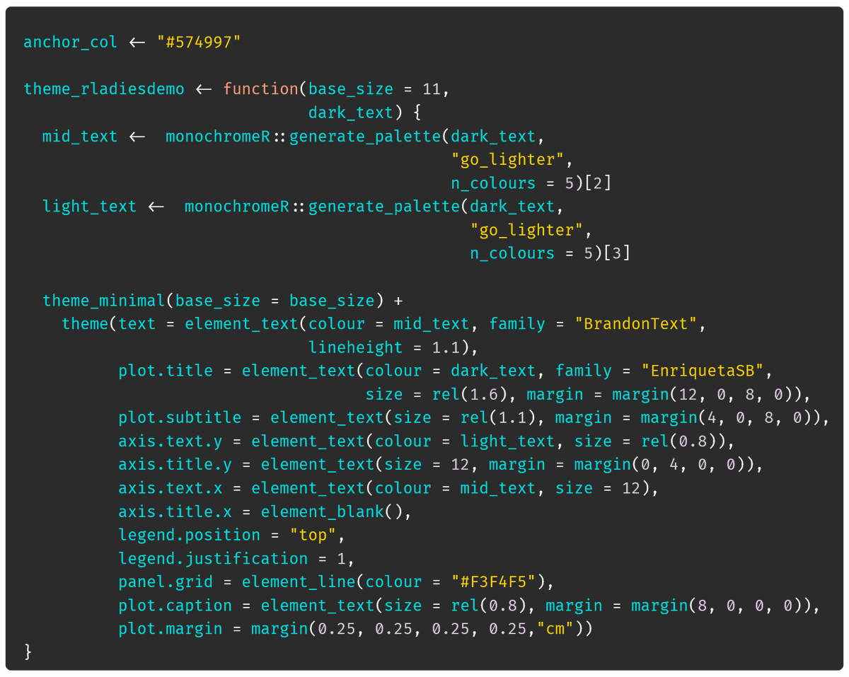
The project I have in mind for this week would require blending together two similar colours, so we may need to think of something else! But even if the spectrum isn't diverse enough, this can be a nice way of finding an "anchor" colour for your theme (more on that tomorrow!) 

If you don't know how many colours you need, colorRampPalette() is your friend. Set some anchor colours and let it do the rest. Here's an example using colours from this painting by Leon Morrocco (Untitled, Jean Resting). 


Can we combine the two to have a "generic" branded colour scheme and a highlight colour for some story telling in a changing context? Yes!
Here's how!
For consistency, you can reuse your anchor vector across plots, or even add it to your own package!

Here's how!
For consistency, you can reuse your anchor vector across plots, or even add it to your own package!


It's important in all this to remember accessibility. Make sure your colours work regardless of colour perception & when printed in black and white!
Thankfully, we have:
- 📦 {colorblindr} to see what your ggplot looks like
- vis4.net/palettes to check the palette
Thankfully, we have:
- 📦 {colorblindr} to see what your ggplot looks like
- vis4.net/palettes to check the palette
Finally, here are some extra resources I've found really helpful in exploring colour in #dataviz - let others help you!
🤩 For inspiration: @womensart1
🕵️ To extract colours from images: imagecolorpicker.com
🛠️ To create palettes from scratch: paletton.com
🤩 For inspiration: @womensart1
🕵️ To extract colours from images: imagecolorpicker.com
🛠️ To create palettes from scratch: paletton.com
@womensart1 Resources (2/2)
🪄 To create palettes based on an anchor colour: mycolor.space
💡 The most thorough and helpful post I've read on the topic by @lisacmuth
blog.datawrapper.de/colors-for-dat…
🪄 To create palettes based on an anchor colour: mycolor.space
💡 The most thorough and helpful post I've read on the topic by @lisacmuth
blog.datawrapper.de/colors-for-dat…
@womensart1 @lisacmuth Over to you!
What are your sources of inspiration for dataviz colour palettes? Would be lovely to see a few images of how you've applied these principles in your own work!
What are your sources of inspiration for dataviz colour palettes? Would be lovely to see a few images of how you've applied these principles in your own work!
• • •
Missing some Tweet in this thread? You can try to
force a refresh


