2) Fonts. Picking fonts can be really tricky, but there are some really great resources out there (see below, where we're back to our "let others help you" mantra!).
Here, I've simply applied the fonts from my own website, changing the family element of element_text().
Here, I've simply applied the fonts from my own website, changing the family element of element_text().


3) Text size. You can manipulate text size within theme() either by setting absolute sizes (e.g. size = 16), or relative sizes (e.g. size = rel(1.2)).
The relative size is a good idea if you're going to reuse this theme: change the base size as needed and everything follows!
The relative size is a good idea if you're going to reuse this theme: change the base size as needed and everything follows!


At this point, we've done most of the work, but we can still make our data story easier to take in by giving everything a bit more space to breathe.
First, let's move the legend to reduce unnecessary eye movements, fade the grid, and remove an unnecessary axis title.
First, let's move the legend to reduce unnecessary eye movements, fade the grid, and remove an unnecessary axis title.


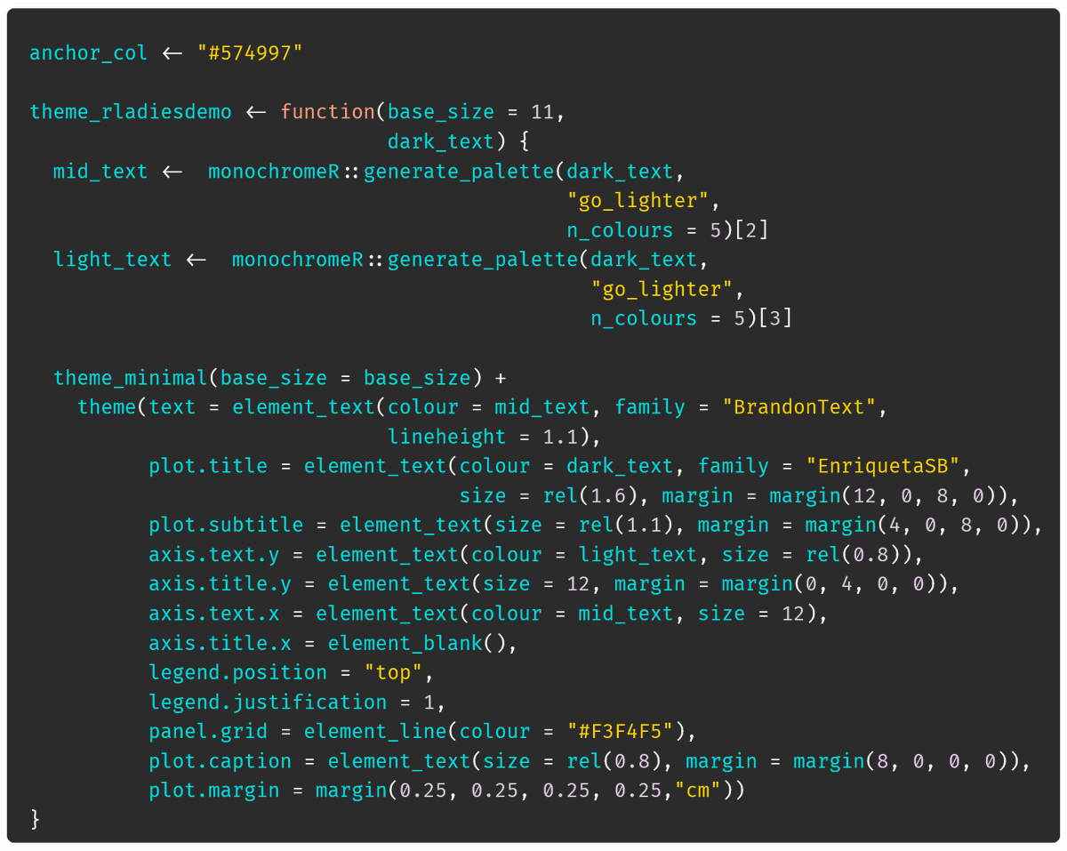
And now let's change the base size, increase the default line height and add margins around the text elements and around the plot itself, using the acronym TRouBLe to remember the margin values go Top, Right, Bottom, Left (or clockwise from the top).
Tada!
Tada!


Finally, let's package this up as a function we can easily reuse to create consistency across our project by just adding `+ theme_rladiesdemo()` to every plot.
Even with no effort to reconcile colours (see yesterday's thread for tips on that), it has a big impact!
Even with no effort to reconcile colours (see yesterday's thread for tips on that), it has a big impact!


And now for some resources (1/3):
- Font advice: @glyphe. Oliver runs a great weekly newsletter with font recommendations, and has some really practical resources on his site, including a free webinar from today which should be available to replay later.
pimpmytype.com/font-choice/
- Font advice: @glyphe. Oliver runs a great weekly newsletter with font recommendations, and has some really practical resources on his site, including a free webinar from today which should be available to replay later.
pimpmytype.com/font-choice/
@glyphe Resources (2/3)
- Fonts specifically within #dataviz, we're back to @datawrapper: blog.datawrapper.de/fonts-for-data…
- Font troubleshooting for #rstats (and other fun stuff such as registering variants!), this blog post by @yjunechoe: yjunechoe.github.io/posts/2021-06-…
- Fonts specifically within #dataviz, we're back to @datawrapper: blog.datawrapper.de/fonts-for-data…
- Font troubleshooting for #rstats (and other fun stuff such as registering variants!), this blog post by @yjunechoe: yjunechoe.github.io/posts/2021-06-…
@glyphe @Datawrapper @yjunechoe Resources (3/3)
- To view what each change to the theme does to the plot, flick through my @quarto_pub slides on building a custom theme: cararthompson.github.io/nhsr2022-ggplo…
(As an aside, I love how easy it is to create these step-by-step demos using Quarto!)
- To view what each change to the theme does to the plot, flick through my @quarto_pub slides on building a custom theme: cararthompson.github.io/nhsr2022-ggplo…
(As an aside, I love how easy it is to create these step-by-step demos using Quarto!)
@glyphe @Datawrapper @yjunechoe @quarto_pub Over to you! What are your favourite fonts (and font pairs!) to use in #dataviz? Or do you have any font horror stories to share?
Would be great to see some examples of how you've added text hierarchy to your data visualisations!
Would be great to see some examples of how you've added text hierarchy to your data visualisations!
• • •
Missing some Tweet in this thread? You can try to
force a refresh