Ilya Shabanov Profile picture
Jan 5 β€’ 7 tweets β€’ 3 min read
Tired of the same old bar graphs and line plots, #ScienceTwitter?

Here are 5 lesser-known but powerful graphical methods for visualizing your next publication.

πŸ‘‡ Image
1 – SANKEY DIAGRAM

Great for displaying dynamic processes or flows in a graph.

Example: Flow of immigrants and emigrants to and from a country.

The favourite diagram of marketers optimizing conversion rates of their customers. Image
2 – TERNARY DIAGRAM

Measured 3 components of something and they sum up to a constant (e.g. 100%)?

Then display this three dimensional data in a two dimensional triangle, without loosing any information.

Example: Soil Composition or relative sources of Income Image
3 – VIOLIN PLOT

Replace boring box plots with sexy violins.

Box plots don't show the distribution of your data.

Especially multiple peaks are easily visible with a violin but hidden by a box plot. Image
4 – SPIDER CHART

One of the few graphs correctly representing high dimensional (3 or more) data.

But it can only display a few points at a time.

Alternative uses are to display periodical data, like average temperature across months. Image
5 – CHORD DIAGRAM

It shines when you need to display (numerical) relations within a group or between multiple groups.

But: Add too much data and it becomes an impressively looking mess.
(Yes, biologists, I am talking to you and your beloved protein interaction networks) Image
Enjoyed this content?

If so, let me introduce myself,
I am Ilya and this account helps academics to make their journey more effortless.

Follow for hacks on productivity, organisation, mental health and academic writing.

β€’ β€’ β€’

Missing some Tweet in this thread? You can try to force a refresh
γ€€

Keep Current with Ilya Shabanov

Ilya Shabanov Profile picture

Stay in touch and get notified when new unrolls are available from this author!

Read all threads

This Thread may be Removed Anytime!

PDF

Twitter may remove this content at anytime! Save it as PDF for later use!

Try unrolling a thread yourself!

how to unroll video
  1. Follow @ThreadReaderApp to mention us!

  2. From a Twitter thread mention us with a keyword "unroll"
@threadreaderapp unroll

Practice here first or read more on our help page!

More from @Artifexx

Jan 7
Finding 200 papers for your research is easy.

What is NOT easy:
β€’ Make sense of it πŸ€”
β€’ Finding holes in the literature πŸ•³οΈ
β€’ Making a novel contribution 😡

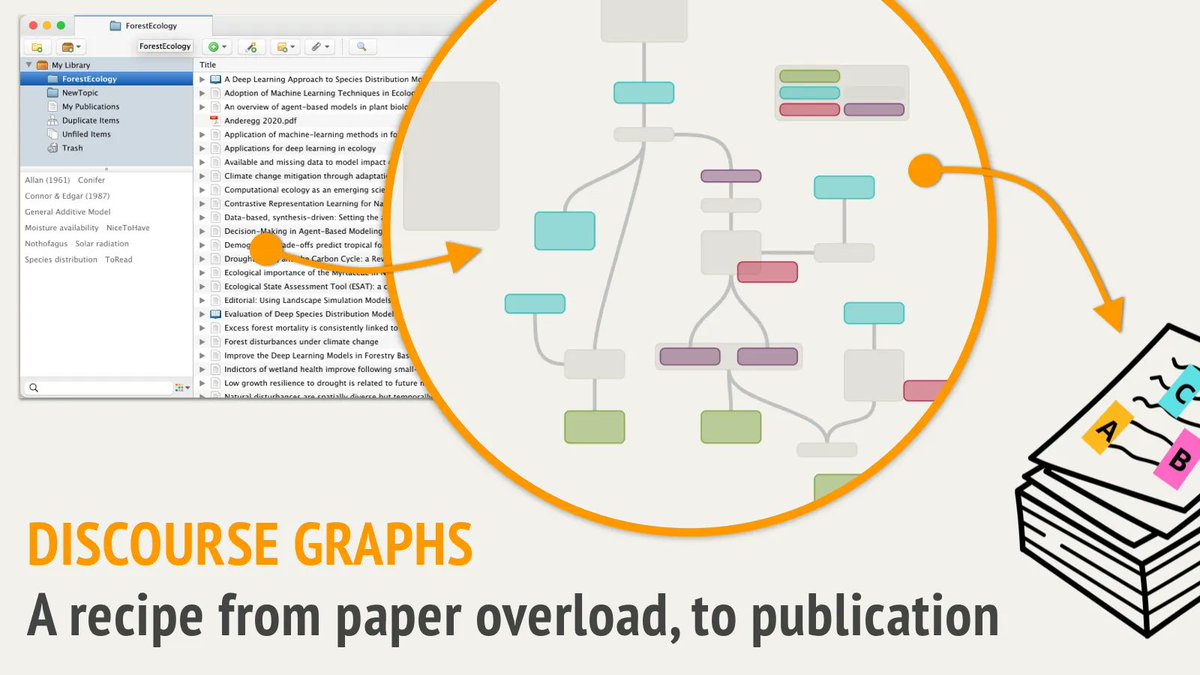
I just learned about "Discourse Graphs".
A super powerful, visual technique, that helps.

Here's how I use it:
πŸ‘‡ Image
Chefs use recipes to get from ingredients to dinner.

Your ingredients: papers & books,

Your dinner: the publication.

How do we prepare, marinate, cook and arrange our ingredients to get a great publication?

That's what we need the Discourse Graph for!
1. What is it?

A visual way of thinking, developed by @JoelChan86

We represent information as: a statement, claim, question or context.

We connect information e.g. "a statement can inform a question"

Just these simple rules.

Visually it looks something like this: Image
Read 19 tweets
Jan 6
Declining Disruption.

#ScienceTwitter is abuzz with this recently published nature article.

I read into the study and 100s of comments.
Consensus: Grants and journals are to blame.

But the authors give a much better, more personal insights.

Here's what I learned:
πŸ‘‡ Image
πŸ’‘Define Disruption:

Suppose I publish a study S that cites X,Y,Z.

If disruptive:
Subsequent work will cite S primarily, as X,Y,Z are "obsolete".

Consolidating:
S,X,Y and Z will be cited. As all are still relevant.

They validate it using many studies from 20th century. Image
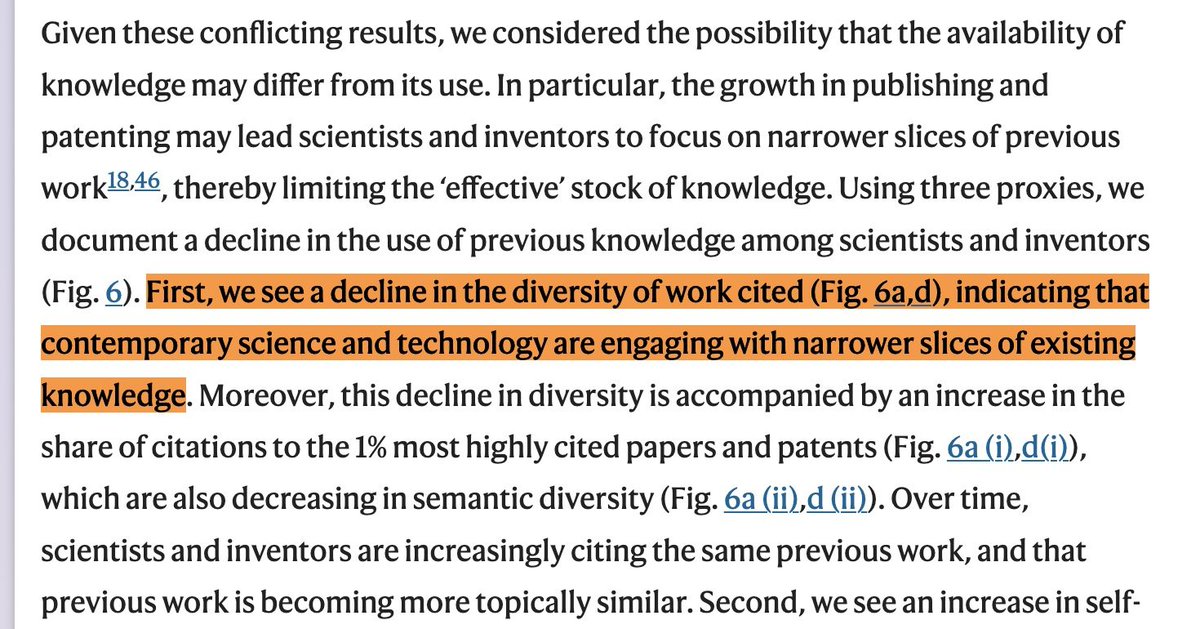
Reason 1: Decline in Diversity

We become "super nerds".
It makes our steps safer, but smaller.

Read "The Age of Insight" to learn how artists, psychologists and doctors all mingled in salons more than a century ago.

Maybe it's time to rediscover the connection to the arts? Image
Read 9 tweets
Jan 4
PhD Planning Masterclass:

Have you heard of a Kanban Board?

βœ… 90% of companies use this visual Japanese planning tool.
❌ Most academics, never heard of it.

Here's my project-manager-turned-phd guide.
Merge pdfs, notes & planning into a single system:
πŸ§΅β¬‡οΈ

#AcademicChatter
This is part 2️⃣ of the tutorial.

In the first part we made a coarse strategic plan.

In this part we are going into more detail to the level of tasks.

Here is the first "high-level" planning tutorial:
⚑️ Break Down your tasks

To get from strategy to action, we break down our tasks.

Subdivide until they are small & actionable.

Ideal size per task: 2-4 hrs.

An example from my PhD.

We break down the big, strategic task:
"Predicting the Future of a New Zealand Forest" 🌳
Read 16 tweets
Jan 2
I made a poll in #AcademicTwitter.

❌ More than 80% don't know this tool yet (p < 0.05).

So here is a beginners guide to @authorea,
an online tool to write your papers.

If you haven't heard of it, you will love it.

⬇️ πŸŽ₯ 🏞️

#AcademicChatter #ScienceTwitter Image
@authorea @authorea makes writing a paper with multiple authors easy.

No more emailing files back and forth.

Make an account on Authorea . com

Price:
β€’ Free for <10 documents
β€’ 10$ / mo for unlimited
β€’ 100$ / mo to publish and get a DOI

Once logged in, hit the + button at the top. Image
@authorea 2. EDITING

As simple as Word or Google Docs,
with all your academic needs taken care of.

Hit the "insert" button at the top to add:

β˜‘οΈŽ Citations
β˜‘οΈŽ Formulae (Latex)
β˜‘οΈŽ Figures
β˜‘οΈŽ Tables Image
Read 10 tweets
Jan 1
Hey #AcademicTwitter

Collaborating on your paper/thesis/manuscript πŸ§‘β€πŸ€β€πŸ§‘.

How do you do it?

Asking for a friend.

#AcademicChatter #ScienceTwitter
Wow so much participation, thank you everyone one.

I made a small tutorial on the "other" section. Coming in a tiny bit.

Also curious to hear the experiences, what annoys you about the current workflow.
Google Docs won!

You are then ready for the "Google Docs for Academics"

Read 4 tweets
Jan 1
The most undervalued skill in academia?

Creativity.

As a young boy, I read in a magazine: Original ideas come from diverse impressions.

β†’ Four things that taught me something new & diverse:

β€’ a website
β€’ a book
β€’ a newsletter
β€’ a podcast

What are yours #ScienceTwitter? Image
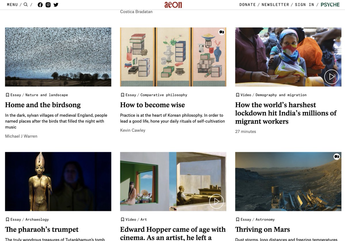
Website: @aeonmag

Ad free essays on every conceivable topic.

At 2000 - 6000 words each article is a commitment.
But it leaves you transformed.

Aeon is what the internet should have been all about - consider donating, if you can afford. Image
@aeonmag Book: Olaf Stapledon, Star Maker

Science Fiction from 1937.

A man wakes up floating in space.
Witnesses billions of years of the universe evolving.
So who is the "Star Maker"?

Sci-Fi that ends up very spiritual & philosophic. I devoured this book. Image
Read 5 tweets

Did Thread Reader help you today?

Support us! We are indie developers!


This site is made by just two indie developers on a laptop doing marketing, support and development! Read more about the story.

Become a Premium Member ($3/month or $30/year) and get exclusive features!

Become Premium

Don't want to be a Premium member but still want to support us?

Make a small donation by buying us coffee ($5) or help with server cost ($10)

Donate via Paypal

Or Donate anonymously using crypto!

Ethereum

0xfe58350B80634f60Fa6Dc149a72b4DFbc17D341E copy

Bitcoin

3ATGMxNzCUFzxpMCHL5sWSt4DVtS8UqXpi copy

Thank you for your support!

Follow Us on Twitter!

:(