Usability pitfalls of disabled buttons
Disabled buttons can cause users to get blocked without knowing why, causing abandonment and frustration.
Tips on how to deal with disabled buttons from @vitalyf's video course - Smart Interface Design Patterns 👇
#design #ui #ux #uxui
Disabled buttons can cause users to get blocked without knowing why, causing abandonment and frustration.
Tips on how to deal with disabled buttons from @vitalyf's video course - Smart Interface Design Patterns 👇
#design #ui #ux #uxui

Always keep buttons enabled by default
Always keep buttons enabled by default and allow users to interact with them. Disabled buttons can cause users to get blocked without knowing why causing abandonment and frustration.
Always keep buttons enabled by default and allow users to interact with them. Disabled buttons can cause users to get blocked without knowing why causing abandonment and frustration.

Point to errors on submit
On submit, explain to users why they can’t proceed, and how to fix errors:
• For a single error, point users to the invalid input via a text link.
• For multiple errors, display an error summary at the top and link to it.
On submit, explain to users why they can’t proceed, and how to fix errors:
• For a single error, point users to the invalid input via a text link.
• For multiple errors, display an error summary at the top and link to it.

Add an explanation next to disabled buttons
If you can’t avoid disabled buttons, at least provide an explanation to guide people towards the most likely solution.
Help customers when they need help, rather than leaving them out there in the wild all by themselves.
If you can’t avoid disabled buttons, at least provide an explanation to guide people towards the most likely solution.
Help customers when they need help, rather than leaving them out there in the wild all by themselves.

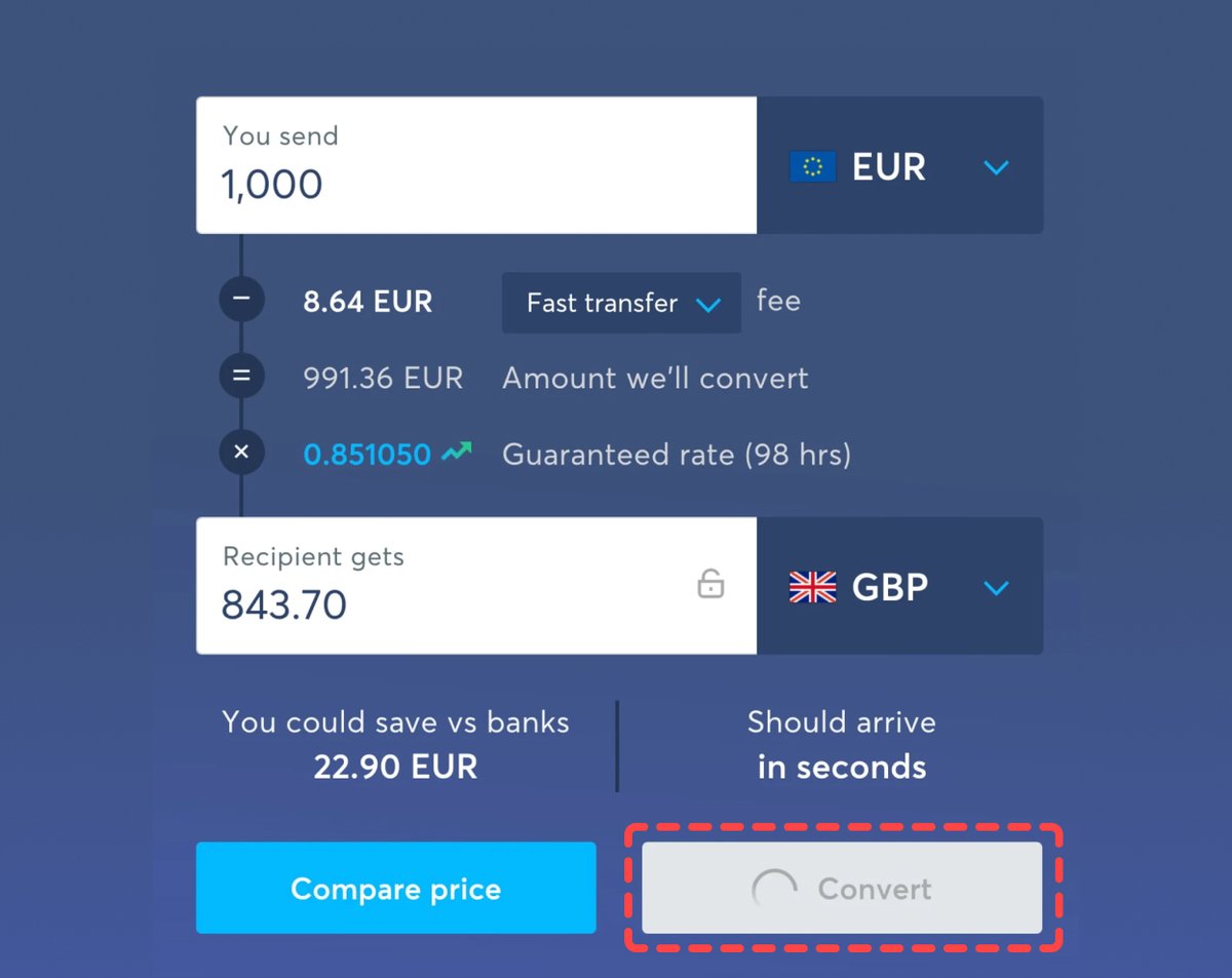
When disabled buttons (and states) work well
Temporarily disable buttons to avoid wrong purchases, double booking or to validate magic sign-in/SMS code. Even then, make sure that the color contrast is sufficient (4.5:1) for the text to be legible.
Temporarily disable buttons to avoid wrong purchases, double booking or to validate magic sign-in/SMS code. Even then, make sure that the color contrast is sufficient (4.5:1) for the text to be legible.
Make disabled buttons more inclusive:
✅ Change the cursor to “cursor: not-allowed”
✅ Prevent the click via JavaScript
✅ Avoid the “disabled” attribute in HTML and use “aria-disabled” instead
✅ Use ARIA live regions to announce dynamic content
✅ Change the cursor to “cursor: not-allowed”
✅ Prevent the click via JavaScript
✅ Avoid the “disabled” attribute in HTML and use “aria-disabled” instead
✅ Use ARIA live regions to announce dynamic content
Learn about other interface design patterns in the full course:
• 30 video lessons (9 hours)
• 4-weeks UX training
100s of real-life examples and tons of practical takeaways.
👉 smart-interface-design-patterns.com
• 30 video lessons (9 hours)
• 4-weeks UX training
100s of real-life examples and tons of practical takeaways.
👉 smart-interface-design-patterns.com
• • •
Missing some Tweet in this thread? You can try to
force a refresh