Adham Dannaway Profile picture
📘 Author of @PracticalUI ⚡️ UX & UI design tips, inspiration, & news 🤟 Pushing pixels since 2005 ⚙️ Specialised in UI design & design systems
Aug 3, 2023 10 tweets 4 min read
🖤 How to simplify your designs

20+ actionable principles you can apply to your designs.

A thread 👇

By Taras Bakusevych

#ux #design #uxui #uxdesign Image Build products with focused value

There is so much software that tries to do so much for so many audiences, everyone tries to be a Swiss Army Knife of the industry. If you want your product to be simple you need to define a core value and identify who is this product really for. Image
Jun 6, 2023 8 tweets 3 min read
⚡️ 20 form design tips

Simple rules to help you design beautiful and user friendly forms.

By Taras Bakusevych

A thread 👇

#design #ux #uxui Image Text field types

Most of them are based on basic text fields that were modified to better handle specific types of information, like credit card numbers. Image
May 16, 2023 15 tweets 9 min read
🔤 My top 10 free typefaces for UI design

Interfaces can quickly get cluttered 😮

An easy way to declutter them is by simplifying the thing that takes up the most space - text.

Here are my go-to sans serif typefaces for optimal legibility and simplicity.

0 / 10 👇 Image Things I look for in a typeface:

✅ Sans serif, as they're generally the most legible, neutral, and simple. This makes them a safe option for UI design.

✅ Relatively tall lower case letters (x-height) and comfortable letter spacing for optimal legibility.
May 16, 2023 12 tweets 4 min read
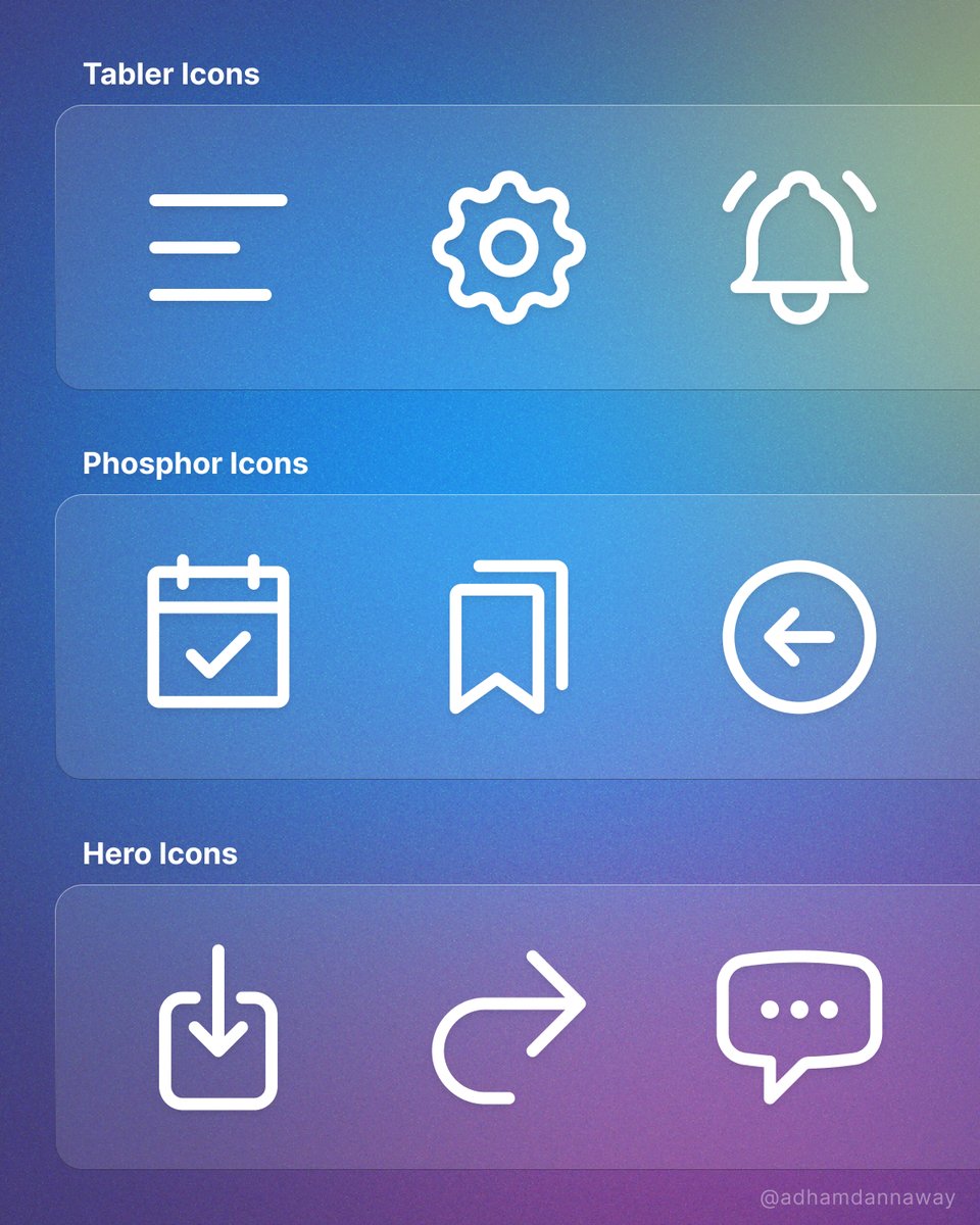
⭐️ 10 Awesome free icon sets

I honestly can't believe they're free.

What's your go-to icon set? 🤔

#design #icons #ux #webdesign #icondesign Image 1️⃣ glyphs.fyi
Mar 14, 2023 28 tweets 11 min read
💥 16 little UI design rules that make a big impact

UI design might appear to be a magical art form, but a lot of it is made up from logical rules or guidelines.

We’ll redesign an example interface using 16 of 100+ guidelines from my book - @PracticalUI

A mega thread👇 1. Use space to group related elements

The lack of space between content makes the design look cluttered and difficult to understand. Increasing spacing helps to clearly group content, making it more organised and easier to understand.
Mar 14, 2023 9 tweets 5 min read
🚨 Launch alert 🚀

My UI design book @PracticalUI 📘 is live on @ProductHunt 🥳

I spent thousands of hours over 1.5 years crafting a book to teach anyone how to design user interfaces using logical rules.

I'd love your support and feedback. Thanks 🙏
👉 producthunt.com/posts/practica… @PracticalUi @ProductHunt Going up against all the AI app companies on Product Hunt is tough 😮

Here's how things are going after the first hour. Wish me luck and/or send me tips/advice 😅 Thanks
Mar 13, 2023 6 tweets 4 min read
⚡️ UI design tip: Check your buttons for common mistakes 😮

After nearly 2 decades looking at buttons, I've noticed that most of them have usability and accessibility issues.

Some quick and practical tips to avoid common mistakes 👇

#design #uxui #uxdesign ✅ Define 3 buttons styles (primary, secondary and tertiary) to display actions of varying importance.

✅ Ensure buttons have a clear visual hierarchy (order of importance) that isn't reliant on colour alone.
Feb 12, 2023 8 tweets 4 min read
Usability pitfalls of disabled buttons

Disabled buttons can cause users to get blocked without knowing why, causing abandonment and frustration.

Tips on how to deal with disabled buttons from @vitalyf's video course - Smart Interface Design Patterns 👇

#design #ui #ux #uxui Always keep buttons enabled by default

Always keep buttons enabled by default and allow users to interact with them. Disabled buttons can cause users to get blocked without knowing why causing abandonment and frustration.
Dec 20, 2022 6 tweets 5 min read
🔥 100 Landing page hot tips
By @robhope

Improve your landing page designs with these quick and actionable tips.

Here are a few of my faves 👇

#landingpagedesign #design #uxdesign #webdesign #uxui 🔥 Spice up those Call-To-Action (CTA) buttons.

You are excited to share your product/service.

🚫 Click Here
🚫 Sign Up

Use actionable phrases.

✅ Discover the wonders of science
✅ Request a call from our agents
✅ Unlock creativity for only $19
Nov 23, 2022 4 tweets 2 min read
⚡️ UI design tip

I’ve been doing buttons wrong! 😱 Have you? 🤔

After nearly 2 decades looking at buttons, I've noticed that most of them have usability and accessibility issues.

Here are some quick and practical tips to avoid common mistakes 👇

#design #uidesign #uxdesign Image ✅ Define 3 buttons styles (primary, secondary and tertiary) to display actions of varying importance.

✅ Ensure buttons have a clear visual hierarchy that isn't reliant on colour alone.
Nov 21, 2022 4 tweets 2 min read
⚡️ UI design tip - Use the inverted pyramid

The inverted pyramid is a writing structure in which the most important information is placed at the start, followed by supporting information and smaller background details.

Learn why it's great for interface text 👇

#uidesign #uxui Image ✅ It gets to the point quickly, helping people understand information and make decisions faster.

✅ People who quickly skim the first sentence will still get the main point.

✅ Additional information is there for those who need it.
Nov 1, 2022 7 tweets 5 min read
📍 Product/UX design methods mindmap

A handy guide to help you decide when to use what UX methods.

1️⃣ Understand
2️⃣ Define
3️⃣ Ideate
4️⃣ Execute
5️⃣ Validate

🧵 A thread

via @Mei_big_eyes #design #uxdesign #uxui #productdesign 1️⃣ Understand

In the understand phase, we put ourselves in the users’ shoes and understand their likes & dislikes, context, needs, pain points, etc.

Meanwhile, we learn about the business: What is the money-making model? What are the metrics to measure business success?
Sep 13, 2022 24 tweets 8 min read
📌 21 Laws of UX

Best practice psychological principles to design more intuitive, human centred products and experiences.

By @JonYablonski

🧵 A thread 1. Aesthetic-Usability Effect

Users often perceive aesthetically pleasing design as design that’s more usable.
Feb 7, 2022 4 tweets 2 min read
⚡️ UI design tip - Decrease usability risks

Many of my design decisions are based on risk. The risk that someone could have difficulty using an interface.

In this example, we’ll fix elements that pose a potential risk to usability using practical UI design principles.

1/4 🧵 Image ❌ Usability risks

We’re not after subjective thoughts on aesthetics, but objective issues that could negatively affect usability and accessibility.

I've pointed out 8 potential risks to usability.

Next we'll fix them 👇 Image