A recurring theme on #MedTwitter is frustration with #LookAlike medications.
We get angry at drug companies & demand they fix what we think is a simple problem. But it’s not. It’s very complex, even bordering on “wicked”. I’m hoping this 🧵 might help tease that out. 1/


We get angry at drug companies & demand they fix what we think is a simple problem. But it’s not. It’s very complex, even bordering on “wicked”. I’m hoping this 🧵 might help tease that out. 1/

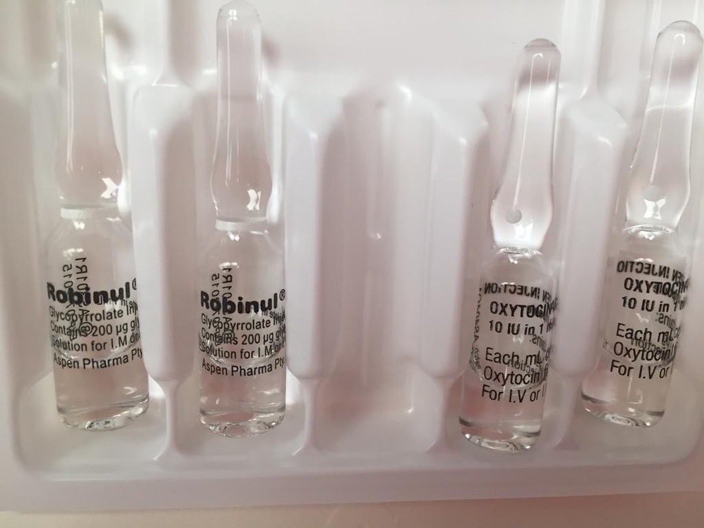


First of all, it’s worth pointing out some companies are aware of the issue and are trying to improve things. One notable attempt by Hameln is the use of the ISO 26825 colour scheme for syringe labels, on their ampoules & packaging. 2/ 


It would certainly have value in anaesthetics as we are familiar with them, & it’s almost a case of “If you’re going to use colours why not those ones?”.
It would certainly help reduce the risk of between-drug-class problems like this (👇) happening. 3/
It would certainly help reduce the risk of between-drug-class problems like this (👇) happening. 3/
https://twitter.com/DrGetafix/status/1617045299603836931?s=20
But there are a couple of problems here. First of all, this only works if you get all your drugs from Hameln. If, due to costs, shortages etc, you need to use a different company, there’s a risk of re-introducing look-alikes. 4/ 


But also, in typical complex problem fashion, if followed to its natural conclusion, the Hameln strategy could generate a new problem. An increased risk of within-drug-class errors as all drugs in the same class could end up looking similar. 5/ 


And here’s a real world example. Aguettant, to their credit, use the ISO colour codes but 3 of these drugs use purple. But it seems they are aware of this so they used a solid block of colour for one but only a border for another. 6/
https://twitter.com/ProfEllenO/status/1631227224341848066?s=20
And of course look-alikes are not just an anaesthetic problem. So an overlap in colour coding may not be a big issue for a small number of drugs in an anaesthetic tray, but could easily become a problem for 100’s of drugs in a pharmacy. 7/ 


And utilising colour coding by class becomes an even bigger concern where a given drug comes in different formulations/concentrations, especially if there are already look-alike/sound-alike issues. 8/ 


Indeed this issue of different concentrations of the same drug is significant enough for some companies to go rogue & use their own colour system to distinguish between them. While well intentioned this may make things worse as there’s a risk of confusion with the ISO colours. 9/ 

The above issues reveal a key limitation of colour coding. There just aren’t enough colours! Also relevant is that significant numbers of HCW’s have colour vision deficiency, although the original standard from South Africa did have a rather brutal way to avoid that issue!😳 10/ 


So if colour’s not going to solve it alone, what else can we try? Tall man lettering is commonly suggested, and used, but the evidence for it’s effectiveness is lacking, and @hypoxicchicken has gone so far as to suggest phasing it out. 11/ 


Another option is shape (& size) coding as suggested by @ybitan. Shape coding has a special place in the heart of ergonomists, as it’s linked with the birth of the discipline. Indeed there are already examples in healthcare, and we often use it without even realising it… 12/ 


…because for a lot of look-alike errors, the shape (& size) matters just as much as, if not more than, colour because it has a tactile as well as visual component. 13/ 


And interestingly, if you go back to the Hameln example, they seem to have attempted some shape coding. It’s hard to say how much it adds, especially without the tactile aspect, but at least they are trying! 14/ 


And going back to the Aguettant syringes, you may have noticed there were actually two that had solid purple colouring. But one of them was shorter than the other one which “should” (😬🤞) be enough to distinguish between them. 15/ 

And we do already have some different shapes & sizes at our disposal, but they seem to be used haphazardly rather in a systematic way to improve safety. And just like colour, the lack of variety currently utilised would limit it’s impact. 16/ 


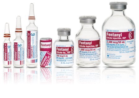


So hopefully you’re now beginning to see that while there are some drug companies trying to address the issue of look-alikes, those efforts are sporadic and there’s no coordinated, standardised, international effort to improve things which I think is what’s required. 17/
And because of the global nature of drug manufacturing and logistics, differing regulatory requirements regarding drug labelling, drug shortages, and cost pressures, any changes a given company make are unlikely to improve things, and have the potential to make things worse. 18/
For this reason the problem’s not going to be solved by an individual company and, in keeping with other wicked problems, has no “stopping point”, so is likely to be ultimately unsolvable. But I think we can make progress. 19/
It will need a sustained input of money, time, attention & expertise, international co-ordination, & the recognition that, to paraphrase John Senders, medication safety is a special case of safety, not a special case of medicine, so will need input from other disciplines. 20/
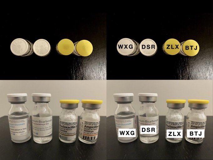
But I think the key ingredient is creativity. Coming up with new ideas, but also doing current things differently. For example, the label is not the only place we can use colour. What about the glass and the ampoule caps? 21/ 


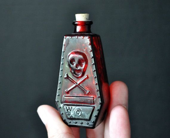
And we’d do well to look at history and learn from the apothecaries who, long before Fitts, Jones or Chapanis, realised the importance of combining text, shape, tactile & colour coding to help stop people drinking poison! 23/ 


But we also need to think of new approaches. What about something along the lines of IATA Airport Codes for example? A unique 3 letter code for each drug, with the advantage of it being suitable for oral meds as well.
Ok, this 🧵is already too long so one final, key point. 24/


Ok, this 🧵is already too long so one final, key point. 24/



Medication safety is about more than physical presentations of drugs. They are only 1 element of a broader medication system & understanding interactions b/w elements of this system is the key to improvement.
@hypoxicchicken & @NicholasChrimes paper covers all this very well. Fin
@hypoxicchicken & @NicholasChrimes paper covers all this very well. Fin

@threadreaderapp unroll please!
• • •
Missing some Tweet in this thread? You can try to
force a refresh


