Alec Profile picture
Follow for bad trading advice and mediocre memes. It's up to you to decide what's a meme.
ZNO Profile picture 1 subscribed
Feb 18, 2022 7 tweets 3 min read
🧵-I was interested to see when is #es_f most likely to put in high of day (HOD) or low of day (LOD) so I looked into some data. I had previously looked at how often 30m Opening Range puts in HOD or LOD, but now I am interested in how often which trading period put in HOD or LOD. Each ‘period’ represents a 30 minute candle. The periods are labeled with letters, starting with A for the RTH open, and M for last 30 minutes of RTH close. Google TPO/Market Profile for more info. I used 276 trading days, first day was 1/4/21. Last Trading day, 2/11/22.
Jan 9, 2022 5 tweets 3 min read
Thread 1/5: After seeing such a clean rejection off of the 30m OR (opening range) for #NQ_F on Friday, I thought of @Michigandolf, who loves the 30m OR. I then wondered how often we close below or above the 30m OR. I decided to do the math so you don’t have to. Although #ES_F did not reject the 30m OR like NQ on Friday, it did reject the open. You can see the highlighted area around open is the 30 second OR, popularized by @paxtrader777 and shared by a few others. My favorite opening range on my chart.
Dec 31, 2021 10 tweets 4 min read
I received questions about how to create spreadsheets in Sierra chart, so here it goes, long thread. This is my process.

We will use 2 charts, 1 chartbook. Chart 1 is a time candle with various hi/lo time period studies for whatever you are looking at, I used 30 second candles. Image 
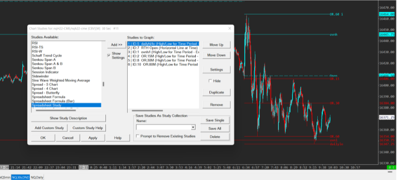
Now how I prefer to do things is go to a daily candle chart and overlay the studies, this reduces the amount of data cleaning I need to do before analyzing, otherwise it would show OR row on every candle row. "Study/Price Overlay" is how I overlay studies. Image
Dec 12, 2021 12 tweets 3 min read
1/x
Wow, my first thread.
Analyzing the NQZ21 contract, I looked at 9/2 to 12/10 and at various opening ranges (OR), gap fills and overnight high/low. I only looked at the last 72 days. I downloaded data from Sierra chart and analyzed it in excel. #NQ_F #NQ 2/x
I did use NQ close data from Yahoo finance because the previous close line on SC was being stubborn and not giving me correct data (probably my fault). There’s a bunch of numbers and percentages, you can scroll to the end if you’d like, or ignore it. idc.