💡Use Multiple Drop Shadows, or a very subtle border (just a shade darker than your actual shadow) around certain elements to make those elements appear a little sharper, more defined, and help avoid those muddy shadows. 
💡It’s absolutely fine to just opt for the 1 Typeface when creating your artwork. Ignore the ‘Always use 2 Typefaces. Minimum.’ crowd. Using a combination of Weights, Sizes, and Colour you can still produce perfectly acceptable results.

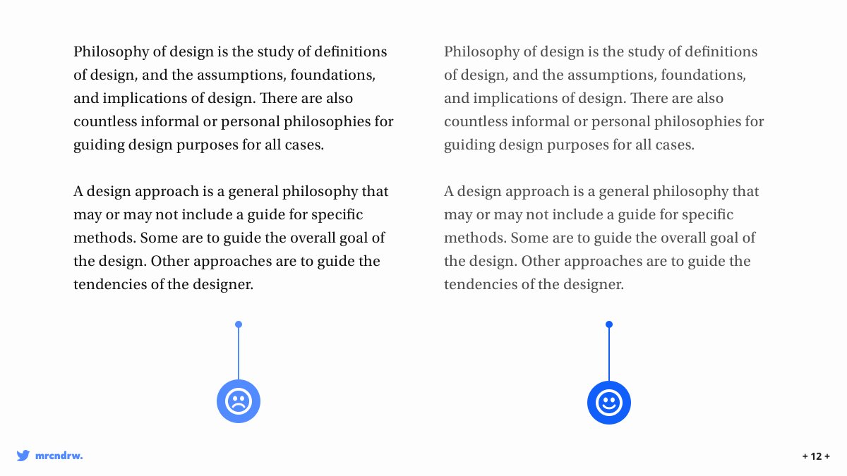
💡For long-form content (ie; Blog Posts, Project Descriptions etc...), try opting for 20pt (or even a little more) with your Body copy. This is of course dependant on the Typeface chosen, but it makes for a better reading experience for the user when faced with a wall of text.

💡Enable users to skip your Mobile App Onboarding sequence at any time, and place that Skip link within easy thumb reach. Thumbs still rule in 2020 remember!

💡Make sure your shadows always come from just the one light source. We don’t live in a land of a thousand suns remember.

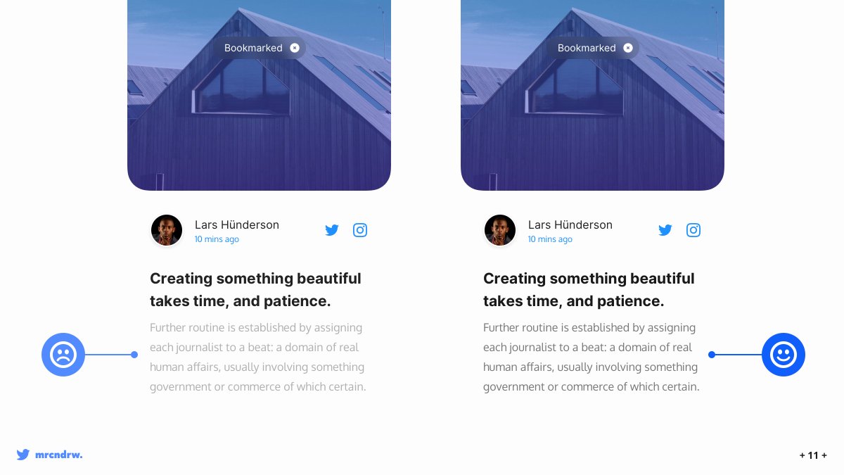
💡Improve Contrast between Text and Images with a subtle overlay. Depending on where the text is positioned over your image, you can either opt for a tried, and tested, full image overlay, or a more subtler gradient overlay to achieve a simple contrast between the two elements.

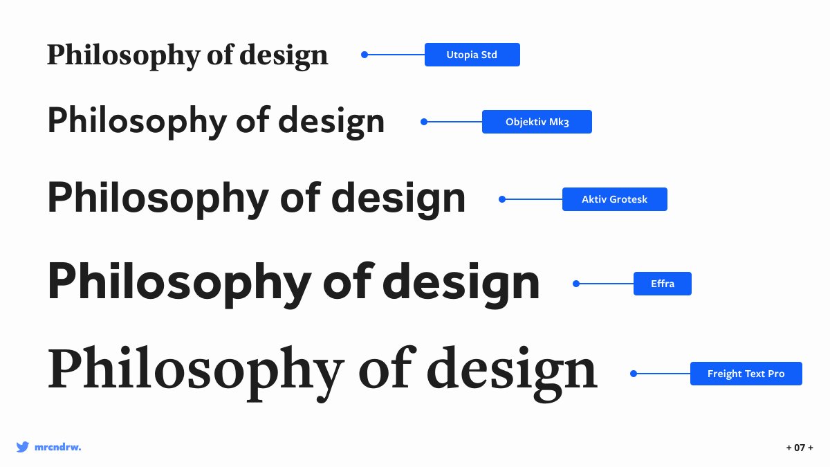
💡Here’s a selection of Serif, and Sans-Serif Typefaces that I’ve used many times before, and found they work really well for Headlines, bringing a bit of warmth, and character to any design.
You can find them at fonts.adobe.com (No, I’m not getting any commission). 😀
You can find them at fonts.adobe.com (No, I’m not getting any commission). 😀
💡Use Centred Text in moderation. Keep it on the low.
Try to only use Centred Text for Headlines and small passages of Text. For pretty much everything else keep that bad-boy (ahem, text content) left aligned.
Try to only use Centred Text for Headlines and small passages of Text. For pretty much everything else keep that bad-boy (ahem, text content) left aligned.

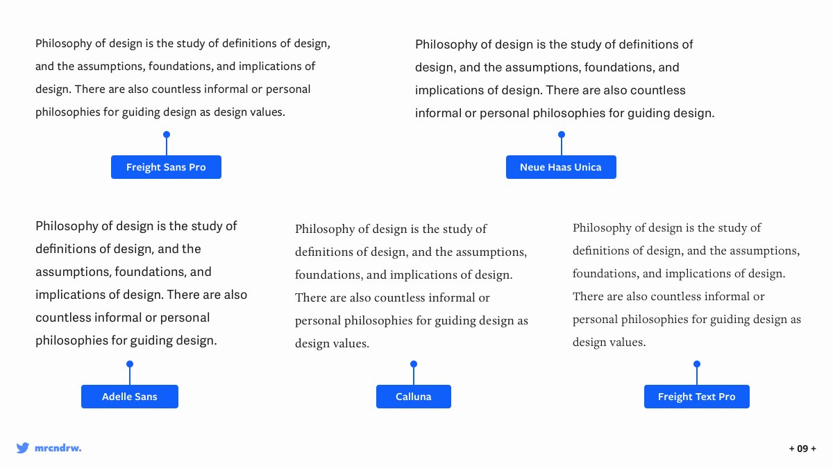
💡Behold a small selection of both Serif, and Sans-Serif Typefaces that I’ve used consistently for long-form body text, and highly recommend.
You can find them over at fonts.adobe.com (No, I’m still not getting any commission). 😀
You can find them over at fonts.adobe.com (No, I’m still not getting any commission). 😀
💡Good ol’ Whitespace, Negative Space, you know the one. Use it generously, or in moderation, but use it well. Even just subtle amounts of the good white stuff can allow your designs to breathe, and look more polished. One of the fastest and simplest ways to improve your designs.

💡Don’t make your text too light. It can look like all the cool kids are (still) doing it, but you're smarter than that, and want to create much more accessible interfaces right?
I use Contrast by @mds for quickly finding any Accessibility issues within my designs. It rocks! 🎸
I use Contrast by @mds for quickly finding any Accessibility issues within my designs. It rocks! 🎸
@mds 💡When it comes to long-form content, certain Regular weight Typefaces can still look a little too stark, and heavy. Easily fix this by opting for something like a Dark Gray (ie; Hex 4F4F4F) to make it that little bit easier on the optics. 👍