Marc Andrew Profile picture
Designer of 25+ Years. Crazy-high standards. Created multiple digital products including the Cabana Design System for Figma & Framer (Acquired).
Jun 29, 2022 12 tweets 3 min read
I’ve been creating articles about UI & UX Design for quite a few years now.

Built a following of over 65K over on Medium. Oooh get you!

Created a strong sales funnel towards my digital products in the process.

Here’s 10 quick tips I’ve picked up over time…

🧵 THREAD 🧵 1. Don’t ever worry about those 1st drafts of your article.

Honestly just write. Let those thoughts pour out of your head. You’ll have repeated sentences, s**t that doesn’t make sense.

Don’t worry. You tweak everything in the 2nd, 3rd… draft.
Aug 10, 2020 8 tweets 5 min read
🎨 Gorgeous Gradients with Nonsensical Names (Volume One)

Just a selection of Gradients for you to use in your next project. Copy those HEX Codes and keep the Gradient dream alive... Blue Monday
#199AFB
#105EFB
Aug 6, 2020 13 tweets 5 min read
💡 How to build a Design Starter Kit in @figmadesign (Part One)

A Thread... 1. Do you like staring at a blank canvas every time you start a project in Figma?

I’m guessing you’re not a big fan, but it’s a practice that you’ve possibly followed on occasion?

Wouldn’t it be better if you could kick-start your design projects faster?

Cue the intro music!
Jul 30, 2020 7 tweets 2 min read
💡White Space is your UI friend. Use it generously.

Ah good old White Space. One of the simplest things to add to your designs to improve both your UIs, and user experience.

Let me share my (quick) thoughts with you on why you need to use it generously, and show it some love... Allow the message of your site or app room to breathe.

It makes me weep into my pillow (with rounded corners of course) when I see UIs bursting at the seams with masses of information crammed into such a small area.
Jul 14, 2020 6 tweets 3 min read
🚀 Welcome to Volume 3 of the bite-sized, and easy to put into practice UI & UX Design MicroTips Thread by @mrcndrw

You can also check out Volume 1 - and Volume 2 - 
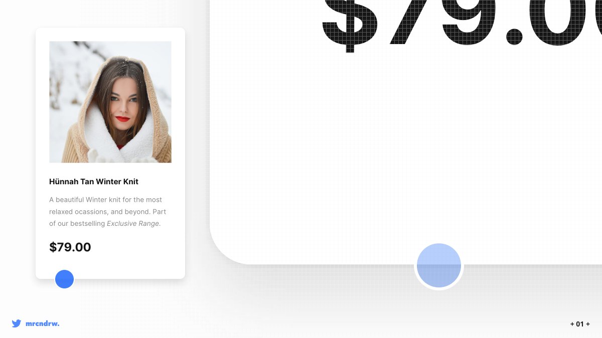
💡 Colour-Pick from your images, and bring your products to life.

Simply colour-picking from your product images, and then applying various tints & shades of your chosen colour to your background, text, or icons, can add plenty of visual interest, and character to your designs.
Jun 3, 2020 9 tweets 4 min read
🚀Welcome to Volume 2 of the bite-sized, and easy to put into practice UI & UX Design MicroTips Thread by @mrcndrw Pls RT

You can also check out Volume 1 here -bit.ly/uiuxtipsvolume… 💡 As your font size decreases, increase the line height for better, all-round legibility.

The same applies to when the font size increases. Simply decrease the line height.
Jan 16, 2020 13 tweets 7 min read
🚀 Jump on in and enjoy this forever growing, and regularly updated Thread of bite-sized, and easy to put into practice, UI & UX Design MicroTips by @mrcndrw #ui #ux #uxdesign #design #webdesign Pls RT 💡Use Multiple Drop Shadows, or a very subtle border (just a shade darker than your actual shadow) around certain elements to make those elements appear a little sharper, more defined, and help avoid those muddy shadows.